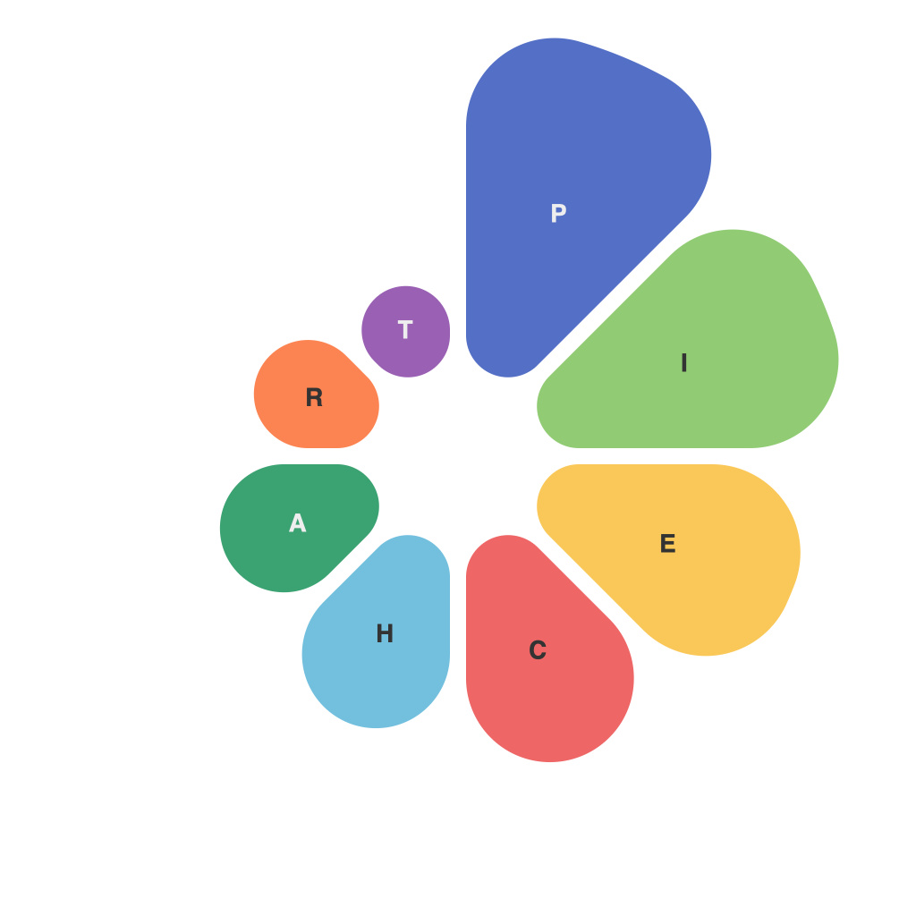
Data visualization is the bedrock of modern analytics, making complex data more digestible and actionable. Among various chart types, the pie chart stands as a popular tool for illustrating proportions and percentages in a single, clear visualization. To master the art of conveying information effectively, decoding the pie chart palette becomes an invaluable skill. This article will delve into the ins and outs of piechart palettes, helping you harness visual insight with precision and style.
Understanding Pie Charts
At their core, pie charts are circular graphs divided into slices, where each slice represents a proportionate segment of the whole. They are effective for showing the composition of data – such as market segmentation, population demographics, and survey responses. By using a piechart palette, presenters can enhance the effectiveness and readability of these charts.
Choosing the Right Color Palette
The color palette in a pie chart can make or break its impact and clarity. A bad choice can lead to confusing visuals, while a good one can make your data pop and stand out. Here are some principles to consider when selecting a color palette:
1. Contrast: Choose colors that stand out from each other to make it easier for viewers to differentiate sections. High contrast allows even smaller or distant sections to be easily distinguished.
2. Simplicity: Limit the number of colors used to reduce complexity. Too many colors can overwhelm the viewer. A common rule of thumb is to stick to no more than four or five main shades.
3. Consistency: Use the same color for the same category throughout your presentation. Consistency is key to creating an easily comprehensible and memorable visualization.
4. Meanings: Assign a color for its meaning and avoid using colors with negative connotations if they represent negative data points.
5. Brand Alignment: If your presentation is part of a wider brand or theme, ensure that your colors align with the overall design language to maintain brand consistency.
Best Practices for Pie Chart Palette
1. Grayscale and冷暖色调 Mix: For a modern palette, consider contrasting warm colors for positive data against cool or灰色的 tones to represent negative numbers. This approach provides an intuitive distinction between good and bad performance metrics.
2. Use Colors to Represent Values: Choose a color that reflects both the type of data and its magnitude. For instance, a brighter shade for more significant values and a darker or more subdued shade for smaller ones.
3. Highlight Key Data Points: Design your pie chart to draw attention to the most important pieces of the pie. This can be done by using a contrasting or larger section for the data that holds the largest portion or that requires a focus.
4. Avoid Color Scheme Pitfalls: Steer clear of clashing colors and monotones, which can make your chart difficult to interpret. Instead, opt for a spectrum that offers variety while retaining harmony.
5. Accessibility in Mind: Consider color blindness. To make your pie chart accessible to everyone, avoid combinations and intensity levels that are problematic for those with color vision deficiencies.
Using Pie Charts in Practice
Pie charts can be powerful when used correctly. However, certain pitfalls can occur:
1. Avoid Pie Charts for Large Data Sets: More data points in a pie chart can make it hard to discern any details. Keep pie charts to a manageable number of segments to maintain clarity.
2. Be Skeptical of Slying Pie Charts: When a pie chart appears to have a “slanted slice,” it’s designed to mislead the eye. Watch out for designs that stretch slices to seem larger.
3. Utilize Callouts: Use callouts to highlight individual data points within the pie chart and to add context to the statistics.
Conclusion
Mastering the piechart palette is about more than just picking colors – it is about conveying information with both aesthetic and practical foresight. By understanding the nuances of color theory, the unique aspects of pie charts, and the principles of effective data visualization, you can create visual pieces that offer more than just insight but engage, enlighten, and empower your audience with the clarity that data mastery commands.

