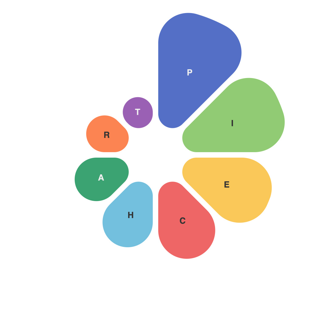
In the vast landscape of data visualization, pie charts have emerged as an intrinsic component of conveying complex information with simplicity and clarity. The art of creating the perfect pie chart is not as straightforward as one might initially assume. pie charts can easily become cluttered and confusing, or strikingly concise and informative. Enter PieChartMaster: the ultimate guide to mastering pie charts and transforming your data into captivating visuals.
Before diving into the nitty-gritty of pie charts, let us first explore their purpose and versatility. A pie chart, after all, is more than just a collection of slices pieced together; it represents a snapshot of a subject divided into proportions. When crafted correctly, pie charts can highlight trends, compare subsets, and draw attention to outliers, making them a vital tool in the arsenal of any analytical professional.
The foundation of a pie chart’s appeal lies in its straightforward visual language—the bigger the slice, the larger the proportion it represents. This fundamental concept allows for quick comprehension of the data being depicted. However, to avoid the pitfalls often encountered while designing a pie chart, one must embrace PieChartMaster’s comprehensive guide. Let’s explore its key tenets:
1. Choosing the right pie chart type
Selecting the most appropriate pie chart type is the first step towards pie chart mastery. While there are several variants, such as percentage pie charts and donut charts, it is crucial to understand the differences and apply the right type for your data. A percentage pie chart is better suited for showing proportional relationships, whereas a donut chart can convey additional information with its ringed, hollow center.
2. Maintaining clarity
Overpopulation of a pie chart is a common issue that can lead to confusion. PieChartMaster emphasizes the importance of keeping the chart simple by avoiding too many slices. If a pie chart features more than 6 slices, consider alternative visualization methods, such as stacked bar charts or radar charts, as the human brain has difficulty processing more than that many segments of a pie.
3. Using consistent angles
When slices are consistently sized and cut at angles, viewers can easily compare their relative proportions. PieChartMaster advocates for using equal spacing of slices to allow for quick comparisons and to maintain a balanced, aesthetically pleasing visual.
4. Incorporating labels and legends cleverly
Labeling slices is essential, but it must be done with care. Avoid overcrowding the chart by strategically placing labels along the edge of the pie or using a hover feature that reveals information on a click. Furthermore, include a clear and descriptive legend to facilitate understanding of the slices’ meanings.
5. Addressing color perceptions
Colors can significantly impact a pie chart’s readability. PieChartMaster highlights the importance of choosing a color palette that enhances contrast and allows viewers to easily differentiate between slices. Use colors that are both aesthetically pleasing and indicative of the data’s significance.
6. Acknowledging the limitations
Although pie charts are powerful tools, they are not infallible. PieChartMaster reminds users of the chart’s limitations, such as the human brain’s capacity to accurately perceive circular relationships and the potential for misinterpretation when dealing with a small number of slices.
In conclusion, pie charts, when designed using the guiding principles of PieChartMaster’s comprehensive guide, can be powerful and versatile tools for data visualization. By focusing on selecting the correct type, maintaining clarity, and incorporating thoughtful design elements such as labeling and color, anyone can unleash the true potential of pie charts. Embrace pie chart mastery with PieChartMaster, and transform your data into captivating visuals that resonate with your audience.

