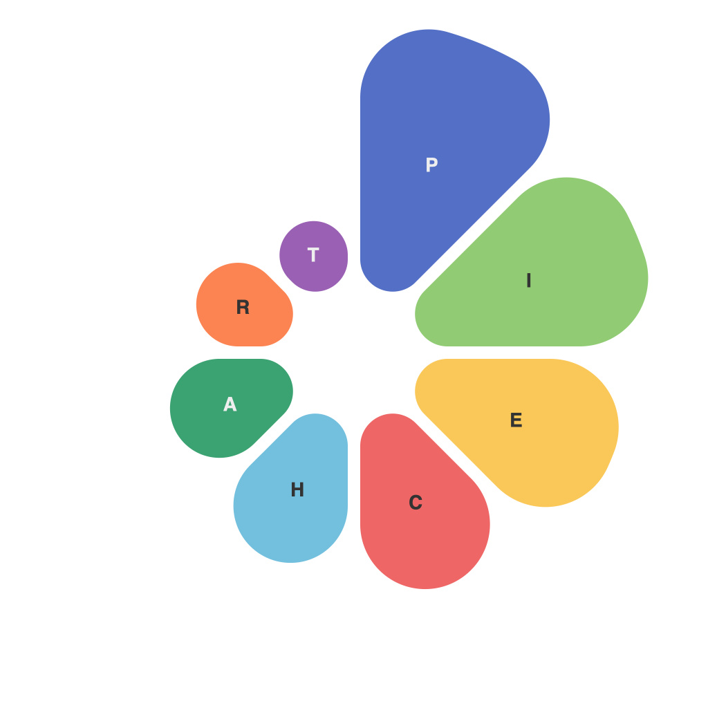
In the vast ocean of data visualization, pie charts have long been a staple. These circular representations of proportions and percentages offer a simplistic yet powerful way to convey complex information. Crafting the perfect pie chart, though, is an art form. From choosing the right elements to presenting the data, the master’s guide to crafting compelling pie charts is here to demystify the process and empower anyone willing to dive into the details.
**Understanding the Basics of Pie Charts**
Before you even begin to design your pie chart, you must understand the purpose of pie charts. At their core, they show the parts of a whole, where each slice of the pie represents a segment of the data. To effectively communicate, pie charts must be both visually appealing and informative.
**Selecting the Right Data**
To craft compelling pie charts, you need more than a heap of numbers. It’s essential to have relevant and meaningful data that can be easily expressed in slices of a pie. Pie charts are best used when showing absolute or percentage comparisons between no more than five or six parts of the whole. Overcrowding the chart can lead to confusion and detract from your message.
**Designing for Clarity**
Aesthetics often play a secondary role when it comes to data visualization, but with pie charts, this isn’t the case. The design must cater to both aesthetic and informative elements:
– **Colours**: Use contrasting, but still pleasing, colours to distinguish slices. Ensure the shades are legible against the chart’s background.
– **Labels**: Clearly label each slice with a percentage and a corresponding value if needed. Avoid overly dense text by using larger font sizes or providing a legend.
– **Ordering**: Present the largest slice first and follow a logical pattern from largest to smallest, or based on category relevance, to maintain a logical flow for the reader.
**The Art of the Centre**
The central area of the pie chart—known as the “donut” or “doughnut” – can often become a source of clutter if not handled properly. Some options to consider:
– **Hole**: A hole can give the chart a visually different look and, sometimes, reduce the risk of overcrowding. However, it also decreases the available area for displaying more information.
– **None**: If you choose not to have a hole, ensure the central region isn’t occupied by a design element that might distract from the pie chart.
**Dealing with Varied Slices**
When you have slices of drastically different sizes, it becomes crucial to maintain legibility. Some techniques include:
– **Label Placement**: Place small labels outside the pie to avoid overlapping. The placement doesn’t have to be on the exact point — off-centering can sometimes enhance clarity.
– **Size Adjustment**: Increase the width of thinner slices or adjust their angle to make them more visible.
**Enhancing Pie Charts with Interactivity**
Pie charts can become much more interactive when the viewer is allowed to manipulate them. This doesn’t imply complex interactivity; even a basic hover-over feature to see more details can make a significant difference.
**Crafting for Accessibility**
Data visualization should be inclusive for all, including those with different types of visual impairments. When crafting pie charts:
– **Contrast**: Maintain high contrast between the pie chart and its background.
– **Screen Reader Compatibility**: Consider that readers of screenreader software will navigate the pie chart’s information in a linear fashion, so proper labelling and structure are key.
**Final Thoughts**
Remember that pie charts are part of your storytelling, not the entire tale. Complement them with other types of graphs and ensure the overall narrative aligns with your data and its presentation. Crafting compelling pie charts takes practice and a keen eye for detail, but following these principles will ensure you are well on your way to unlocking the power in pie. Let your charts be a beacon in the sea of data, guiding your audience through the information’s lures and traps with efficiency and elegance.

