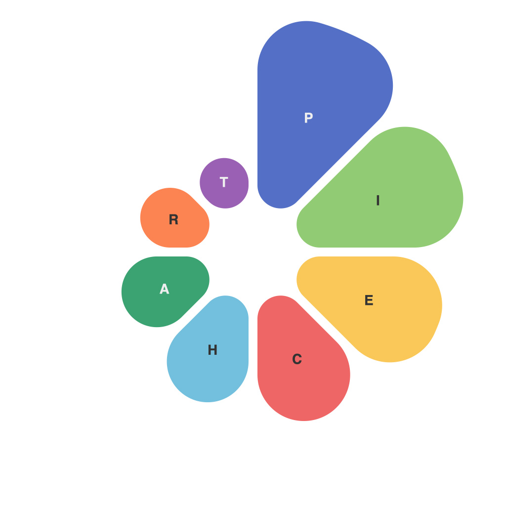
In the era of digital data analytics, the significance of effective data visualization cannot be overstated. One particular form of data representation that has stood the test of time is the pie chart. This circular, colorful barometer of percentages captures at a glance a detailed breakdown of a dataset. But beneath the simple facade of its visual allure hides a complex language that tells the story behind the numbers. This article delves into the decoding of data in colors, exploring the power and intrigue of pie charts for effective analysis and visualization.
The fundamental allure of pie charts lies in their clarity and simplicity. As a circular section of a whole, each slice of a pie chart symbolizes a fraction of the whole; the larger the segment, the more dominant the category within the dataset. A single glance at a pie chart often reveals valuable insights into trends, frequencies, and proportions without the need for reading long lists or performing calculations.
Colors – the hue of the slices within the pie – serve as a powerful tool in distilling large volumes of data into something digestible, making each slice unique in its identity. Decoding the color palette employed within a pie chart is a critical skill for anyone seeking to understand the data it represents.
### Enhancing Color Utilization
Color scheme and selection are pivotal in the pie chart’s effectiveness. The right choice of colors can highlight patterns, reveal anomalies, or simply add a level of aesthetic coherence that satisfies the human sense of order.
1. **Color Intention and Pattern Recognition**: Each color you choose should represent a distinct category or group within your data. By using a consistent color scheme (such as those in the color wheel for differentiating closely related categories), you allow the eye to effortlessly recognize patterns and trends.
2. **Contrast and Visibility**: When dealing with a large dataset that may contain many different slices, it’s crucial to have high contrast between colors so that the distinctions between slices remain clear. Certain contrast levels are innate; for instance, certain color combinations such as blue and orange or red and green are inherently more distinguishable than others.
3. **Limited Color Palette**: Avoid overload by sticking to a limited palette. Too many colors can confuse the reader and dilute the impact of each color. The fewer colors used, the more powerful and distinct your chart becomes.
### The Intrigue of Comparative Pie Charts
Pie charts can also be used to compare values across different datasets or series. In such comparative pie charts, subcategories are often depicted using multiple colors, each belonging to a different data set but overlapping on their corresponding pie.
The intrigue here lies in the negotiation between overlaps and distinctiveness. The design must balance the need for the audience to identify the various slices amidst their close proximity without losing the essence of the charts’ comparative nature.
### Decoding Data Through Size and Position
In pie charts with numerous slices, where color alone may not be enough, size and position can also become intrinsic decoding elements.
1. **Circular Design and Orientation**: The pie chart’s circular design implies a cyclical or sequential pattern. Some designers exploit this principle by placing the larger slices towards the front or bottom of the chart, thus drawing the audience’s eye to them instantly.
2. **Slice Size**: The size speaks volumes, signaling importance and influence. Larger slices, while more visually prominent, can overwhelm the smaller ones, so a skillful balance must be achieved.
### Utilizing Labels and Legends
Another means to unlock the mystery of colored segments in a pie chart is through thoughtful label placement and the creation of a clear legend. The legend should be easy to read and positioned either beside the pie or in a separate location so that it does not obstruct the viewer’s understanding of the chart itself.
### Conclusion: Pie Chart Deciphering
The art of reading pie charts requires an appreciation for its color coding, placement, orientation, and labeling—a form of visual literacy that enhances the communication and comprehension of data. As a potent visualization tool, the pie chart’s potential is often realized only when it is decoded correctly. By understanding the power within the colors and the intrigue of the slices it encapsulates, analysts can communicate complex information with clarity, paving the way for better decision-making, deeper insights, and a richer understanding of the world through data.

