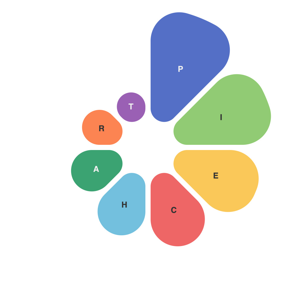
In an era awash with data, the need to make sense of statistics and complex information has never been more pertinent. Visualization tools have thus become indispensable in the quest to translate reams of data into comprehensible narratives. Among the myriad forms of data visualization, pie charts sit as reliable staples, offering a straightforward and intuitive way to represent categorical data. This article aims to dissect the visual vocabulary inherent in pie charts, a language that often goes unnoticed but is fundamentally crucial in the art of decoding data.
The foundational element in pie charts is the circle, the perfect figure that serves as the template for the entire display. Typically, the circle is divided into sectors, each representing a different category or proportion within the total dataset. This division is a prime example of how the symbolism of circles—completeness, unity, and wholeness—translates into data representation. By examining these divisions, we unravel a rich vocabulary that can be used to communicate and understand data at a glance.
The first term to grasp is the “central angle,” which refers to the angle at the center of the pie segment corresponding to each category. Depending on the size of the angle, the category’s relative significance can be quickly ascertained. Larger angles denote larger data segments, while smaller angles symbolize more minute categories. These angles act as visual cues that encourage users to focus on larger components of the pie, thus emphasizing the importance of the data at hand.
Colours serve as a pivotal part of the pie chart’s visual language. Each segment of the pie chart is usually assigned a distinct hue to distinguish one category from another. A well-thought-out palette not only sets the chart apart visually but also aids in memorability. In some cases, the choice of colours directly correlates to the categories being represented, providing a secondary layer of interpretation. However, it is crucial to note the potential for colour bias and to consider colourblindness in design, using contrastive and accessible colour combinations.
One of the hallmarks of pie charts is their simplicity, where less is often more. The effective pie chart communicates complex information with minimal distractions. A cluttered or jam-packed pie chart, with too many slices, can quickly descend into visual chaos, making interpretation difficult. The key is to choose the right granularity for the chart, selecting only essential categories that are meaningful in the context of the data being represented.
Labels play an integral role in the pie chart’s communication. They provide written information that acts as a complement to the visual aspects. Proper labelling ensures clarity in the interpretation of the chart. Each label should succinctly reflect the category, and when placed strategically around the pie, should enhance rather than hinder the viewers’ comprehension.
Pie charts can be enhanced by incorporating percentages or absolute values to the sections. These numbers, attached to the ends of the sectors, provide a quick reference to the size of the category in numerical terms. Although the main focus of pie charts remains their visual display, supplementing with actual figures can give the audience more context and facilitate comparison between different slices.
Pie charts also come in various styles, such as exploded, 3D, or donut (a variation featuring a hollowed-out circle for better scale distinction). Each style serves a different purpose and can influence the reader’s interpretation. Exploded pie charts, where one slice is separated from the rest, draw immediate attention, while a donut chart can help users discern smaller segments more easily due to the larger reference point.
Despite their widespread use, pie charts come with caveats. One significant drawback is their susceptibility to misinterpretation due to perspective effects, where the size of the slices appears to vary when viewed from different angles. Additionally, pie charts are not well-suited for comparison purposes across different datasets that have different total values.
In conclusion, the visual vocabulary of pie charts offers a framework from which we can decode data through the use of circular representations. The study of this vocabulary reveals the elements that contribute to the clarity, accuracy, and comprehensiveness of pie charts. By understanding this language, we can better interpret the statistical narratives presented to us, leading to more informed decisions and discussions rooted in data-driven insights.

