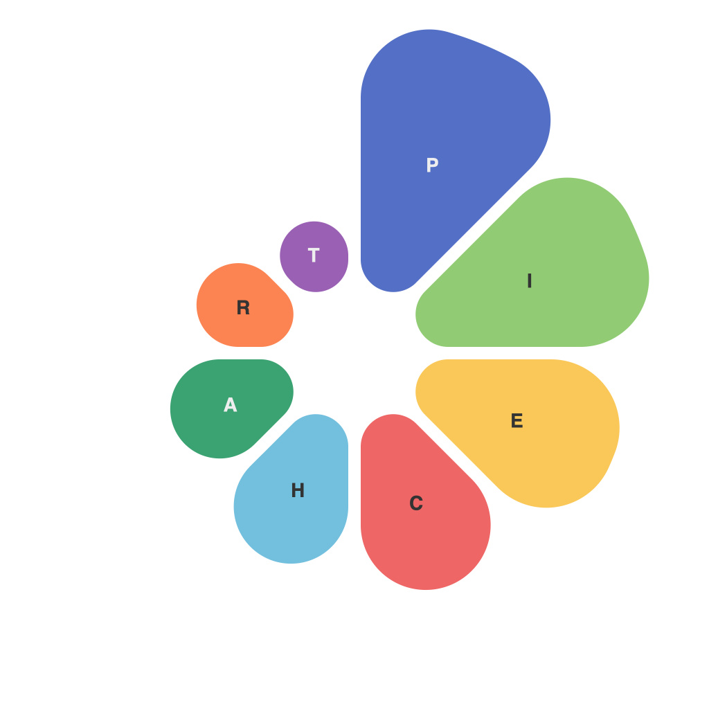
PieCharts: Capturing the Essence of Visual Insights
Visual insights play a crucial role in today’s data-driven world. They facilitate easy comprehension, reveal patterns and insights, and are instrumental in decision-making processes. Among the various types of visual representations available, piecharts are particularly powerful tools that excel in illustrating proportions and comparisons in a visually engaging and intuitive manner. This article delves into the world of piecharts, offering insights on how to effectively create, interpret, and leverage them to make informed decisions.
### Understanding the Basics
Piecharts, also known as circle graphs, are circular diagrams divided into sectors or slices, each representing a portion of the total data set. The size of each sector corresponds to the value it represents, making it easy to visualize the relative sizes of categories at a glance. The entire circle represents the total sum of the data, while each slice represents a specific category’s proportion.
### Benefits of PieCharts
Piecharts are incredibly useful for several reasons:
1. **Ease of Understanding**: Their simple, straightforward design makes it easy for anyone, regardless of their data literacy levels, to understand the information presented.
2. **Comparison of Proportions**: They allow for quick comparisons between different categories, showcasing how much each contributes to the whole.
3. **Visual Impact**: The use of colors and segment sizes draws attention to key data points, enhancing the visual impact and memorability of the data.
### Creating Effective PieCharts
1. **Start with the Right Data**: Piecharts are ideal for datasets where you want to compare parts of a whole. Ensure that the data is accurate and representative of the insights you wish to convey.
2. **Limit the Number of Slices**: Piecharts can become cluttered with too many categories. Aim to keep the number of slices to five or fewer to maintain clarity and readability.
3. **Use Distinctive Colors**: Assign a unique color to each slice. This not only improves visual appeal but also helps in distinguishing between categories easily.
4. **Label Clearly**: Include labels for each slice to provide context. Use concise and descriptive labels to avoid clutter.
5. **Consider the Chart’s Purpose**: Think about the audience and the most effective way to convey the data. Sometimes a labelless piechart can be more impactful.
### Best Practices
1. **Ordering of Slices**: Arranging slices in order of size can make comparisons easier for the reader. A typical approach is to place the largest slice in the top or at a significant angle from the center.
2. **Use of 2D vs. 3D Effects**: It’s generally advisable to stick to 2D depictions as the use of 3D effects can distort the perception of slice sizes, particularly when comparing sizes closely.
3. **Avoid Exploding Slices**: Instead of making one slice stand out, it’s better to improve readability and comprehension by keeping all slices within the circle.
4. **Legends vs. Labels**: For charts with many categories, using a legend might be more practical than adding labels to every slice. Make sure the legend is clear and accessible.
### Leveraging PieCharts for Insight
Piecharts are especially useful across various sectors, including business, education, healthcare, and marketing, where visual understanding of data trends and proportions can significantly impact strategy and decision-making.
### Conclusion
Mastering the art of piecharts involves choosing the right data, following best practices for clear representation, and effectively leveraging the visual format to communicate insights clearly. By understanding the nuances of piecharts, you can harness their power to make data more accessible, enlightening, and actionable. Remember, the goal is not just to create piecharts but to use them as effective tools in achieving better insights and decisions based on the data provided.

