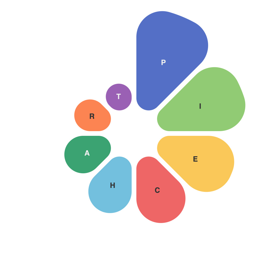
Visualizing data with pie charts is an integral part of communication in today’s data-driven world. Pie charts offer a simple and intuitive way to present complex information in a digestible format. However, despite their straightforward nature, there are best practices and design tips that can greatly impact the clarity and effectiveness of your visualizations. This guide delves into the keys to creating impactful pie charts that convey information accurately and engagingly.
### Understanding Pie Charts
To begin, let’s establish what a pie chart is. A pie chart is a circular statistical graphic that uses percentage splits of a circle to represent portions of a whole. It’s a popular and widely used tool due to its ability to illustrate proportions without requiring numerical computations in the viewer’s mind.
### Best Practices for Creating Pie Charts
#### 1. Use Pie Charts for Proportions
Pie charts are best used when you need to compare or explain the size of different parts of a whole that are not independent of each other. They show relationships within one set of data.
#### 2. Limit the Number of Parts
The general rule is not to exceed three parts in a pie chart. The more parts you add, the harder it becomes for the viewer to differentiate and compare them. When dealing with more than five categories, consider alternate visualization options.
#### 3. Avoid Large Data Differences
Large differences in the size of slices can distort the interpretation. Always check the size of each slice relative to the others and your overall data set.
### Design Tips for Effective Pie Charts
#### 1. Label Properly
Ensure that your labels are clear and concise. Choose a type size and font style that don’t overcrowd or distort the visual. Always provide a legend to explain what each slice represents, particularly with complex pie charts that may have multiple categories.
#### 2. Use Colors to Highlight Information
Choose a color palette that provides high contrast and does not cause confusion or fatigue. Use color judiciously to highlight comparisons of interest. Remember, high saturation and contrasting colors should not overshadow the message of your data.
#### 3. Add a Legend
The legend helps viewers understand which slice corresponds to which category. Ensure that the legend is large enough and in a readable font, and keep it near the visual for easy access.
#### 4. Pay Attention to Slice Orientation
Try to avoid having slices starting or ending at the 12 o’clock position, as this can warp the observer’s perception of size. When possible, arrange slices of comparable size to be adjacent to each other for easier reading.
#### 5. Use Data Labels Wisely
Data labels should be optional or used judiciously to avoid overcrowding. If you do use them, ensure they are easily readable and spaced appropriately.
#### 6. Consider Pie Alternatives
Pie charts can be difficult to interpret when comparing multiple slices. Consider alternatives like donut charts (which have a lighter background) or multiple pie charts to make complex data sets easier to digest.
### Final Thoughts
Pie charts are just one of many tools for visualizing data, and they need to be used carefully to achieve their intended goals. By adhering to these best practices and design tips, you can create pie charts that serve as informative and engaging tools for explaining complex data in a digestible and aesthetically pleasing way. In the world of data visualization, the goal is not just presentation, but effective communication—and pie charts, when done right, can be a valuable part of that conversation.

