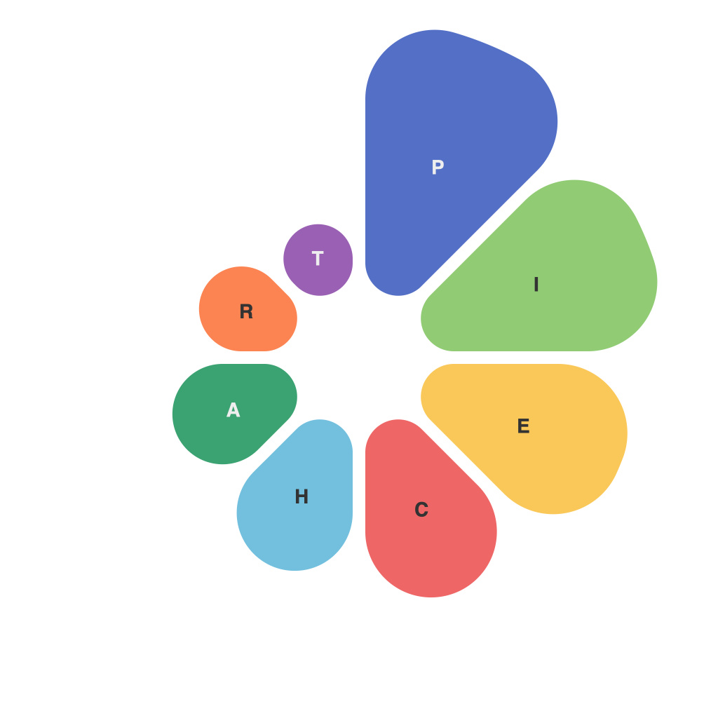
PiechartMaster’s Comprehensive Guide to Unlocking the Power of Piecharts
Piecharts, those round data snapshots, are more than just slices of a pizza under a chart title. They carry the potential to deliver information in a digestible, visually engaging way, enabling audience understanding and retention of data more effectively than text-based data representation. In this article, I, your guide, PieChartMaster, will unlock the full extent of this potential, exploring how pie charts enhance data visualization and detailing essential steps to ensure that they do so effectively, accurately, and impactful.
### 1. Understanding the Basics
Pie charts display data as a percentage of the whole, with each slice representing a category of data. This visual format allows viewers to quickly grasp proportions at a glance, making it ideal for showing the composition of a whole. Understanding these basics helps in making informed decisions about when to employ pie charts over other types of charts.
### 2. Choosing the Right Use Case
Pie charts are most effective when used with up to seven categories because more than that might clutter the chart and decrease readability. Choose pie charts when you need to show how different parts relate to the whole, especially when those parts represent large categories versus smaller ones which tend to be overshadowed.
### 3. Designing for Impact
– **Simplicity**: Keep the design clean and uncluttered. Avoid unnecessary elements like sparklines or borders around each slice. Use one color per slice (except for labels) to maintain a simple, neat appearance.
– **Labeling**: Ensure that every slice has an explicit label. Include percentage values to avoid any ambiguity. When space is limited, using percentage values for every slice helps in making the chart more complete and understandable.
### 4. Enhancing Readability with Color
Colors in a pie chart are more than just aesthetic; they can be strategic. Choose a color scheme that aids in distinguishing the slices easily, and possibly associates colors with other visual elements like the chart title, legend, or background for cohesive effect.
### 5. Avoiding the Misleading ‘Donut’ Effect
Pie charts can be visually deceptive when the size of slices alone is used to compare categories, without percentages or labels. The ‘donut’ shape effect, where some slices are disproportionately larger than others due to their position, can mislead the viewer. Using percentages alongside visual elements can minimize this effect.
### 6. Incorporating Interactive Pie Charts
In digital platforms, interactive pie charts can be incredibly powerful. They allow users to click on individual slices to see more detailed information, making the data not just visual but interactive and dynamic. This can be particularly useful in reports or presentations where data insights need to be explored in-depth.
### 7. Ethical Considerations
Always be mindful of the ethical implications of your data representation. Avoid distorting the data for persuasive bias, and ensure that the pie chart tells a truthful story of the data, with all necessary contexts provided.
### Conclusion
Piecharts offer a concise way to visualize proportions, serving as essential tools in various aspects of data storytelling. By focusing on the right application, design, and ethical considerations, you can effectively unlock their potential to empower insights, enhance viewer engagement, and make data analysis both comprehensible and enjoyable. Remember, though piecharts are a valuable data visualization tool, they are not a one-size-fits-all solution. They should be judiciously chosen based on the data being presented and the insights sought.

