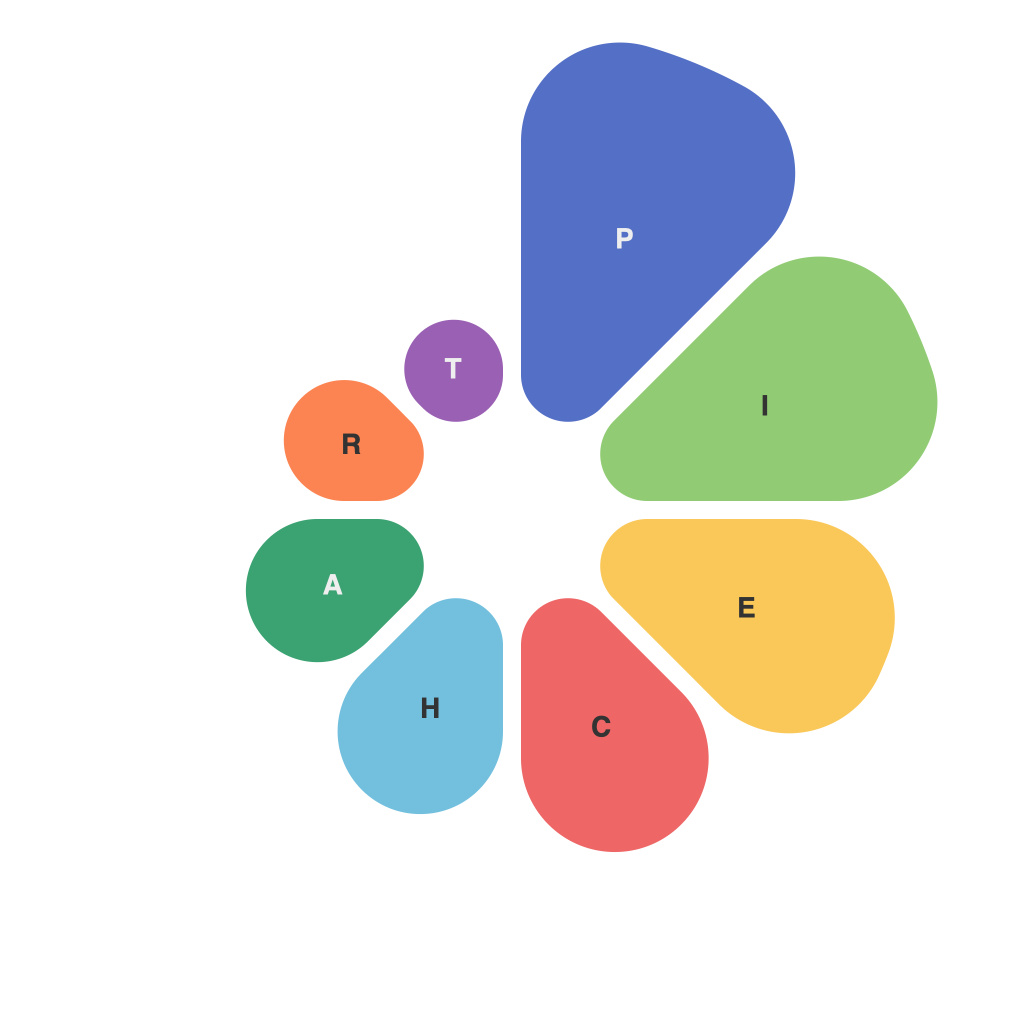
Unlocking the Power of Effective Data Visualization: A Comprehensive Guide to Mastering Pie Charts
In the endless sea of data, pie charts stand out as iconic symbols for showcasing distribution and proportions in a visually engaging manner. Serving as a gateway to comprehend complex data sets in a simplified, digestible format, skilled usage of pie charts can amplify your message, bringing clarity and insight to your audience. This comprehensive guide navigates you through the essential aspects of pie charts, including their purpose, how to construct them effectively, best practices, and common pitfalls to avoid, so you can harness their power to transform data into compelling narratives.
### Understanding Pie Charts
**Purpose**: Pie charts are primarily used to represent parts of a whole or the proportion of subcategories within a larger category. They are best suited for displaying data that has a small to moderate number of categories (typically less than 8) to ensure that the segments are readable and comprehensible.
### Constructing Effective Pie Charts
**1. Selection of Categories**: Choose categories that are mutually exclusive and collectively exhaustive. Each category should add up to 100%, and there should be a clear difference in proportions that can be visually distinguished.
**2. Labeling Clarity**: Ensure that each segment is labeled with its corresponding category name or percentage. Avoid overcrowding by providing concise labels. Use tool-tips for more detailed information, which can be revealed by hovering over each segment.
**3. Visual Consistency and Aesthetics**: Maintain consistency in the use of colors, fonts, and overall design to enhance readability and maintain professional appearance. Use high contrast colors to easily distinguish between segments.
### Best Practices
**Maintain Sliceness**: Smaller segments should not be too small relative to the size of the pie to ensure they can be read correctly. Guidelines suggest adjusting text sizes based on segment sizes to prevent overlapping labels.
**Focus on Meaningful Differences**: Highlight significant contrasts between categories by using a strategic color palette and placing the largest segments closer to the center. This visual emphasis draws attention to key comparisons and trends.
**Use Tooltips or Legends**: If space constraints prevent fitting labels on the chart, utilize tooltips on hover or a legend to provide necessary category details.
### Common Pitfalls to Avoid
**Overloading Charts**: Do not fill a pie chart with too many categories or too large a set of subcategories, as it can lead to visual clutter and make the chart difficult to read.
**Misuse of Color**: Avoid using overly bright or clashing colors which can distract from the data being presented. Opt for qualitative color schemes that enhance rather than detract from the chart’s readability.
**Lack of Context**: Always provide context for the pie chart. Include a title that succinctly describes what the chart represents and explain its relevance within your presentation.
### Applications
Pie charts are widely used across various fields for a variety of applications, from business analysis to academic research. They are particularly effective for displaying market share, budget allocation, demographic breakdowns, and simple comparisons of proportions. Their versatility makes them indispensable for both business professionals and educators.
### Conclusion
Pie charts, with their simple yet powerful visual representation, serve as an essential tool in the arsenal of data visualization. By following the principles espoused in this guide, you can create effective pie charts that not only capture attention but also convey insights with clarity and precision. Whether you’re analyzing trends, explaining results, or communicating simple comparisons, mastering the art of pie charts can transform raw data into meaningful, impactful narratives.

