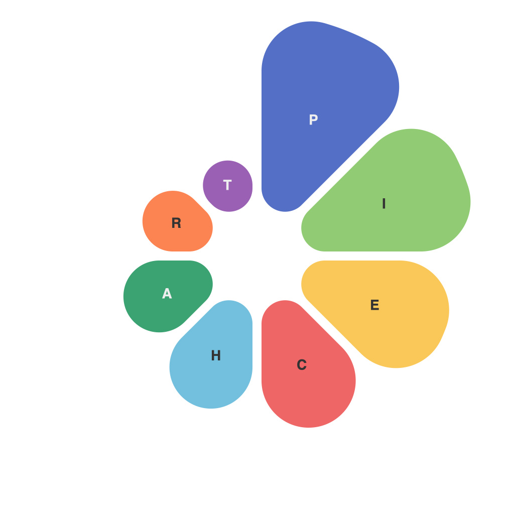
Unlocking the Power of Data Visualization: Mastering the Art of Pie Charts
In the realm of data interpretation and presentation, visualization techniques play a pivotal role in transforming complex and cumbersome data into easily digestible insights. Among the various types of charts available in this spectrum of visualization methods, the pie chart has stood the test of time as a fundamental tool for conveying proportions and distribution. Mastering the nuances of pie charts is not just about creating visually appealing graphics, but understanding how to effectively disseminate critical information and effectively communicate insights to a diverse audience.
Pie charts excel at depicting data in which comparisons are best made via proportions of the whole. This makes them ideal for displaying the composition of a data set, especially when the data set is about categories that represent a single, collective entity. For instance, pie charts are commonly used to show the distribution of market shares among different companies, breakdown of a budget, or demographics across various groups. Their strength is particularly evident when there are a moderate number of categories, typically ranging from three to seven, to avoid visual clutter and maintain clarity.
Crafting an effective pie chart involves several strategic considerations to ensure that the data narrative is both compelling and accurate.
1. **Simplicity for Clarity**:
A primary design principle in pie charts is to maintain simplicity. Excessive categories or too many slices can overwhelm the viewer and diminish the chart’s effectiveness. Aim for a maximum of seven categories for which each slice should be easily discernible. Categories with similar proportions should be grouped together to maintain visual cohesion and make comparisons straightforward.
2. **Sorting for Easier Comparison**:
Sorting chart slices by size (e.g., from the largest to the smallest) can greatly enhance the readability and interpretability of the chart. This order allows the viewer to quickly identify key trends and major contributors without straining their eyes to compare small slices.
3. **Color Coding and Consistency**:
Colors play a significant role in drawing attention and aiding visual differentiation. Utilize distinct, yet consistently perceptible colors for each slice. Ensure that the color scheme is both intuitive (e.g., green for growth, red for decrease) and visually engaging to keep the audience interested and focused on the data rather than the design. Palettes that are accessible to colorblind individuals are recommended to promote inclusivity.
4. **Labeling with Precision and Clarity**:
Directly labeling each slice provides immediate information, enhancing understanding and reducing the need for hovering or a separate legend. Ensure labels are concise and describe quantitative values, percentages, or both, depending on space availability and audience familiarity with the data. When space is limited or labels become too numerous, categorization labels can be used alongside a simple legend.
5. **Appropriate Usage Context**:
Not every data scenario suits a pie chart. They are less suitable when the focus is on exact values rather than proportions or when datasets contain too many categories or small differences in proportions, which can lead to difficulties in accurate visual comparison. Consider alternatives like stacked bar charts, line diagrams, or dot plots in such cases to better convey the intended message.
6. **Interactive Enhancements**:
In digital media, interactive pie charts offer additional layers of insights by allowing users to hover or click on slices to reveal more detailed statistics or additional information. This interactivity can be crucial in providing deeper understanding and engagement, especially with complex data sets.
In conclusion, the power of pie charts lies in their ability to simplify complex data into easily digestible proportions, making them an indispensable tool in the arsenal of data visualization. By carefully crafting pie charts with these strategic considerations in mind, data analysts and illustrators can effectively communicate insights, facilitate quicker decision-making, and enhance the overall impact of their presentations. Remember, the goal is not only to create visually appealing graphics but to create data narratives that are both accurate and engaging, ultimately leading to a better understanding and informed action by the audience.

