Unlocking Visual Insights: Mastering the Art of Pie Charts
Pie charts, one of the oldest forms of data visualization, have been a cornerstone in the vast universe of statistics and analysis. With roots that extend back to 18th-century England, they offer a visually intuitive method to comprehend portions of a larger whole. While it’s in our nature to gravitate toward complex graphs that claim to simplify overwhelming data, the allure of pie charts as a fundamental tool sometimes gets overlooked. In this guide, we unravel the mysterious beauty of pie charts, offering tips, tricks, and practical steps to master the art of using pie charts effectively.
### Understanding Pie Charts: The Why and How
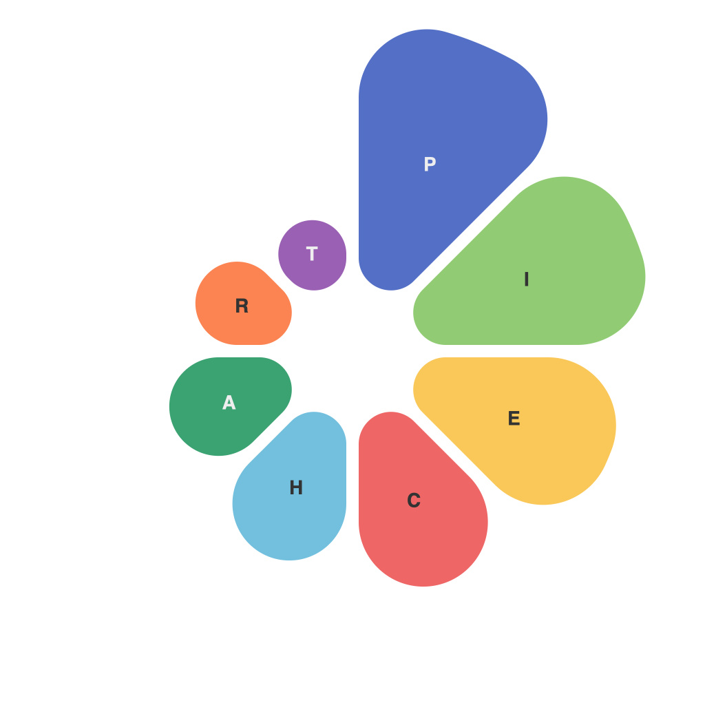
Pie charts are graphical representations where a circle is divided into sectors or slices, each representing a proportion of the whole. Their utility lies in their ability to quickly communicate how different parts make up the whole, making them a favorite in areas such as market analysis, budget allocation, and demographic studies. The simplicity of the design ensures that audiences can grasp the information without requiring a specialized knowledge base.
### The Essential Elements
##### – **Slices**: Each slice represents a category or a percentage of the total. Labeling each category with clear, readable text is essential for comprehension.
##### – **Colors and Patterns**: While color can enhance readability by distinguishing between categories, too many colors can clutter the chart, making data understanding challenging. Consider using patterns or gradients for differentiation.
##### – **Labels vs. Legends**: Balancing between using direct labels on the chart versus a legend is a crucial decision. Direct labels are more practical for small pies, whereas legends can alleviate clutter in complex examples.
##### – **Ordering**: Typically, categories are ordered from the largest to the smallest slice, but experimenting with this order can highlight insights based on the specific data. Alternatives like alphabetical or thematic orders can sometimes reveal more meaningful comparisons.
### Common Pitfalls to Avoid
1. **Overloading Pie Charts**: Remember, pie charts are for showing parts of a whole and should not be overly complicated. Including too many slices or categories can make the chart difficult to interpret.
2. **Color Blindness Considerations**: Be mindful of those with color blindness and consider using patterns or color combinations that can help distinguish slices.
3. **3D Effects**: 3D and exploded pie charts have lost their appeal in most professional settings due to aesthetic choices and practical considerations that they do not enhance data interpretation.
4. **Lack of Context**: Providing a brief explanation or key outside the chart can drastically improve understanding, especially when dealing with complex data relationships.
### Tips for Effective Presentation
1. **Use Simple, Clear Scales**: For readability and precision, especially when comparing percentages or small differences between slices.
2. **Consistent Categories Order**: Depending on your audience’s needs, ordering categories in descending size can make comparisons easier, while alphabetical order can be better for categorical or thematic comparisons.
3. **Highlight Key Data Points**: Use color, annotations, or a prominent slice to direct attention to significant data points or trends within your chart.
### Conclusion: The Power of Insight
Pie charts are a testament to the blend of simplicity and power in data visualization. While they require careful consideration in their design and presentation, their strength lies in their ability to quickly communicate proportions and trends. By mastering the art of pie charts, you unlock the potential to effectively communicate complex data in a way that is accessible and engaging to your audience, making critical insights emerge in a blink. Whether you’re presenting quarterly sales figures or analyzing demographic trends, pie charts stand as a testament to the art of visual story telling in data analysis.

