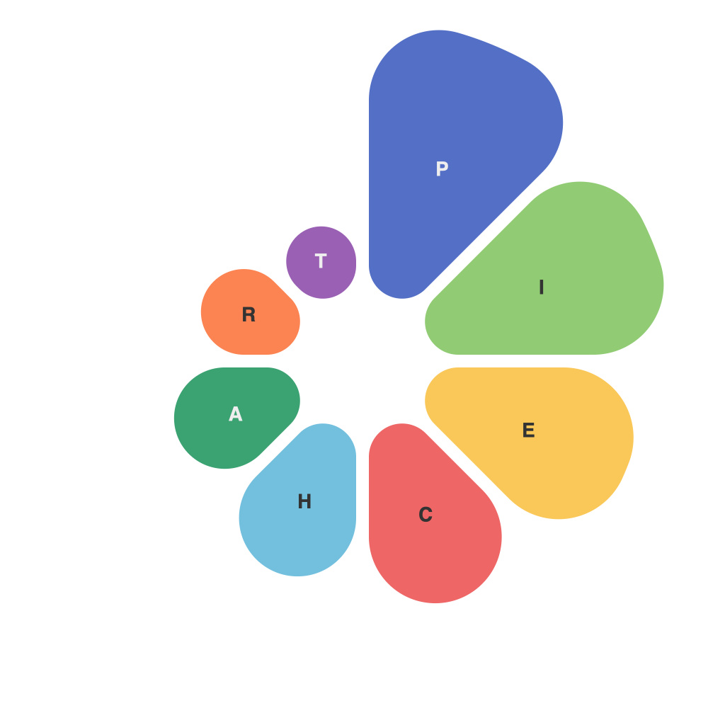
With the escalating volume of data at our fingertips, mastering the art of visualizing information has become an indispensable skill. One of the most popular and versatile tools in the data visualization toolkit is the pie chart. Crafting a clear, precise, and visually compelling pie chart is a task that requires both a deep understanding of the data and an eye for design. Below, we unveil essential tips that will transform you into a pie chart maestro, ensuring your data visualization stands out in the crowded sea of information.
### 1. KISS: Keep it Simple, Stupid
pie charts should be straightforward and easy to understand. Overcomplicating them with too many data slices disrupts the viewer’s comprehension. Adhere to the KISS principle by limiting the number of slices to 5-7, as too many can cause visual clutter and diminish the intended message.
### 2. Choose the Right Format
Pie charts come in various formats. Traditional pie charts are great for showing percentages alongside whole numbers, but they can sometimes be misleading. A donut chart solves that by leaving a ring around the middle and keeping the overall visual cues intact. For extremely complex data sets, consider splitting the pie chart into segments or using additional layers to provide a clearer picture.
### 3. Label wisely
Labeling your pie chart correctly is a critical step. Ensure that each slice is labeled adequately to make the data easily identifiable. Also, use labels that are consistent with the rest of your project’s style guide to maintain coherence and professionalism.
### 4. Highlight Key Data
Use contrasting color palette to bring attention to the most salient data slices. The eye is naturally drawn to differences in color, so choose hues that stand out against the rest. Highlighting key data helps the viewer grasp the message promptly.
### 5. Be Mindful of the Color Wheel
Color is a powerful tool in pie chart design. Utilize the color wheel to select complementary colors that contrast when placed next to each other. However, avoid overly bright colors, as they can be distracting and may not translate well on various platforms.
### 6. Consider Proportional Sizing
Ensure that the size of each slice is proportional to its share of the total. This can easily be done by setting relative sizes so that the largest slice takes up at least 25-30% of your pie chart and is visually distinct from the smaller slices.
### 7. Include a Legend
If you have more than three colors or if the shades are very similar, include a legend to assist viewers in associating the different slices with respective categories they represent.
### 8. Offer Interactivity
With modern tools, interactive pie charts are becoming increasingly feasible. Allow users to hover over slices for more detailed information, or perhaps provide a separate panel that displays additional data. This feature can make your pie chart more engaging and informative.
### 9. Use High-Quality Graphics
A pixelated or low-resolution pie chart can detract from the professionalism of your work. Use high-quality graphics and ensure the image scales properly if it will be used in different resolutions or on various devices.
### 10. Test and Refine
After you’ve created your pie chart, test how well it communicates its information. Make sure to get feedback from peers or potential viewers. Look out for any areas that may cause confusion or any components that could potentially be removed for clarity. Continuously refine until the pie chart effectively communicates your data story.
To summarize, pie charts are a valuable tool for sharing complex data in a digestible format. By keeping them simple, colorfully designed, and representative of the data, you can unlock the full potential of this visualization technique. By embracing these strategies and adapting to the nuances of your particular dataset, you’ll be well on your way to pie chart mastery – leaving your audiences with information that is not only understood but also appreciated.

