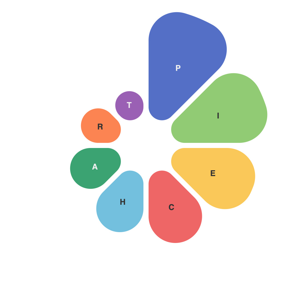
Transforming Data into Insight: The Mastery of Piecharts – A Comprehensive Guide by PieChartMaster
Pie charts, widely employed graphical representations with a circle segmented into distinct parts, have long been a staple of both qualitative and quantitative data visualization. However, their true potential often lies in the transformation of raw data into insights that inform, educate, or persuade. This guide serves as a comprehensive roadmap for anyone looking to harness the power of pie charts, from beginners to seasoned professionals, through understanding their effective design, execution, and application.
Understanding Piecharts: The Foundation
To master piecharts, one must first understand their core characteristics and limitations. A piechart is defined by a circle evenly divided into sectors, each representing a portion of the whole. This graphical representation is particularly useful for illustrating proportions and distributions. However, human perception is biased, with research showing that piecharts can distort the judgment of relative sizes due to the nature of human visual processing, especially when comparing values close to each other.
Visualization: Designing for Insight
Effective piecharts begin with thoughtful design considerations to ensure they communicate as intended. Key factors include:
1. **Simplicity**: Start with a simplified design, focusing on clarity and readability. Too many slices or labels can overload the viewer with information, leading to confusion.
2. **Accessibility**: Ensure that the piechart is accessible to everyone, particularly those with color blindness. Consider using labels, colors that are distinguishable to all viewers, or additional textual information to aid understanding.
3. **Consistent Usage**: Use piecharts consistently within a given presentation or report to maintain coherence and aid in the viewer’s ability to identify different pieces of information at a glance.
4. **Limit the Number of Slices**: Generally, stick to five or fewer slices, and avoid sorting them in a clockwise or counterclockwise order. This minimizes visual clutter and maximizes comprehension.
5. **Effective Labeling**: Label each slice clearly and succinctly. Avoid overcrowding the chart and use clear, legible fonts. For small slices that might be hard to interpret without labels, consider omitting them to focus on the larger contributions.
Analytics: The Insight Extraction
Once piecharts are designed for clarity and accessibility, they can be used to extract valuable insights from data:
1. **Comparison and Contrast**: Use color and contrast to highlight differences in proportions among the data segments, making comparisons easier to discern.
2. **Trend Analysis**: Observe shifts in proportions over time through a series of piecharts, allowing you to identify emerging trends or anomalies.
3. **User Segmentation**: In marketing and audience analytics, piecharts can help segment users into distinct categories based on their behavior or characteristics, allowing for personalized strategies.
4. **Resource Allocation**: Understand the distribution of resources across different sectors or departments within an organization for informed decision-making.
5. **Problem Identification**: Piecharts can visually identify underperforming or overperforming areas that require attention, indicating potential inefficiencies or areas for optimization.
In conclusion, mastering piecharts involves not only understanding their design principles but also their role in transforming raw data into actionable insights across a variety of fields. By employing best practices in design and interpretation, you are well-equipped to unlock the potential of piecharts as a potent tool in your data analysis arsenal, capable of enhancing both clarity and decision-making.
Endnote
For anyone hoping to deepen their skills in data visualization, mastering the art of piecharts is a critical step toward crafting insightful and impactful visuals that can significantly elevate the comprehension and persuasiveness of your work.

