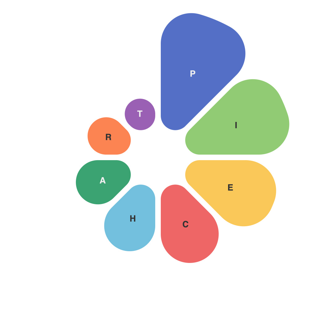
The Art and Science of Pie Charts: Visualizing Data with Clarity and Precision
In the current era of data-driven decision-making, effective communication of complex information in an easily digestible form is crucial. Among the various tools available for visualizing data, the pie chart stands as a classic and versatile option. Combining traditional artistic values with the rigor of scientific method, pie charts bridge the gap between dry numbers and actionable insights. This article explores the art and science behind creating pie charts that not only depict data accurately but also captivate and communicate effectively with the audience.
**The Art of Pie Charts: Composition and Aesthetic**
The art component of pie charts begins with the aesthetic choices that influence their design and appeal. When designing a pie chart, it is essential to consider the following artistic principles:
1. **Color Palette**: While using bright colors can enhance recognition, the palette should be consistent with the brand or the context, aiming for legibility and clarity.
2. **Contrast**: Contrasting colors between slices make it easier for the eye to identify different segments. However, too many contrasting colors can lead to visual clutter.
3. **Alignment and Grids**: Proper alignment and the use of grids ensure that slices are placed symmetrically, increasing the chart’s appeal and perceived professionalism.
4. **Whitespace**: Adequate whitespace around the pie chart can help to draw focus and improve readability, especially in reports or presentations where visual overload is a concern.
**The Science of Pie Charts: Accuracy and Data Integrity**
While art may win the initial nod, it is the science of pie charts that ensures their reliability as a data representation tool. The following scientific principles must be considered:
1. **Segment Integrity**: Each slice within a pie chart represents a different segment of the whole. It is critical to calculate the portion size accurately to maintain the integrity of the data.
2. **Scale Consistency**: Slices of various sizes should reflect their relative proportions accurately. Distorting the sizes will mislead the viewer.
3. **Standard Pie or Multiple Slices**: While a standard pie chart is usually the preferred format, multiple pie charts may be more appropriate when dealing with more complex datasets to avoid overburdening viewers.
4. **Label Placement**: Labels should be easily readable. Incorrectly placed or overlapping labels can obscure data or lead to misinterpretation.
**Designing Pie Charts: Techniques for Effective Communication**
Pie charts, like all visualizations, must effectively communicate their message. Here are several design techniques to ensure this:
1. **Labeling and Legends**: Clear labels and a well-defined legend help the viewers quickly understand the chart’s content and navigate complex datasets.
2. **Highlighting Trends**: Emphasize important slices—perhaps through bold colors or labels—directing attention to what matters most.
3. **Error Bars**: When appropriate, including error bars on the data points can provide a clearer picture of the reliability of the data.
4. **Avoiding Misinformation**: Ensure that the pie chart doesn’t misrepresent the data, such as by altering the radius or slice shape to skew the perception of proportions.
**Pie Charts in Practice: Success Stories and Case Studies**
Successful pie charts can enhance reports and presentations. For example, in political polling, pie charts are effective in illustrating voting patterns. In business, they demonstrate market share. One such case is a global software firm that used a series of pie charts to track the growth of different product lines, leading to better strategic allocation of resources.
In conclusion, the art and science of pie charts intersect at the balance between accuracy, clarity, and aesthetic appeal. Crafted with precise data and artistic flair, pie charts can unlock the potential of data stories, converting complex numbers into visually compelling narratives, and助力决策者更深入地了解数据背后的真相。

