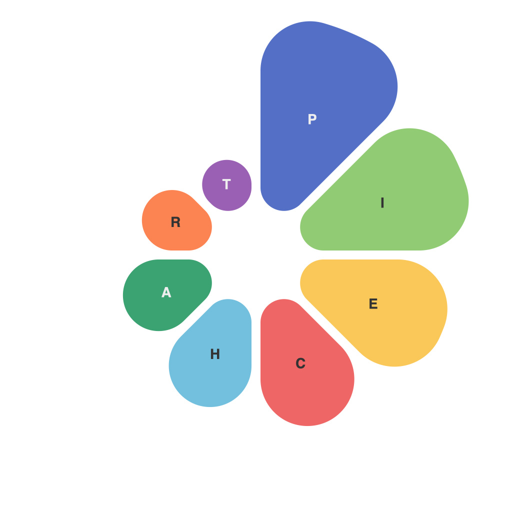
**Mastering the Pie Chart: 10 Timeless Techniques PieChartMaster Unveils**
Pie charts have become a staple in data visualization, showcasing segments that represent a whole in a visually engaging manner. However, creating an effective pie chart is more than just piecing together components—it involves a blend of design principles, understanding of data, and attention to detail. PieChartMaster, a leading authority on data visualization, has compiled 10 timeless techniques to help you master the use of pie charts. Here, we delve into these strategies to transform your pie charts from mere diagrams to powerful storytelling tools.
### 1. Start with a Clear Objective
Before you begin illustrating your data, consider what your pie chart aims to achieve. Are you trying to show proportions, highlight a significant segment, or compare different segments to the whole? A clear objective will guide your design choices.
### 2. Simplify Your Pie
Too many wedges can make a pie chart overwhelming and difficult to interpret. Keep the number of segments to a minimum. If you have several categories, consider using multiple pie charts or a different chart type, like a donut chart, to better represent the data.
### 3. Prioritize Large Segments
Position the largest segments adjacent to each other for easy comparison and emphasize them in color to grab the viewer’s attention. Visual cues like this help communicate the most crucial insights more effectively.
### 4. Use Consistent Color Coding
Apply a recognizable and consistent color scheme across your entire data set. This will not only enhance the visual appeal but also ensure that viewers can quickly recognize each segment.
### 5. Label Your Data Wisely
Always label your pie chart segments with both percentages and numbers. This double data labeling technique allows viewers to process the information at different levels; while percentages provide a relative comparison, numbers offer a precise value.
### 6. Think Outside the Round
Consider breaking the circle and using a “wedges on a line” or a “sunburst” layout to draw attention to a particular segment or to visualize hierarchical relationships between categories.
### 7. Minimize the Size of the Center Hole
If you’re using a donut chart to show percentages without overwhelming the viewer, only remove the center to a minimal extent. A large empty center can distract from the data and skew the visual interpretation.
### 8. Include a Legend
While well-designed pie charts often don’t need a legend due to their clear visual segregation of segments, when using a color scheme that might be confusing to some viewers, a legend becomes invaluable.
### 9. Be Mindful of the Audience
Tailor the presentation of your pie chart to your audience and platform. For instance, a pie chart displayed on a large screen can afford more detailed design, whereas a chart in an email or presentation should maintain clarity.
### 10. Review and Validate
After crafting your pie chart, take a step back. Examine it for clarity and simplicity. Are the wedges evenly sized? Is the text clear? Validate the chart with stakeholders to ensure it accurately represents the data and meets its intended purpose.
Pie charts, when properly executed, serve as powerful data conveyors. At PieChartMaster, we believe these timeless techniques will elevate your pie charts from mere visual illustrations to compelling storytelling tools that effectively communicate your data’s insights. By embracing these strategies, you’ll not only enhance the readability of your charts but also provide your audience with a memorable and informative visual experience.

