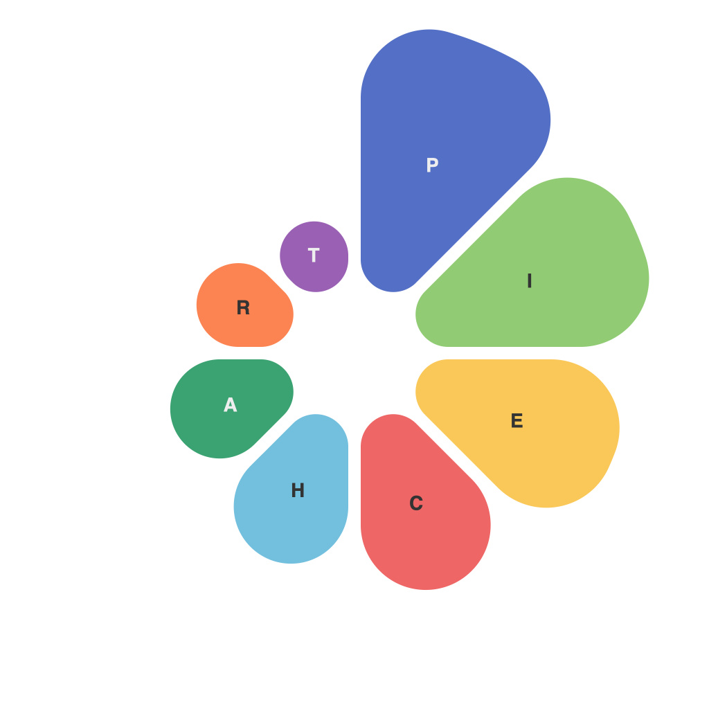
Pie charts are a staple in the world of data visualization, offering a straightforward way to present percentage-based information. Their circular design elegantly divides a whole into segments, each representing a proportionate part. Yet, despite their ease of understanding, pie charts can be the source of both wonder and frustration. Today, we delve into the art and science of pie charts, exploring how to perfect them for your data insights.
**A Snapshot of Simplicity**
Imagine you are a data professional tasked with communicating complex data points to a broad audience. Pie charts have been your go-to for years; they are simple, easy to understand at a glance, and can hold the interest of a crowd. However, not every pie chart is destined for visual greatness. It takes mastery to create an effective pie chart, one that not only tells a story but also captivates.
**The Perfect Pie: Dimensions for Data Representation**
1. **The Circle of Choice**
A classic pie chart should be round, not square, to maintain its integrity as an accurate slice of your data. The circular nature ensures that the chart visually divides into equal slices, each representing an equal angle.
2. **Choose Your Colors Wisely**
The right color palette can make your pie chart pop without confusion. Use hues with sufficient contrast and ensure that each slice is distinguishable. There’s no one-size-fits-all color scheme, but it’s crucial to remain consistent and professional.
3. **Slice Size and Proportions**
Remember that larger slices should look larger! People interpret the size of pie chart slices relatively, not absolutely. If the largest slice is too small to grasp, viewers may overlook an important piece of the data.
4. **Limit the Number of Slice**
With too many slices, a pie chart can quickly become cluttered and overwhelming. Aim for five or fewer, ideally three, to keep the chart readable.
5. **Label Your Slices**
Names should be clear and concise. Use a label along the edge of the pie segment so viewers can read it even when the pie chart is not viewed front-on.
**The Art of Pie: Tackling the Technical Challenges**
1. **Adjusting Angle**
Make use of pie chart angle options. When there are too many slices, angles can be adjusted to ensure maximum clarity. Sometimes, even rotating some slices can help improve readability.
2. **Legends and Context**
Include a legend with the slice labels when it’s needed. If slicing a category down even farther is necessary, you can have a second legend. Also, provide context with a title and, if space allows, a brief description or explanation.
3. **3D vs. 2D**
While 3D pie charts may look cool and can increase perceived depth (at the expense of accuracy), flat, 2D pie charts are generally more effective. Stick to 2D unless there’s a compelling design reason to go 3D.
4. **Sorting Slices by Size**
Arrange the slices in descending order of size, so the largest categories are not buried at the bottom, where they might be overlooked.
**The Power of Pie: Analyzing Data Trends**
Mastering pie charts isn’t just about making them pretty—it’s about enhancing data communication. They can highlight trends, demonstrate the importance of certain categories, and reveal patterns that would be difficult to discern with other chart types.
**Pie Chart Pro Tips**
– Emphasize only the most important data points or trends in your pie chart.
– Consider creating a pie chart with different slices on two or more rings to compare multiple datasets.
– Use a pie chart only for data that has multiple categories or when showing parts of a whole.
– Stay away from pie charts with center holes unless you have a specific design or illustration rationale.
Pie chart mastery is an art that requires attention to detail, an understanding of human perception, and a creative eye for design. When executed correctly, these charts can be compelling, informative, and even fun to look at. After all, the goal of effective data visualization is not just to share data, but to make it understood, remembered, and actionable.

