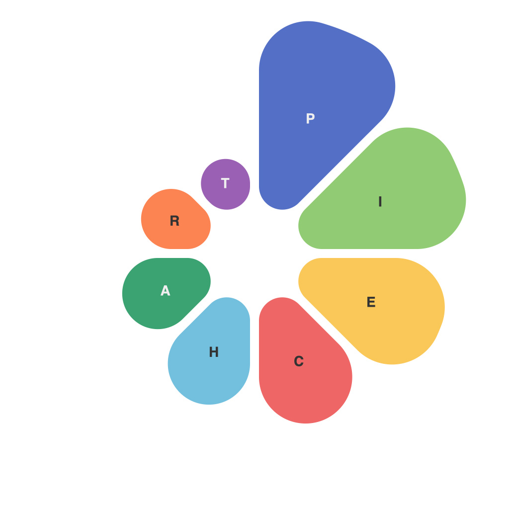
Pie charts are a fundamental visual tool that are integral to simplifying complex data into an easily digestible format. They allow us to quickly assess parts of a whole and can be particularly useful in situations where comparisons are needed. However, to truly decode data with pie charts and use them effectively in visual communication, certain strategies must be employed. This article delves into the nuances of creating effective pie charts and offers strategies to enhance their communicative power.
The Concept of Pie Charts
Pie charts are circular graphs that represent data in a fractional or percentage format. Each segment of the pie represents a part of the whole, with the size of each segment proportional to its value. This visual representation makes pie charts an excellent choice for illustrating the proportion of different parts to the whole, especially when the numbers are not too large or do not require precise comparisons.
Selecting the Right Data
The foundation of an effective pie chart is the data you choose to visualize. Before jumping into the design, evaluate the dataset and determine if it’s even suitable for pie chart representation. Pie charts excel when you want to show the comparative significance of various elements, but they fall short when data ranges widely or there are too many categories to display clearly. Avoid pie charts for long lists or extremely large datasets.
Optimal Number of Categories
When choosing the data for a pie chart, remember that too many categories can quickly clutter the chart and make it difficult to interpret. It’s generally recommended that pie charts have between 3–5 categories, but if more are necessary, careful design choices may be required.
Aesthetic Arragement
For a more readable and effective pie chart, it’s essential to arrange the categories meaningfully. For instance, consider sorting categories in descending order of size and separating major categories across the chart to prevent cognitive overload.
Color and Labeling
Using color effectively can greatly enhance the readability and memorability of pie charts. Colors should stand out against the background without using an excessive number of hues to avoid confusion. It’s also important to use a consistent color scheme throughout the chart and across related visualizations to maintain a logical flow of information.
When labeling pie chart sections, use concise text so that it doesn’t clutter the chart. Placing a label directly on each segment is ideal, but when segments overlap, you may need to resort to a legend or a label outside the segments. Always ensure that text is legible and labels correspond with the accurate data values.
Using Percentages
Pie charts are most effective when readers understand that the size of each slice represents a proportion of the whole. Always include percentage values next to or in the center of each segment to reinforce this concept. Make sure that these values are easy to read and place prominently.
Comparative Visualization
If the primary purpose of the pie chart is to compare two or more categories, you can either create multiple pie charts or design the same pie chart in a way that highlights the comparison. For the latter, a technique commonly used is to have a single pie chart but draw emphasis by using contrasting colors or highlighting the sections of interest.
Highlighting Trends and Patterns
Beyond comparisons, pie charts can help identify trends and patterns. For instance, if one category grows significantly larger over time, you can visually show this progression by using line charts or another appropriate visualization alongside or within the pie chart to provide a more comprehensive view.
Interactive vs. Static Pie Charts
Interactive pie charts can enhance the user experience by allowing individuals to select or deselect sections to reveal more detailed information. However, static pie charts are more widely accessible in printed materials or when interactivity is not possible. Decide whether interactivity will aid communication based on your audience and the context in which the data will be presented.
Conclusion
Pie charts are versatile tools in the world of data visualization, but their effectiveness hinges on careful crafting. By adhering to these strategies, you can ensure that your pie charts are not just visually appealing, but also highly informative. Remember to start with the right data, pick an optimal number of categories, use colors and labels effectively, display percentages for easy understanding, focus on comparisons and highlighting trends, and choose between static or interactive depending on your audience. With these principles in mind, your pie charts are poised to decode data and communicate insights with clarity and impact.

