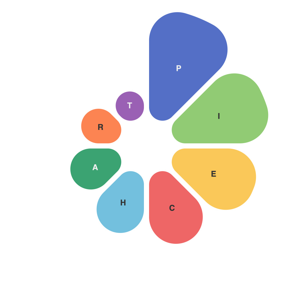
In the realm of data visualization, the art of effectively communicate complex information often hinges on simplicity and clarity. Among the myriad of chart types, pie charts have emerged as a staple, known for their ability to convey proportions and parts of a whole. However, crafting a pie chart that not only presents data accurately but also leaves a memorable impression is an art form in itself.
The Power of Pie Charts
Pie charts are beloved for being intuitive and easy to understand. They provide a visual snapshot of the relative sizes of different data sets by dividing a circle into segments. This division allows the audience to immediately grasp the distribution of categories within the whole. They are especially effective when compared to other chart types in terms of highlighting dominant categories, trends over time, or comparing various data series.
Crafting a Memorable Pie Chart
To evoke awe and appreciation for pie charts, it’s important to take the following best practices into consideration:
1. **Select the Right Data**: Choosing data that is easily divided into distinct categories makes it simple for the audience to follow the segments of the pie. Focus on data sets that lend themselves naturally to pie charts rather than forcing the visual to work for information that may not align well with its strengths.
2. **Limit the Number of Categories**: As the number of segments on a pie chart increases, the viewer’s ability to accurately perceive the relative sizes of these segments decreases. To ensure clarity, keep the number of categories under 5 or 6.
3. **Use a Consistent Color Palette**: Choosing colors that complement each other helps make the chart easily readable. Color psychology should play a role in determining suitable hues that can also signify categories or convey emotions.
4. **Implement a Gradient or Texture**: For more distinction between the segments, consider adding a gradient or texture to each slice. These small design elements can make the pie chart stand out and ensure that each piece feels unique.
5. **Highlight Key Data**: Distinguishing the largest or most significant data segment can make the pie chart more dynamic. This can be achieved through an outline, bold color, or a different texture to draw the eye to this pivotal piece of information.
6. **Label Your Data**: Use legible and clear font styles that do not conflict with the color of the slices. It’s best to place labels directly on the slices next to the segment where the data value is most visible.
7. **Use Data Labels**: Include data labels on the chart to provide context to the viewer. They not only aid in quick visual recognition but also help viewers make exact comparisons between segments.
8. **Keep it Symmetrical**: To make the pie chart more effective, aim for symmetry in both the data and its presentation. This symmetry helps to avoid misleading interpretations and ensures that the chart is balanced and visually pleasing.
9. **Add a Legend**: If colors have a specific meaning, such as representing different subcategories within a segment, include a legend to make this hierarchy clear.
10. **Be Mindful of Design Aesthetics**: Finally, the layout and overall design of the pie chart are critical. Aesthetics shouldn’t overshadow the information, but a well-designed pie chart can certainly enhance its impact.
Pie charts are a fundamental tool in the visualization toolbox. When well-crafted, they can captivate an audience and present complex information in a digestible and appealing format. With careful consideration of design elements and the nuanced use of data, pie charts can transcend their functional purpose to become artful representations of information, leaving a lasting impression on all who experience them.

