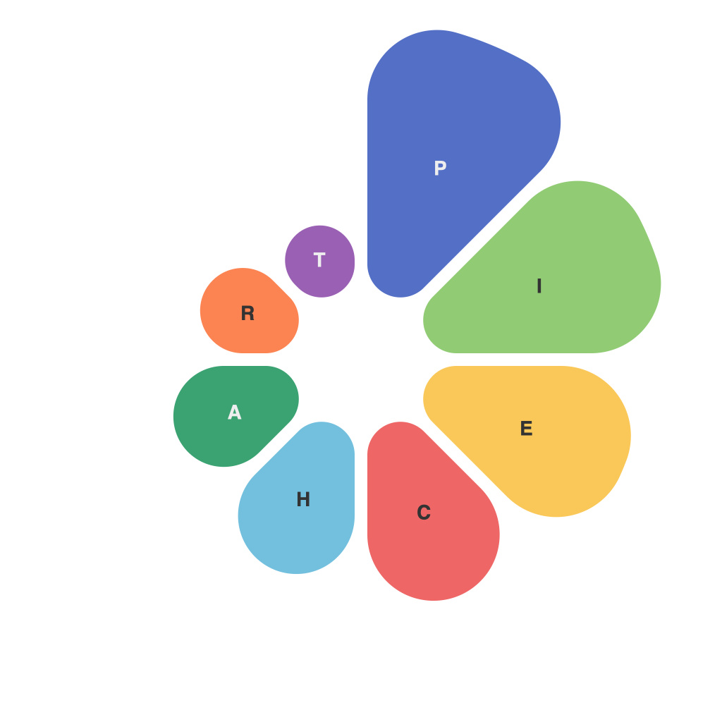
In an era where data drives decision-making, understanding and interpreting data has become paramount. One of the most widely used data visualization tools at our disposal is the pie chart. But what lies beyond the familiar sliced circle? This article delves into the art and science of using pie charts effectively, offering insights, tips, and best practices to make the most of this often misunderstood visual aid.
**The Art of PieChartMaster**
Designing a pie chart that is both informative and aesthetically pleasing is an art form. The key to mastering it lies in understanding the basics:
1. **Clarity in Representation**: A well-crafted pie chart communicates information clearly, enabling the viewer to grasp the chart’s message at a glance.
2. **Color Palette**: Choose colors thoughtfully, bearing in mind the color Blindness Awareness palette to ensure accessibility. Different hues should contrast sufficiently so that they stand out from each other.
3. **Labeling**: Proper labeling of slices is critical. Use clear, legible fonts and place labels near their respective slices to avoid viewer confusion.
4. **Hue for Emphasis**: Consider using a contrasting hue for a slice that holds significant importance, drawing the viewer’s attention to it immediately.
**The Science of PieChartMaster**
Pie charts are scientifically sound when constructed using the following principles:
1. **Proportional Slices**: A slice of a pie chart should accurately reflect its proportion, with the largest slice corresponding to the largest segment of data.
2. **Limited Number of Slices**: To optimize readability, a rule of thumb is to keep pie charts to about seven slices, or even fewer for optimal comprehension.
3. **Order of Segments**: When segments are arranged in order, either from largest to smallest or vice versa, it helps viewers quickly interpret the data hierarchy.
4. **Segment Width**: Avoid making pie charts look crowded by ensuring there is enough space between segments. If necessary, consider using a donut chart for a less cramped presentation.
**Navigating Nuances**
Pie charts are not always the best choice for presenting data. Here are a few nuances to consider:
1. **Comparison of Multiple Series**: Comparing more than two segments in a pie chart can be overwhelming. Bar or line charts might be a more appropriate choice in such cases.
2. **Overuse**: Pie charts should be used sparingly. Overuse can lead to data fatigue and desensitize audiences to the visual representation of data.
3. **Circularity Myths**: It is a common misconception that the whole pie represents 100%. While this was traditionally true in statistics, it is not always necessary today, especially in more advanced data visualization tools.
**Embracing PieChartMaster for Success**
By embracing the art and science of pie charts through careful design and proper application, we can turn a seemingly simple visual tool into an invaluable asset in our data storytelling arsenal. Whether you are sharing insights with colleagues, clients, or the public, a well-crafted pie chart can effectively unlock the secrets of your data and foster a deeper understanding across audiences.
As a PieChartMaster, it’s important to remember that the goal is to aid in understanding, not to complicate or mislead. With the right approach, pie charts can be a powerful tool to convey the story your data wishes to tell.

