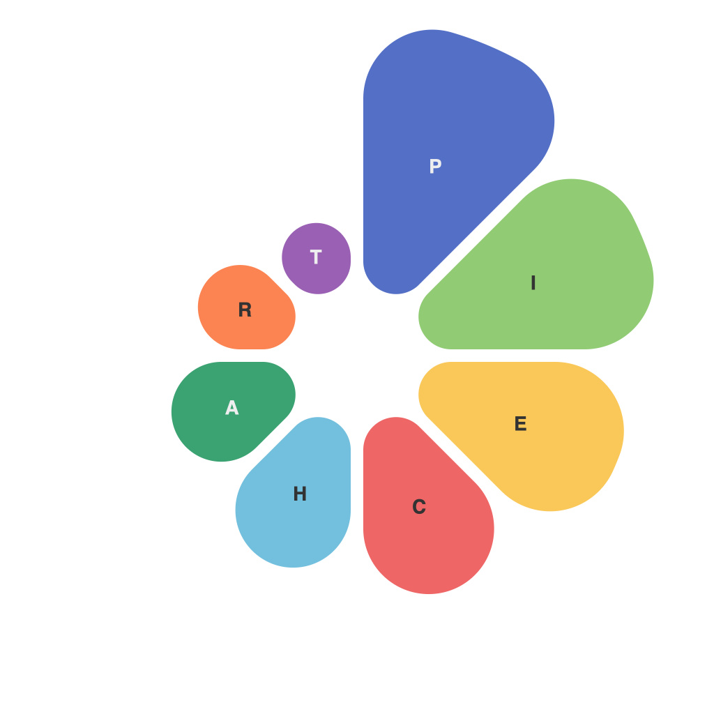
In today’s data-driven world, the ability to present information in a compelling and informative way is crucial. One essential tool in the communicator’s arsenal is the data visualization, particularly the pie chart. Pie charts are an intuitive way to express proportions and show the makeup of a group. However, crafting an effective pie chart requires more than just arranging slices of color; it demands a keen understanding of design principles and an appreciation of the audience. This article delves into the fundamental aspects of decoding data visualizations and mastering the art of creating the perfect pie chart design.
### Understanding the Purpose
Before delving into the intricacies of pie chart design, it is essential to understand its purpose. Pie charts are best suited for situations where you want to emphasize the parts of a whole, compare different segments, or illustrate the composition of categories in a dataset. When you plan to use a pie chart, ask yourself:
– Are the comparisons you aim to make clear enough to be understood?
– Does the pie chart aid in drawing the viewer’s attention to the most crucial detail?
### Selecting the Correct Data Type
The foundation of every pie chart is the selection of the data type. Because pie charts only work with percentage-based or absolute quantities that add up to 100% or a specific value, ensure that your data suits this format. If your data contains discrete items or multiple series with different totals, a bar or line chart would be more appropriate.
### Number of Slices: The Rule of 5
A common rule in data visualization is the “rule of five,” which suggests that any pie chart exceeding 5 slices should be avoided. With more than 5 slices, pie charts become difficult to interpret, leading to cognitive overload and the possibility of misinterpretation. If you need to depict a larger number of categories, consider a doughnut chart or a bar chart.
### Choosing the Right Colors
Color is one of the most potent elements in data visualization. It can enhance the message, guide the viewer’s eye, or even make a chart accessible to color-blind users. As you select colors for your pie chart:
– Use a contrasting color palette to differentiate between slices.
– Be mindful of color blindness and use color combinations that are easily distinguishable.
– Avoid using colors that are similar in brightness or saturation, as they may blend together.
### Labeling Wisely
Labels play a crucial role in pie charts by providing context and clarity. Here are some best practices for labeling:
– Position labels outside the chart, ideally above the corresponding slices, to maintain viewer orientation.
– Use concise labels, avoiding long sentences or complex data points.
– In cases of too many labels, consider using annotations or an external key.
### Consider Shape and Style
The shape of slices can give your pie chart a unique personality or even provide additional information. Circular pie charts are standard, but sometimes a donut chart with indented centers can help to highlight the center of a set of slices. Keep the following in mind:
– Be consistent with all charts you present for consistency across your data suite.
– When using a doughnut chart, make sure the space left in the center is relevant to your audience and does not dilute the pie chart’s focus.
### Size and Orientation
Size matters not just in the context of data representation but also in the design of your pizza chart. Ensure that the chart is:
– Visually prominent without overwhelming the viewer.
– Oriented in keeping with the common reading direction. In English, this is typically from left to right.
### Reading the Chart: An Analytical Approach
Remember, pie charts are not self-explanatory. Audiences need to analyze each slice and its relationship to others to extract meaning. To assist with this:
– Arrange slices in a logical order, such as alphabetically, by size, or from most to least significant.
– Highlight the data point that matters the most, perhaps by using a larger slice or different color.
### The Perfect Pie Chart: It’s a Matter of Practice and Attention to Detail
From the selection and presentation of data to the color palette and orientation, creating the perfect pie chart is a blend of art and science. Take time to study the principles of data visualization, apply best practices, and pay attention to the nuances that impact how the chart communicates its message. In mastering this art, you will not only help your audience understand the data with ease but also enhance the integrity of your research and insights. By decoding the elements that make up a data visualization like the pie chart, you’ll be well on your way to becoming a master of information communication.

