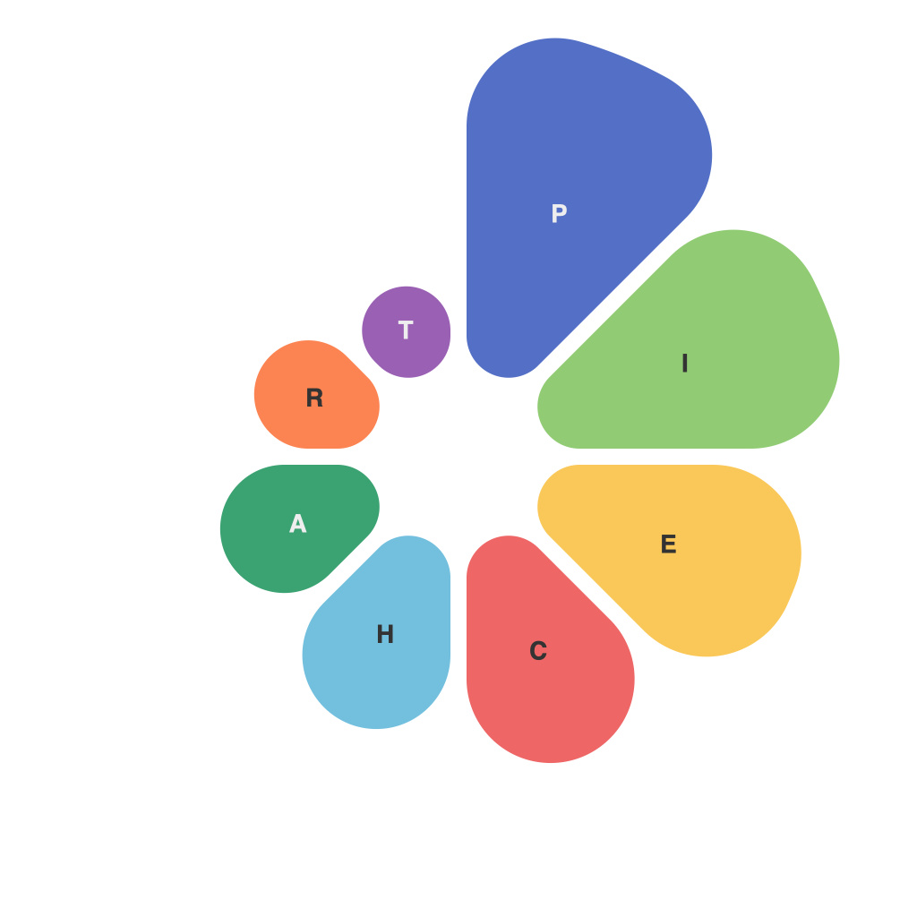
Navigating the world of data visualization can be an awe-inspiring journey, full of visual representations that turn raw numbers into stories of human achievement, failure, or the mundane. One of the most pivotal tools in this journey is the pie chart. Pie charts, with their circular charm and pie wedges, are a go-to for statisticians, market researchers, and business analysts seeking to communicate complex data points to a broad audience. However, mastering pie charts isn’t as straightforward as it may seem. This guide aims to demystify and dissect the elements of pie chart mastery, ensuring that you too can walk the path of the data visualization master.
**The Foundation: Understanding What Makes a Pie Chart**
Before diving in, it’s essential to understand the basics. A pie chart visually divides a circle into slices or wedges to show proportions or percentages of a whole. Whether you’re communicating market shares, opinion polls, or data trends, the pie chart remains a cherished visualization tool due to its simplicity and memorability.
**Choosing the Right Data**
The journey to pie chart mastery begins with selecting the right data for illustration. Here are some fundamental considerations to ensure you use pie charts effectively:
1. **Whole vs. Part**: Pie charts are best used to represent whole entities (e.g., global population breakdown) rather than parts of a portion (e.g., the proportion of men in a specific population segment).
2. **Comparison of Proportions**: They’re ideal for comparing proportions and showcasing data where each part of the whole is meaningful when seen in terms of its size against the others.
**Crafting the Perfect Chart**
Once you’ve decided the data that needs to be visualized, let’s look at how to create a pie chart that’s as visually appealing and informative as possible:
1. **Clarity and Simplicity**: Avoid a “busy” pie by removing any unnecessary text or design elements. More slices make the chart harder to read. Aim for between five and 12 slices to maintain readability.
2. **Color Strategy**: Using a distinct color for each slice helps viewers differentiate between different segments of data. Ensure there’s a clear contrast between the wedges—neon orange might clash with a deep purple.
3. **Labeling Wisely**: When it comes to labels, less is more. Use labels that are concise but informative so readers know exactly which segment each pie slice represents.
**Pie or Donut – The Decision**
Choosing between a basic pie chart and a donut is often a matter of taste. While pie charts have the advantage of showing a greater slice size, allowing viewers to more easily interpret proportion, donut charts may be preferable when you want to emphasize the parts. It all depends on what message you want to convey and how much space you want to allocate for the background.
**Interactivity vs. Static Charts**
While static pie charts might be timeless, interactive variants can be a game-changer. Adding interactivity allows users to hover over a slice to get detailed information, slice a pie to isolate segments, or even drag slices onto a different location to show comparisons. This level of interactivity not only enriches the user experience but can also make complex datasets more accessible and engaging.
**Specialized Chart Types: The Wildcard**
Pie charts, as the foundation for many variations, give way to a family of charts. These include percentage pie charts, doughnut charts, exploded pie charts (where one slice is separated from the rest to emphasize it), and 3D pie charts. While 3D pie charts can be visually impressive, they often lead to misinterpretation due to the perspective distortion. Hence, it’s wiser to stick to 2D charts for clarity.
**Pie Chart Pitfalls to Avoid**
Avoiding common pitfalls in pie chart creation can greatly enhance the quality of your data visualization:
1. **Misinterpretation**: Don’t use pie charts to imply magnitude or order. The circular nature of pie charts can mislead viewers to think larger slices represent larger proportions.
2. **Too Many Slices**: Too many segments in a pie chart can be overwhelming. It’s better to aggregate slices into broader categories or use a different type of chart altogether.
3. **Incorrect Label Placement**: Placing labels inside wedges can be tricky, but they’re less cluttered. If you don’t have enough space, experiment with labeling external to the pie or using a legend.
**Conclusion: Pie Charts as Tools for Thought**
In the grand tapestry of data visualization, the pie chart is a thread that weaves narratives from the fabric of raw information. By understanding both the intricacies and the art of pie chart design, you can harness this timeless visual metaphor to convey information in a straightforward and compelling manner. Remember, the essence of pie chart mastery lies not just in the chart itself but in the story it tells and the insights it brings to the surface. Take every dataset, and let your pie chart be a beacon in the sea of numbers, guiding you and your audience through the vast landscape of data.

