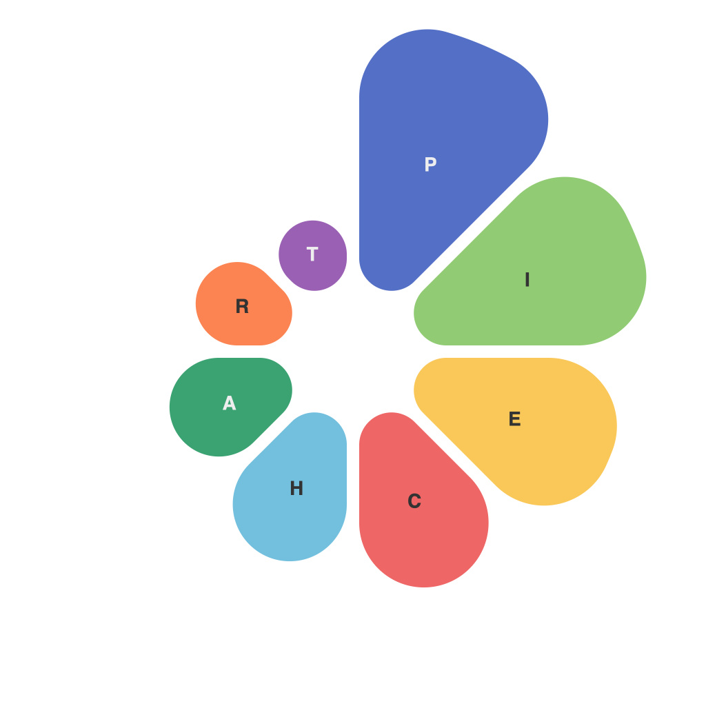
In an era where information overload is a constant challenge, the art of visual storytelling becomes increasingly crucial to convey complex data with clarity and impact. Among the many tools at a data analyst or communicator’s disposal, the pie chart has stood the test of time as a powerful device for illustrating proportional relationships. While pie charts have received criticism in the past for being confusing and potentially deceptive, they remain an effective means of communication when crafted with strategic precision.
Strategies for Effective Communication
1. **Start with a Storyboard**: Begin with a clear narrative in mind. Before you even start the design process, ask yourself: What is the main story that needs to be told? Ensuring the pie chart aligns with that story will make it more impactful.
2. **Limit Number of Categories**: Keep the number of slices on your pie chart to a minimum. Experts recommend five or fewer categories. More slices can lead to a cluttered chart that is difficult to interpret at a glance.
3. **Use Clear Labels**: Designate each slice with a label and, if possible, a concise description that speaks to the information you’re presenting. Make sure these labels are easily readable, especially when colors are similar.
4. **Ensure Consistent Color Palette**: Select colors that complement each other and stand out against the background. Consistency is key, so if your pie chart is part of a series, make sure the colors are repeated accurately across charts.
Strategies for Interpretation
1. **Compare Slices**: Pie charts are designed to highlight the relationship between the whole and its components. By adjusting the angle of visibility, you can lead viewers to focus on the comparisons between slices rather than individual sizes.
2. **Highlight Key Data**: Emphasize the most relevant data by making a specific slice larger or using a different color. It’s akin to highlighting the key points of a speech – it makes them stand out and easier to remember.
3. **Avoid Misleading Comparisons**: Be wary of using misleading comparisons, such as using 3D pie charts rather than the traditional 2D version for visual effects that can distort proportions.
4. **Tell the Whole Story**: While it is important to home in on certain slices, ensure the reader can see the whole pie at all times. This perspective reinforces the overall context of the data.
Considerations for Design
1. **Proper Size**: A pie chart that is too large or too small can limit its effectiveness. If a chart is too small, it becomes difficult to discern details. Conversely, a disproportionately large pie chart can be overwhelming and difficult to manage onscreen or in print.
2. **Layout**: Position the largest slice closest to the 12 o’clock position to help viewers naturally gravitate to it first. If you want to guide the viewer from a central point, consider mirroring the chart to keep a logical progression.
3. **Accessibility**: Pay attention to color contrast and consider using data labels that might help readers with color vision deficiencies discern between similar tones.
In conclusion, pie charts remain a valuable tool for visualizing data, but they must be used wisely. With careful design and purposeful communication, pie charts can effectively communicate data-driven insights. By considering the strategies for both effective communication and interpretation discussed here, data analysts and those responsible for sharing information can leverage the pie chart to tell a compelling and accurate story about the numbers they are presenting.

