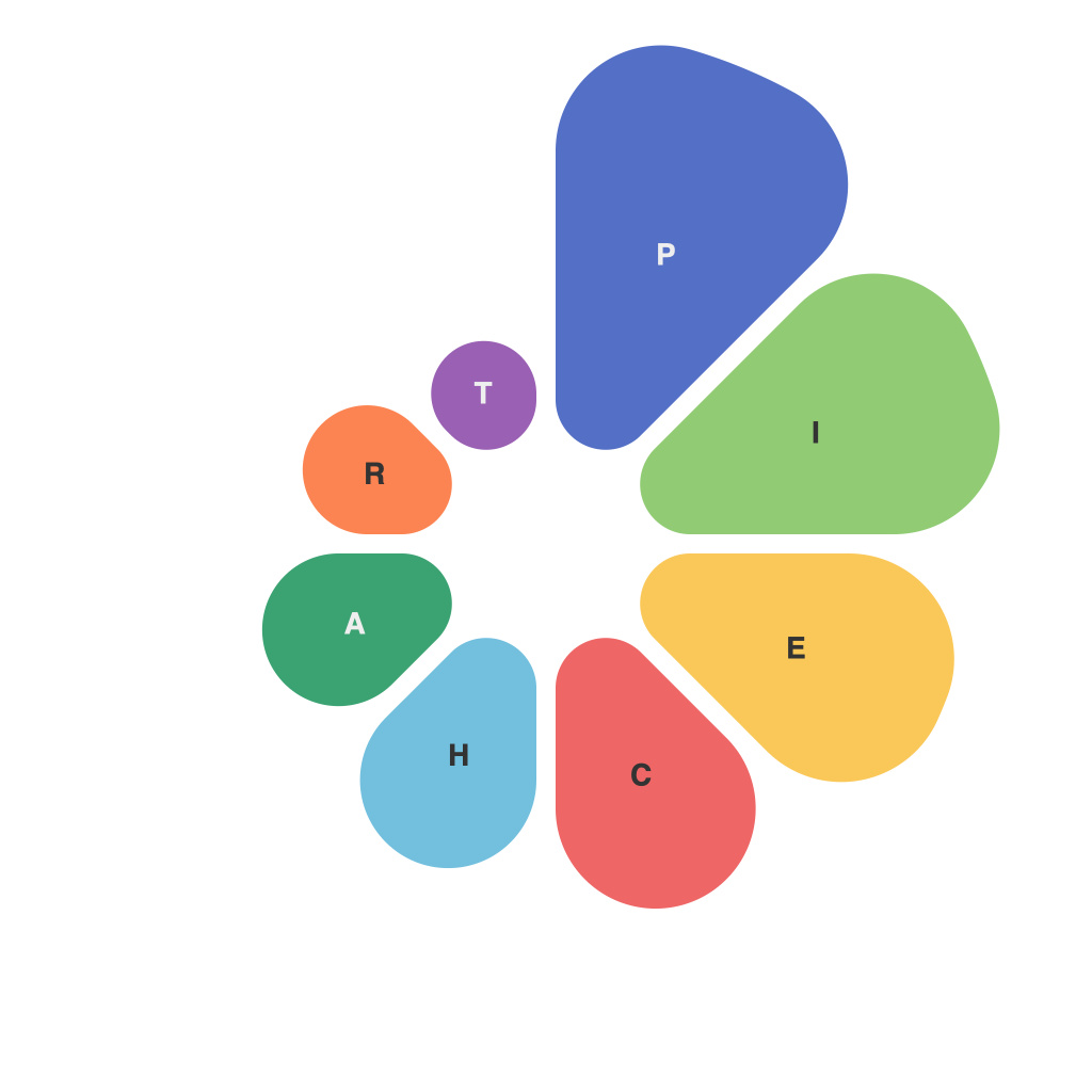
Visual Insights: Crafting Effective Pie Charts for Clear Data Representation
As the adage goes, a picture is worth a thousand words. This truth stands even more so when the picture in question is a well-crafted pie chart, designed to distill complex data into an easy-to-digest and visually compelling format. Pie charts, with their round, concentric slices, are a staple in corporate presentations, research papers, and educational materials. Here, we delve into the mechanics of pie charts, their nuances, and how to use this visual tool effectively for clear data representation.
The Basics of a Pie Chart
At its core, a pie chart divides a circle into sectors, each corresponding to a proportion of the whole. This makes them particularly useful for illustrating how parts relate to a whole. Each slice is proportionately larger or smaller, depending on the data it represents. The whole circle equals the total value or quantity being analyzed.
The Art and Science of Pie Charts
1. **Choosing the Right Data to Represent**
Not every type of data is best represented by a pie chart. Use a pie chart for data that is mutually exclusive (the sum of each category adds up to the whole) and not in too small a quantity. For complex data, pie charts can become visually overwhelming.
2. **Using the Full Circle**
A common mistake is to not use the entire circle to represent the whole. If only a partial circle is used, it creates a misleading visual representation of the data. The pie chart should cover the entire 360 degrees to show the full scope of the data.
3. **Sectors and Colors**
Ensure each sector is distinctly demarcated from the others. Use contrasting colors for clarity. Consistent and professional color choices can improve the appeal of the pie chart and convey the message effectively.
4. **Labeling and Data Accuracy**
Clearly label each slice with its corresponding data, and make sure the values are accurate and easy to read. Including a brief legend can aid in understanding the colors used.
5. **Avoid 3D Pie Charts**
Many graphic designers agree that 3D pie charts should be avoided like the plague. They make it extremely difficult to compare slices accurately as shadows and depth perception distort the visual elements.
6. **Consider Size and Proportion**
For a detailed comparison, use a pie chart with a larger diameter, as it provides more space for data labels and makes it easier to discern between slices.
7. **Avoid Starting at Zero**
Starting the pie chart at zero can make the chart appear different than the actual data. However, for visualization purposes, if zero is not particularly representative or relevant, a chart can also be started partway into the circle.
8. **Label Placements**
Avoid placing data labels directly opposite one another, as this can lead to confusion. Placing data labels too close to their corresponding slices can also hinder readability.
9. **Comparing Relative Slices**
When used for comparison, it might be better to view the pie chart horizontally instead of using a traditional vertical slice. This can provide a better visual comparison and avoid common perceptual distortions.
10. **Interactive Pie Charts**
If your audience can interact with the chart—by rotating or selecting slices—you can create a dynamic and engaging experience that helps make complex data more approachable and understandable.
Conclusion
Pie charts are a versatile tool when used correctly, and they can communicate complex data succinctly. However, their success hinges largely on the careful planning and implementation. It’s not just about presenting the data but ensuring that the audience comprehends it and takes away the intended message. By adhering to the best practices of pie chart creation, you can transform raw data into a visual narrative that speaks volumes.

