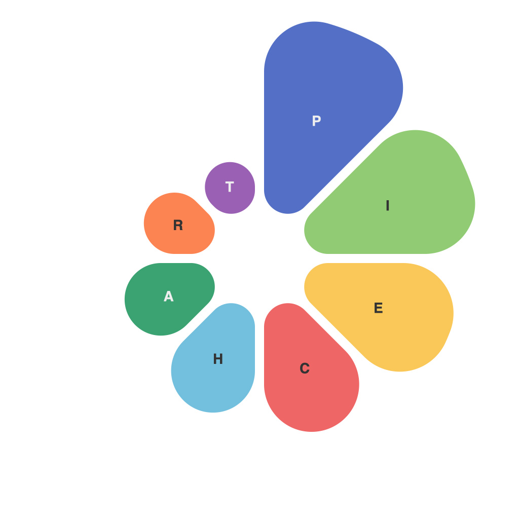
Pie charts are a staple of data visualization, with their round shape and wedges that segment the data into proportional parts. While they may seem like a simple concept—cut a round pie and each slice represents a slice of the whole—they are far from one-dimensional. There is a delicate balance between art and science that comes into play when designing a pie chart that accurately conveys information and is visually appealing.
The Art of Pie Chart Design
The art aspect of pie chart design becomes apparent when you consider the user experience. How do you draw a pie chart that is engaging, easy to understand, and communicates the point you are aiming to make? Good design is about more than just ensuring the pie chart is readable—it’s about creating an experience that can help users absorb the information without confusion.
1. **Storytelling Through Design**: Every pie chart should tell a story. The designer must first determine what that story is, and then choose colors, layouts, and labels to convey it. The color palette must be cohesive and not overshadow the data; the aim should be to highlight important segments with contrasting hues.
2. **Consistency**: In data visualization, consistency is key. A chart that deviates from a brand’s color scheme or standard formatting may confuse the viewer. Uniformity across all data visualizations helps reinforce the brand identity and ensures that the audience quickly relates to new data presented.
3. **Balance and Scale**: Just as the placement of elements on a painter’s canvas impacts the overall feel of the piece, the balance of a pie chart’s layout is crucial. Proper scaling of pie slices ensures nothing is cluttered and everything is equally legible—no one wants to read a minuscule slice that tells a valuable part of their story.
The Science of Pie Chart Design
On the other side of the coin is the scientific aspect of pie chart design. It’s not just about making it look good; it’s about ensuring the chart is right about the information it presents, and it does so accurately and effectively.
1. **Data Accuracy**: The core of pie chart science is ensuring the data is displayed correctly. The angles of the wedges (when they intersect with the center) should be equal to the proportion of the data points they represent. Any discrepancy between the angle and the data can lead to misinterpretation.
2. **Number of Slices**: Too many slices, and the pie chart becomes convoluted and difficult to understand. There’s no set rule for the number of slices that’s right for any dataset, but it’s generally agreed that more than seven slices can complicate the pie chart’s readability.
3. **Label Placement**: The placement of labels around the pie is a technical decision that needs to be tested and adjusted for clarity, especially for charts with a high number of slices. Proper labeling ensures that each segment is not only visually identified but also described succinctly.
Pie Charts in Context
Whether a pie chart is an standalone infographic or part of a complex report, its design choices must be informed by its context. Here are a few considerations:
– **Purpose**: Is the pie chart intended to inform or persuasively argue? The design should reflect the priority of clarity or argumentative strength.
– **Format**: Print media vs. digital — this affects the way the pie chart will be perceived and can influence design choices for size, color, and legibility.
– **Audience**: A chart aimed at experts may require different labelling and layout considerations than one intended for the general public.
Pie charts are powerful tools when designed well. They merge the emotional appeal of art with the analytical integrity of science, creating visual stories that tell a truth as accurately and engagingly as possible. By carefully considering the art and science of pie chart design, one can truly unlock insights behind the numbers.

