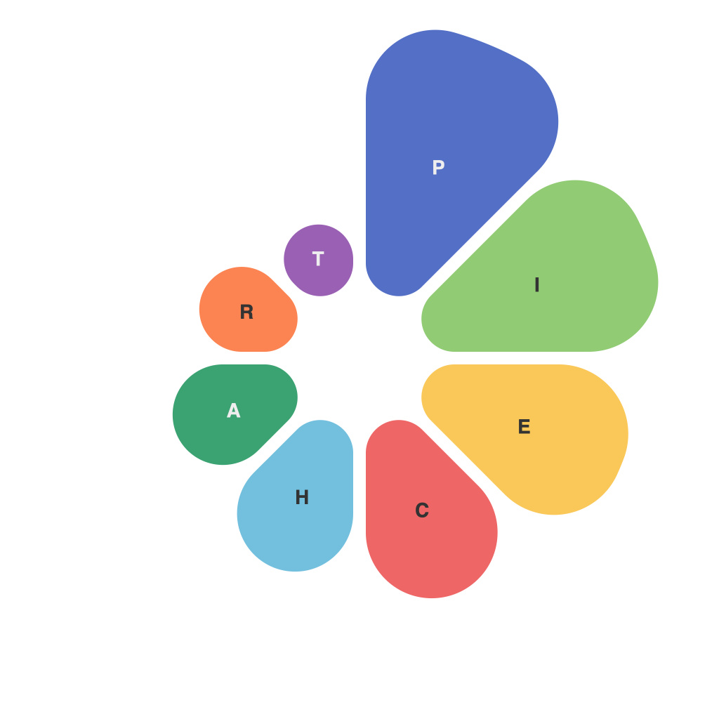
The evolution of data visualization techniques has resulted in a rich tapestry of tools used to interpret and present information. Among these tools, the humble pie chart often garners overlooked yet significant attention. This article delves into the circular symphony that is decoding data with pie charts, examining their insights, common uses, and essential design tips to ensure effective communication of data.
### Insights into the World of Pie Charts
Pie charts provide a straightforward and visually captivating way to present data. They are often praised for their simplicity and ability to communicate a single message at a glance. This makes them an excellent choice for comparing parts of a data set to the whole and for illustrating proportions.
When correctly constructed, pie charts can deliver insights into complex data relationships, providing a visual language that surpasses the limitations of text and numbers. They can highlight significant trends, disparities, or patterns that might not be immediately apparent in raw data.
### Common Uses of the Pie Chart
1. **Comparative Analysis**: When you have two distinct categories, pie charts can be an effective way to represent their comparative sizes.
2. **Market Share**: Industries frequently use pie charts to showcase market distribution, such as different segments within the automotive market.
3. **Budget Allocation**: They are handy for illustrating how a budget is allocated among different categories.
4. **Poll Results**: In public opinion or market research studies, pie charts can elegantly depict the distribution of votes or responses.
5. **Time Distribution**: For showing how time is spent, such as daily activities or project duration, pie charts are a visual delight.
### Design Tips to Perfect the Pie Chart Symphony
1. **Keep it Simple**: Resisting the urge to add too much to a pie chart keeps the message clear and helps viewers engage with the data.
2. **Use a Logical Starting Point**: Ensure the first slice is at the top for consistent interpretation. The starting point should make intuitive sense for the context.
3. **Limit the Number of Slices**: Too many slices can clutter the chart and make it difficult to visually decipher the segments. Ideally, stick to around 8-10 slices, but don’t go over 12.
4. **Label Clearly and Visually**: Label each pie piece with a minimum of both the name and the value of the data segment. Consider using both a label and a title or text description.
5. **Leverage Color to Enhance Meaning**: Choose colors carefully to differentiate slices and convey the message effectively. Use color gradients or a palette that contrasts well with the background.
6. **Rotate for Readability**: Rotate the entire chart for better readability. This is especially useful when you have a lot of slices, as it allows viewers to understand their orientation without struggling.
7. **Consider Aesthetics**: While aesthetics should never prioritise over functionality, a well-constructed pie chart is pleasing to the eye. This can make it more interesting and retain viewers’ attention.
8. **Use Interaction for Interactive Dashboards**: When pie charts are part of interactive dashboards, ensure that interactive features, like hovering or clicking, can provide additional insights into selected data.
9. **Avoid Pie Charts When Not Appropriate**: Lastly, it’s important to recognize the limitations of pie charts. They are not ideal for displaying trends over time or for making precise numerical comparisons, so consider alternative visualizations for these purposes.
By employing these design elements and understanding the nuanced uses of pie charts, analysts and communicators can add a delightful symphony of clarity and impact to the way data is presented and interpreted. As with any art form, pie charts require skillful practice to ensure their intended message resonates and resonates most effectively with their audience.

