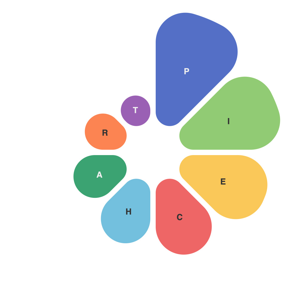
Navigating through the vast realm of data visualization, pie charts have stood as a popular go-to for depicting a whole as divided into segments. This article delves into the intersection of art and science as we dissect the multifaceted world of pie charts—focusing on their design, application, and the nuances of interpreting them with precision.
**The Foundations of Pie Charts**
Pie charts are circular representations displaying data where the entire circle equals 100% or a total sum. Each segment, or slice, within the pie represents a portion of that whole, typically in percentages or whole number proportions. Their simplicity and ease of conveying large data values to an audience make them a staple in presentations, reports, and educational materials.
From a designer’s perspective, pie charts are a blend of creativity and structure. The art lies in the balance, symmetry, and the chosen palette of colors. A well-designed pie chart is aesthetically pleasing, yet the emphasis is on clarity and accuracy.
**Designing the Perfect Pie**
One essential rule of pie chart design is to ensure that it remains symmetrical. If not, pie charts can easily become distorted when the circles are not the same size. When it comes to colors, they should be selected to convey meaning while not overpowering the chart itself or the other elements around it. Too many colors can lead to visual clutter, detracting from the chart’s main purpose.
The use of lines or dots to connect the center to each segment adds to the clarity, making it easier to see individual slices. However, overuse of such elements can make the pie chart look cluttered.
**Choosing the Right Scenario**
Despite their widespread use, pie charts aren’t a silver bullet for data visualization. They work wonders when presenting categorical comparisons for simple data where variables fit neatly into distinct, mutually exclusive categories. However, as the number of categories in a pie chart increases, interpretability often diminishes.
To use pie charts correctly, designers should be cautious and consider:
– Avoid pie charts when there are more than six segments. People can only recognize three to five slices accurately due to cognitive limits.
– Be mindful of the radius of the pie. It should be large enough to see individual slices clearly. If it’s too small, it can appear cluttered and the exactness of the data gets lost.
– It can be challenging to discern small slices because of their proximity to large ones and their angles.
**Interpreting the Data**
Once a pie chart is neatly drawn, how does one interpret its data? Here are some tips:
– Pay close attention to the angles of the slices. Larger segments will always be more prominent, but this doesn’t always translate to a larger numerical value.
– Look at how the colors correspond to the data—often the more intense or striking colors are the ones that carry more weight.
– Pay attention to any labels or captions that accompany the pie chart, as these can often add important context to the statistics.
**A Balancing Act**
The art of pie chart mastery is a balance between making it visually appealing and ensuring it effectively communicates the data at hand. These circular graphs are a powerful storytelling tool when used correctly. However, it’s important for both the creators and the consumers of these charts to recognize their limitations. Understanding how to design and interpret them with care can turn a basic pie chart into a compelling narrative of data insights.

