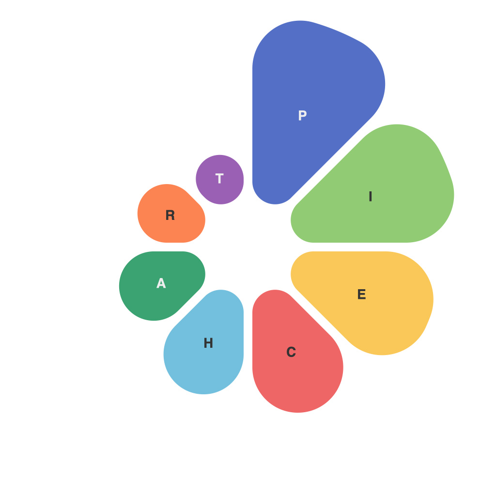
Visual representations of information have become indispensable tools for conveying complex data and trends in an easily digestible format. Among these, pie charts have stood out as one of the most popular and universally favored methods of data representation. This guide deciphers the nuances of pie charts, their applications, and the best practices for crafting an impactful visual narrative.
**Understanding the Pie Chart**
At its core, a pie chart is a circular graph that divides a dataset into distinct categories, each represented by a slice of the whole. Each slice’s size is proportional to the value it represents within the dataset. The sum of all these slices equals the total dataset, hence the name “pie” chart, hinting at the whole from which the segments are sliced.
**When to Use Pie Charts**
Pie charts are particularly effective when highlighting the proportion between different parts of a whole. These charts are perfect for showcasing market shares, population demographics, or survey responses, where the sum of parts adds up to a single entity or total.
**Design and Composition Elements**
1. **Simple Simplicity**: It’s critical to maintain an uncluttered composition. Keep the pie chart simple—avoid adding unnecessary information that can make the chart complex and hard to comprehend.
2. **Easy Navigation**: Ensure the chart is easy to navigate. Use clear, descriptive labels for each slice (segment) and make them big enough to read without strain.
3. **Legend and Titles**: Include a legend to explain what each color or segment denotes, if color is used for distinguishing slices. A descriptive title helps set the context for the viewer.
4. **Colorcoding**: Use color to differentiate slices, making sure the colors chosen are contrasting enough to stand out but not too jarring. Be consistent in the use of color throughout your different charts if you plan to compare multiple pie charts.
**Best Practices for Effective Pie Charts**
1. **Limit the Number of Slices**: With too many slices, a pie chart can quickly become difficult to interpret. Aim for no more than 8 slices, and no less than 4 to ensure that viewers can distinguish between segments.
2. **Avoid 3D Effects**: A flat, two-dimensional visualization is often more effective than the 3D pie chart. This applies to all types of charts, not just pie charts, but there is a specific reason for this in pie charts.
3. **Equal Slice Widths**: Slices should be divided based on relative size rather than using different angles. This visual practice can enhance the accuracy of interpretation.
4. **Labeling Inside the Chart**: When possible, including labels within the pie chart increases clarity. This works well for fewer slices. Otherwise, text labels should be placed on the outside of the slice.
5. **Order of Appearance**: Slices should be ordered in descending order of value or importance to the viewer. This helps direct their focus to the more significant data points.
**Interpreting Pie Charts**
Viewers should start with the largest slice and proceed clockwise, aligning the largest piece of the pie with the viewer’s interest or knowledge of the content. This helps in building a narrative around the data.
**Pie Charts in the Digital Age**
With the advent of digital data visualization tools and software, pie charts have become even more accessible. Programs like Microsoft Excel, Google Sheets, and advanced data visualization platforms offer customization options that allow for intricate designs and enhanced functionalities.
**Conclusion**
The pie chart is a dynamic, versatile tool for representing partial-to-whole relationships. When created thoughtfully, pie charts can be powerful instruments that help users not only understand but also engage with data. Understanding the principles underlying the creation of a pie chart and employing these best practices will allow you to craft effective, informative, and aesthetically pleasing visual presentations of your data.

