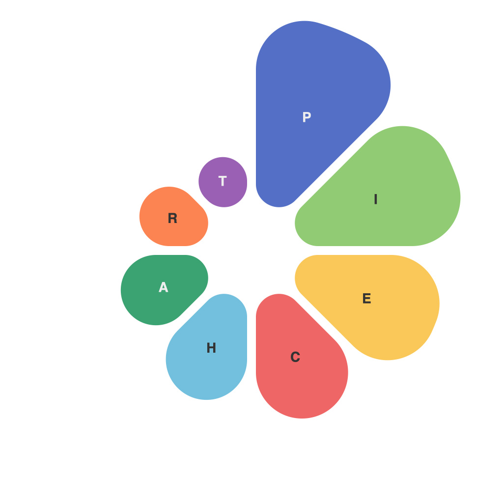
Data visualization has emerged as a crucial component in today’s data-driven world. It’s the art of turning complex numerical information into graphics or visual representations to communicate insights more effectively. Among the various forms of data visualization, pie charts have long since become a staple for representing portions of a whole. These circular graphs are undeniably popular, but are they the perfect choice every time? Let’s delve into the mastery and myths of the pie chart master.
### Mastery of the Pie Chart
When done right, pie charts are a masterful tool for depicting the proportions of a dataset. Here are some of the key elements to consider when mastering this tool:
1. **Clarity in Information Representation**: A great pie chart should leave no room for ambiguity. The slices should be clearly legible, with colors and labels that differentiate between the different parts.
2. **Correct Proportions**: The size of each slice should accurately represent the size of the corresponding section of the total data. Even a small variation can significantly impact the interpretation.
3. **Limited Number of Categories**: Keep in mind that pie charts are best used when there are only a few categories. Too many, and it gets difficult for viewers to distinguish between them.
4. **Ease of Comparison**: The angle at which each slice is cut can help with making comparisons. For instance, using even slices can make it easier to compare the sizes of different categories.
5. **Effective Labeling**: Incorporating labels inside the slices ensures that the audience doesn’t have to constantly refer back to the legend, thereby streamlining their comprehension.
6. **Balanced Aesthetics**: An aesthetically pleasing pie chart doesn’t necessarily mean being colorful or visually striking, but it should be arranged in a way that enhances legibility.
### Debunking Pie Chart Myths
Despite their widespread use, there are several myths surrounding the pie chart that need to be addressed:
1. **Myth: Pie Charts Are Best for All Situations**
– Reality: Pie charts are best when there are only a few categories. For an extensive list of data points, a bar or line graph can convey the same information more effectively.
2. **Myth: Pie Charts Are Always Readable**
– Reality: Depending on the variation in sizes and the number of slices, some pie charts can be difficult to read. This is because the human brain is better at detecting differences in length than angles.
3. **Myth: All Slices Should Be Syclic**
– Reality: The angle between the radii and the circumference for a pie chart slice does not have to be one-eighth of the 360 degrees. Any standard can be used as long as it is consistent and well-documented.
4. **Myth: Pie Charts Are Always Unbiased**
– Reality: When pie charts are designed to be misleading, they can give a biased impression. This could be due to the way slices are arranged or colored.
5. **Myth: Pie Charts Are Always Accurate**
– Reality: Due to their nature, pie charts can be prone to errors in perception. Two people might interpret a small difference in angles differently.
6. **Myth: Pie Charts Should Be Round**
– Reality: While it’s technically a circle, a pie chart doesn’t have to be perfectly round. Using an irregular shape can sometimes enhance its visual appeal without affecting its functionality.
In conclusion, the pi chart is a versatile tool in the data visualization arsenal, but only when used thoughtfully and appropriately. There are many nuances to consider, and understanding these subtleties helps us demystify the role of the pie chart master in data storytelling. As we continue to explore the realms of data visualization, we can appreciate the mastery required to craft the perfect pie chart and dispel the commonly held myths that shroud this simple yet powerful graphical device.

