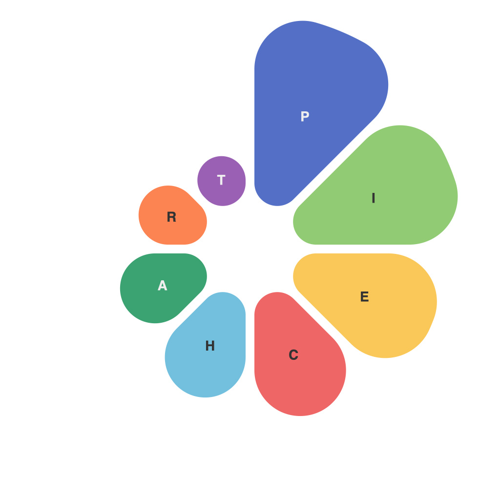
Pie charts can be a powerful tool for showcasing data in a visually appealing and easily digestible manner. This article comprehensively explores the art of creating pie charts that are clear, compelling, and informative. We discuss the basics of pie charts, the best practices for their design, and how to effectively utilize them in various contexts.
**Understanding the Basics of a Pie Chart**
A pie chart, as the name implies, is a circular graph that divides data into a number of slices to represent portions of the whole. Each slice is proportional to the value or frequency it represents, allowing viewers to quickly understand the size of each portion relative to the whole.
Pie charts are best used when:
– Displaying part-to-whole relationships.
– Illustrating comparisons among different categories.
– Comparing a single data point to the whole.
However, it’s worth noting that pie charts have limitations and should be used judiciously. For example, they can become challenging to interpret when there are more than seven or eight slices, and they can be affected by perceptual biases.
**Selecting the Right Data**
The first step in creating an effective pie chart is determining the right data to represent. Before diving into the design, consider the following:
– **Cohesiveness**: Ensure that the categories you choose are distinct and relate back to a central theme or data point.
– **Relevance**: Choose data that is meaningful and provides insight into the subject at hand.
– **Clarity**: Make sure that the information you want to convey is easily understood after looking at the chart.
**Crafting a Clear and Engaging Design**
Once you have your data, it’s time to visualize it. Here are some design tips to keep in mind:
**1. Color Scheme**
Select colors that are easy on the eyes and differentiate slices distinctly. A good practice is to use a palette that is legible on different backgrounds and with sufficient contrast between slices.
**2. Labeling**
Use labels for clarity; labels help viewers identify each slice immediately. A key or legend can be useful if there are many slices or if the color choice may be confusing.
**3. Labels and Numbers**
Include numeric labels or percentages on the chart to reinforce the visual representation. Providing this data allows viewers to verify the size of the pie slices precisely and to make comparisons more accurately.
**4. Simplify the Data**
If you have too many slices, consider combining similar categories or using different visual elements such as donut charts (a variation of the standard pie chart where the center is removed) or a horizontal bar chart for better clarity.
**5. Readability**
Pay attention to the font, size, and placement of all elements. Ensure that there is enough contrast between the pie slices, and that the text has adequate spacing for readability.
**Visualizing Data in Practice**
Different contexts require different presentations. Here are some examples:
– **Market Research**: Use pie charts to illustrate market share percentages of competitors.
– **Business Analysis**: Display financial performance over time, such as income and expenses for a specific period.
– **Demographics**: Compare different age groups in a population in a particular geographic location.
**Final Thoughts**
Pie charts can be an effective way to tell a story with data. However, they should be crafted with care to ensure that they are clear, compelling, and support the points you wish to make. By sticking to the principles outlined in this guide, you can create pie charts that not only inform but also captivate your audience. Always remember to iterate on your design, gather feedback, and refine as needed to ensure the best possible visual representation of your data.

