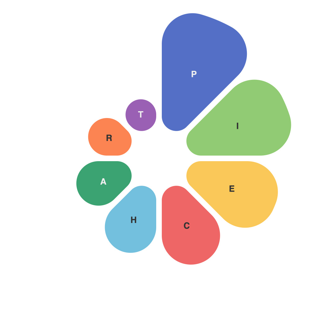
In the ever-evolving landscape of data visualization, the pie chart emerges as a timeless staple, simplifying complex information with a circle sliced into representative pieces. Yet, despite its ease of comprehension, many data storytellers struggle to adeptly apply its potential. This article, brought to you by PieChartMaster, delves into the subtle art of pie chart creation, revealing the secrets to crafting this graphical gem with precision and finesse.
The Core of a Pie Chart
A pie chart fundamentally illustrates proportions of a whole through pie-shaped sectors. Each slice of the pie is proportional to the data it represents, and the sum of all the slices adds up to the total, or 100%. However, the effectiveness of a pie chart hinges on its composition and presentation. Here’s how PieChartMaster navigates the nuances of pie chart creation:
Choose the Right Data
PieChartMaster stresses the importance of using pie charts when comparing relative proportions—a single data variable with unique parts should be your guide. Overlapping multiple data sets or using category data can lead to a cluttered chart that loses its ability to communicate clearly.
Select a Suitable Size and Scale
PieChartMaster cautions against creating pie charts that are too small or too large: both extremes can lead to misinterpretation. A pie should easily fit within a space that is not dominated by the data, but doesn’t overwhelm the page. For clarity, PieChartMaster recommends using values that are simple to compute to the nearest whole number.
Employ the Proportional Slicing Technique
The classic approach to slicing a pie chart is to use angles and arc lengths proportionate to the data. PieChartMaster explains that rather than relying solely on a visual estimate, it is beneficial to label each slice with its equivalent percentage. This not only facilitates exact comparison but also aids in understanding which segment constitutes the bulk of the pie.
Play with Color Wisely
Color is a crucial part of a data visualization, and PieChartMaster points out that it should enhance readability without causing eye strain or confusion. PieChartMaster suggests a methodical approach to color selection, ensuring that each segment is distinctly different from the others but fits harmoniously within the pie’s composition.
Optimize for Navigation
PieChartMaster knows that pie charts can feature many slices, which means a strategic approach to pie chart design is essential. To improve readability, keep the pie chart’s components consistent in size and color and follow a logical ordering from the largest to the smallest segment. Always label slices clearly, and consider adding a legend if the chart lacks clear context.
Utilize Contextual Information
Contextual data not included in the chart itself helps PieChartMaster enhance the user’s understanding. Provide context such as a title that clearly indicates the data represented, and additional annotations or a brief summary that outlines key takeaways from the pie chart’s proportions.
Embrace Innovation Without Abandoning Tradition
PieChartMaster encourages the use of design innovations that can bring pie charts to life, such as 3D rendering or interactive versions. However, the Master warns that these should be used sparingly and only when they genuinely add clarity and engagement without compromising the chart’s integrity.
In conclusion, becoming a PieChartMaster is not merely about knowing which software tool to press, but rather understanding the principles of effective data storytelling. By employing the secrets detailed here—selecting the right data, choosing an appropriate size and scale, slicing proportionally, using color wisely, optimizing for navigation, providing contextual information, and embracing innovation—the data storyteller can master the art of the pie chart, delivering clear and compelling insights through this timeless visual tool.

