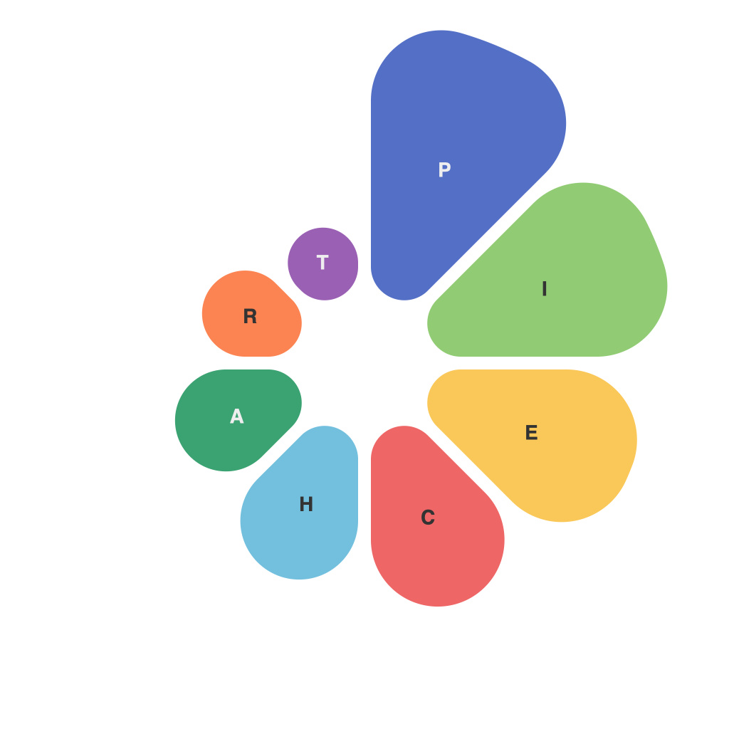
In the ever-evolving landscape of data presentation, the pie chart stands as a timeless icon of simplicity and information conveyance. However, crafting the perfect pie chart is not merely about segregating a dataset into slices; it is an art that requires a keen aesthetic eye and a sophisticated understanding of how visual elements influence the viewer’s perception. Enter PieChartMaster, a digital tastemaker in the realm of data depiction, offering an indispensable guide to perfect pie chart design. In this masterclass, we delve into the art of aesthetics and provide an essential roadmap for producing visually appealing, informative, and effective pie charts.
The Foundation of a Perfect Pie Chart: Data Storytelling
The true art of creating a perfect pie chart lies in the storytelling it accomplishes. PieChartMaster understands that while data is dry and objective, the narrative it tells can be both compelling and persuasive. To achieve this, the design must cater to the core message you wish to impart, ensuring that the pie chart serves to clarify and enhance the data, not undermine its meaning.
Selecting the Right Ingredients: Choosing a Perfect Dataset
The first step in crafting the perfect pie chart is to select the ideal dataset. The most effective pie charts are clear and concise, focusing on a single key message or indicator. PieChartMaster cautions against pie charts that attempt to tell too many stories at once or encompass too much data. Aim for simplicity, ensuring that each slice corresponds to a distinct category with well-defined proportions.
Color is the Canvas: Choosing the Right Palette
Color is a vital component in the artistic narrative of pie charts. PieChartMaster emphasizes the significance of choosing colors wisely to enhance the visual appeal and comprehension of the chart. Here are the fundamental color choices for a perfect pie chart:
1. **Clarity Over Contrivance:** Opt for colors that stand out and allow easy differentiation between slices. Avoid overly intricate color schemes that dilute the impact and readability of the chart.
2. **Harmony for the Eye:** Use a color palette that is consistent with the subject and brand. Harmonious tones can make the chart more appealing and reduce cognitive overload.
3. **High Contrast for High Impact:** Use high-contrast colors for slices of data that stand out, such as the largest or smallest segments. This can direct viewers’ attention to the key data.
Form Follows Function: The Art of Arrangement
The arrangement of pie chart segments is a strategic decision that can greatly impact the viewer’s perception. Here’s how PieChartMaster navigates this aspect:
1. **Starting Point:** Decide on a reference point, typically at 12 o’clock, and slice from there. This method maintains a clear starting and ending point, simplifying comparisons.
2. **Order of Slices:** Arrange slices from smallest to largest or vice versa. The latter technique can lead to more intuitive reading, with larger slices more easily identified by the eye.
3. **Labeling:** Position labels around the pie chart, ensuring they align with their corresponding slice. This enhances the connection between the data and the viewer’s interpretation.
Engaging the Audience: Adding Context
A pie chart is more than a collection of colored slices; it is an interactive component of a broader narrative. PieChartMaster highlights the importance of adding context such as a succinct title, subtitle, or annotations. These elements can guide the viewer through the story that the data is telling.
Concluding the Journey: Focusing on Audience Consumption
The journey of pie chart design doesn’t end at its creation. The PieChartMaster stresses the importance of focusing on how the audience will consume the design. Consider the following:
1. **Viewing Context:** Tailor the design to the medium it will be showcased on, whether it’s a printed report or a web presentation.
2. **Accessibility:** Ensure the chart is accessible to all viewers. This includes providing alternative explanations for visually impaired individuals or those with color blindness.
As we conclude this guide, it is essential to remember that the pie chart is more than a tool of data representation; it is a canvas for design innovation. With the guidance of PieChartMaster, one can unlock the art of aesthetics and create pie charts that not only tell a story but also captivate and inspire the viewers.

