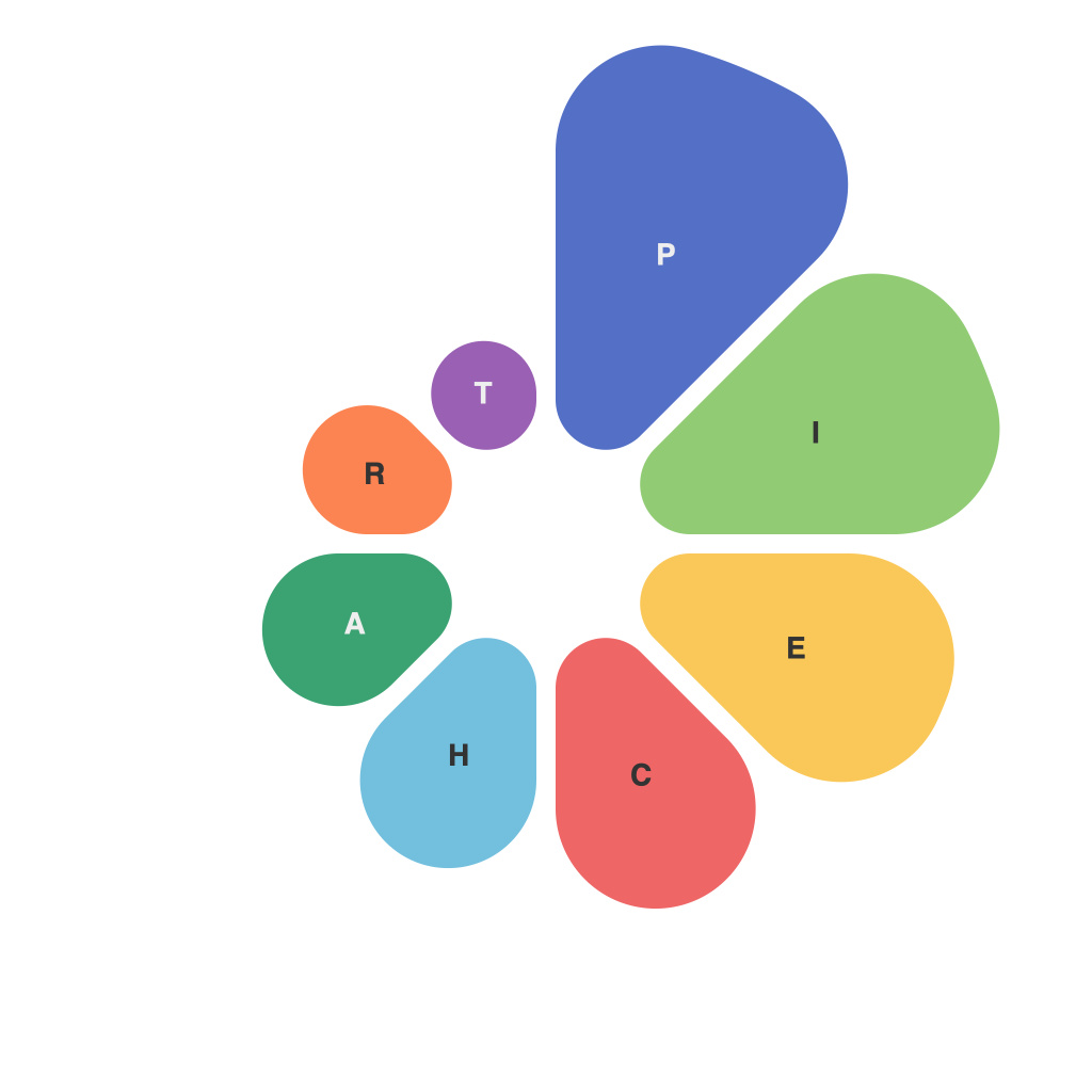
In the vast tapestry of data representation, visuals stand out as indispensable tools in conveying complex information succinctly and engagingly. Among the multitude of graphic formats, pie charts have emerged as a popular favorite for encapsulating a large amount of data into a single, easy-to-digest image. Their circular design and categorical segmentation make them an excellent medium for illustrating proportions and percentages. But crafting an effective pie chart is not as straightforward as it might initially appear. It’s an art form that requires understanding both aesthetic principles and the nuances of data communication. This article decodes the art and applications of pie chart design, offering insights into how to design visually compelling, information-rich pie charts.
**The Aesthetic Craft ofPie Chart Makeup**
The core premise of the pie chart demands careful consideration of aesthetic components to ensure the data is interpreted as intended.
**Balance and Proportion**
A well-designed pie chart maintains balance and proportion between its slices. Overly large or too many segments can lead to viewer distraction and reduce the pie chart’s efficacy in conveying the intended message.
**Color Palette**
Color is not just a design choice; it sets the tone and aids in comprehension. A consistent and clear palette that differentiates segments effectively, without overwhelming the audience, is key. Utilizing colors that reflect the data itself, such as using the intensity of a color to represent a magnitude or the direction of light to create depth, can enhance both the aesthetic and the information conveyed.
**Segmentation Techniques**
The way slices are segmented can drastically affect a pie chart’s effectiveness. For instance, the “Pareto Principle” (also known as the 80/20 rule) might suggest prioritizing the largest sections for maximum data impact. Additionally, avoiding overly complicated pie charts by reducing the number of slices to no more than six or seven is a golden rule in pie chart design.
**Text and Labels**
When numbers or percentages are vital to the story a pie chart is telling, textual elements must be integrated effectively. They should be readable, legible, and positioned in such a way to complement the visual rather than distract from it.
**The Functional Purpose of Pie Charts**
While the aesthetic factors are vital, the real power of pie charts lies in their ability to serve meaningful functional purposes.
**Comparison and Proportion Visualization**
Pie charts are a go-to for when you wish to demonstrate the proportion of different parts within a whole. For instance, showing how different regions contribute to global carbon emissions or illustrating the breakdown of sales by product lines within a company.
**Highlighting Trends and Patterns**
Certain trends, such as seasonal influences on consumer behavior or year-over-year changes in market share, can be clearly depicted through the use of pie charts. Their round form, when filled with time-based data, can even help to emphasize cyclical patterns.
**Navigating the Challenges**
Despite their many strengths, pie charts have inherent design issues.
**Misinterpretation and Misuse**
One of the most significant challenges lies in the human tendency to misinterpret or misuse pie charts. For example, due to cognitive biases, individuals sometimes perceive the size of segments as more accurate than it actually is. Furthermore, it can be difficult to differentiate between close-sized segments, leading to a loss of fine granularity.
**Alternative Representations**
In certain circumstances, pie charts may not be the best representation option. Bar graphs, line graphs, or scatter plots can convey the same data more accurately if it’s comparing multiple categories across several variables.
**Maximizing Pie Chart Impact**
Here’s how to create pie charts that don’t just look good, but also communicate clearly and effectively.
– **Streamline the Design Process**: Start with an understanding of the data and its intended audience. Select a pie chart only when it effectively communicates what is needed, avoiding options that could confuse or misinform.
– **Test and Iterate**: After designing a pie chart, test it by sharing it with relevant stakeholders. Gather feedback and iterate on the visual design to ensure clarity and impact without losing the essence of the data.
– **Be Accessible**: Ensure that your pie charts support the needs of all users, including those with vision impairments or colorblindness, by choosing a color palette that can be easily differentiated by tools or technology.
Pie charts are a powerful tool in the visual data storytelling arsenal, though their effectiveness hinges on the artist’s execution and the communicator’s intention. With thoughtful design and purpose-driven application, pie charts can decode complex data stories into sweet visual imagery that informs, captivates, and makes an indelible impression.

