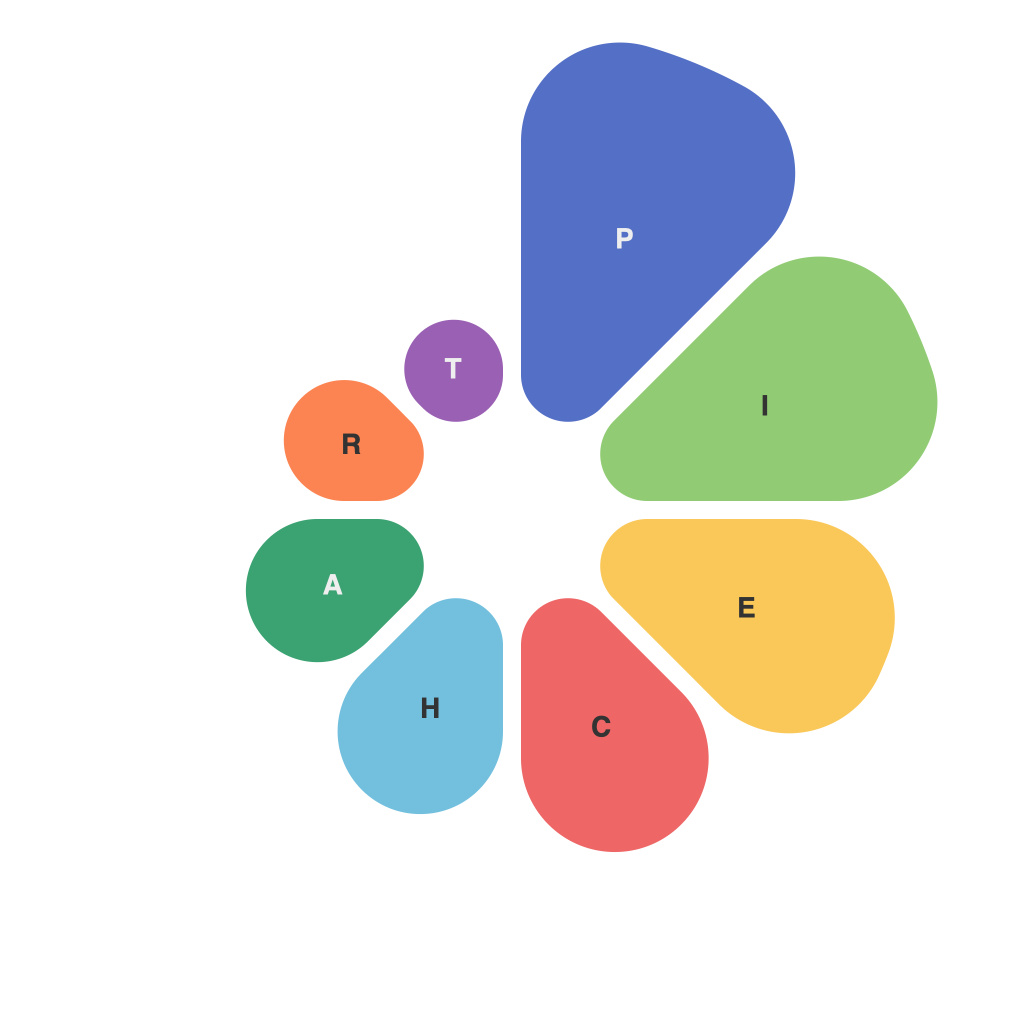
Navigating the intricate world of data presentation can sometimes feel like trying to solve a complex puzzle with hundreds of different pieces. One of the most common – and, truth be told, sometimes overused – tools in the data presenter’s toolkit is the pie chart. It’s not without reason that pie charts have been enduring since their inception in the 18th-century by WilliamPlayfair. However, in the hands of an artist with keen vision, a pie chart can indeed be a work of art that tells a compelling story. Let’s unravel the complexity behind the piechartmaster’s art and master the craft of visual communication.
The Pie Chart: A Brief History
Originating from a rudimentary concept, the pie chart is a circular statistical graph divided into sectors, each representing a fraction of an entire. The chart’s slices are proportional to the magnitude of what they represent, allowing for a quick visual comparison of parts to the whole. Despite being around for centuries, the pie chart’s functionality has always been centered on simplicity, clarity, and ease of comprehension.
The Case for the Pie Chart
The charm of the pie chart lies in its sheer simplicity. It is innately persuasive, and this is part of its enduring appeal. A well-executed pie chart presents data in a way that’s hard to resist; it’s visually appealing and makes comparisons intuitive.
Here’s when a pie chart could be the right tool in your arsenal for visual communication:
1. Showing Simple Relationships Between Parts and a Whole
2. When the Parts Are Small and the Pie Chart is Simple
3. For Projects Where You Have No or Limited Textual Content
4. In Demonstrations or Presentations that Demand Visual Appeal
When to Question Your Love for the Pie Chart
Despite its widespread use, the humble pie chart isn’t perfect. There are some drawbacks, often due to its simplicity.
1. Large Pie Charts Can Be Overly Complex
2. The Pie Chart’s Format Can Be Misleading
3. Human Perception Biases Can Skew Interpretation
Mastering the Art of the Piechartmaster
To become a skilled piechartmaster, consider the following principles:
1. **Simplicity:** Avoid clutter; select the most relevant data points to show.
2. **Clarity:** Make sure each piece clearly represents its respective data.
3. **Consistency:** Use the same coloring and labeling convention across multiple charts.
4. **Design:** Strive for a clean, elegant layout that enhances the data narrative.
A few additional practices can further enhance your piechartmastery:
– **Comparing Slices:** If comparing multiple data sets, be sure to use a consistent slice-to-slice reference, and clearly label each segment.
– **Avoiding Overload:** No more than 5-7 data sections are recommended in a single chart.
– **Utilizing Subgroups:** When needed, introduce subgroups to present more information within the same pie chart.
– **Highlighting Key Slices:** Use bold colors or shading to draw attention to the key data points.
In Conclusion
As a visual communication tool, the pie chart can be both a marvel and a misstep. It can simplify complex information to digestible visuals or overwhelm the viewer with confusion. To become a piechartmaster, your skill lies in selecting the right data, interpreting it appropriately, and creating an appealing, clear presentation. By mastering the art of pie charts, you can transform data into an engaging, insightful narrative that resonates with your audience. And remember, with great power comes great responsibility—ensure the statistics and percentages within your pie charts are not just a pretty face, but an accurate reflection of the story you wish to tell.

