In the digital age, data has evolved not just as a commodity, but as the primary language through which we understand and interpret the complexities of our world. Pie charts, a staple of this data-driven culture, often get hailed as the go-to visual tool for presenting information. Yet, they are not without their limitations. This article deconstructs the world of pie charts, revealing both their visual insights and the potential for misrepresentation that lurks just beneath their seemingly innocent surfaces.
The Alluring Simplicity of a Pie Chart
At first glance, pie charts are a simple yet beautiful creation. Each slice represents a portion of the whole, allowing for a clear visualization of the relative sizes of different parts. For quick comparisons or for illustrating a single data set, this format can be quite effective.
There is a certain elegance in the way a pie chart arranges the data, and their simplicity makes them easy to comprehend. You need only a glance to see the distribution of elements, without getting lost in the details or the intricacies of numerical figures.
The Potential Perils
Despite their apparent charm, pie charts are not without their weaknesses. One of the most significant challenges lies in their interpretation. When slices are very small or very large, the human brain struggles to accurately gauge their size and compare them with the pie’s perimeter. This phenomenon is well-documented and is often referred to as the “size illusion.”
The size illusion results in the overestimation or underestimation of values based solely on the visual angle they occupy. This is particularly problematic when presenting complex datasets with a multitude of slices, as the brain may not be able to process all the information correctly.
Moreover, when dealing with data that are highly unequal, pie charts can be problematic. For instance, if one slice represents 99% of the total data and many other slices only 1% each, it’s extremely difficult for the viewer to discern the distribution and relationships between the slices without careful analysis.
Adding Fuel to Misinterpretation
Pie charts aren’t just susceptible to the size illusion; they’re also ripe for misinterpretation due to various subtle design choices.
1. **Size does not equal value:** The size of a slice implies relative importance, but this is often misinterpreted to mean absolute importance. If one slice is significantly larger than the rest, the reader might immediately assume that this part represents a more crucial contribution, when it could simply be larger in size due to a different scale.
2. **Perspective and layout:** Pie charts can be presented in different ways, but some formats are inherently more misleading. For example, a three-dimensional pie chart may provide a visually dramatic presentation, but its proportions can be difficult to interpret, especially when the angles or the shadows affect the perceived size of slices.
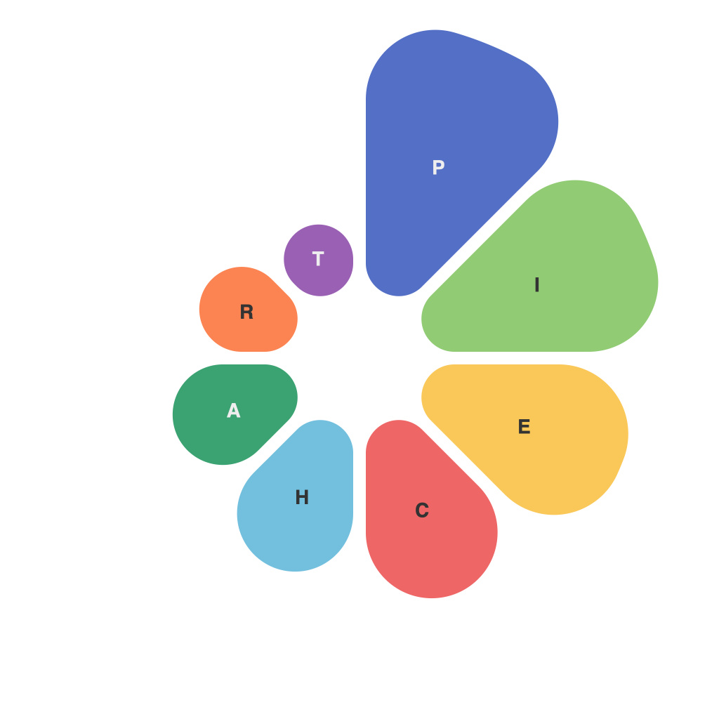
3. **The pie chart vise:** When a dataset has a large central empty space (the “vise”), it gives the impression that this area is significant even though it makes up no part of the actual data. This gap can lead to misinterpretation and distraction from the core message of the chart.
The Path to More Informed Visualization
To avoid the pitfalls of pie charts, it is necessary to consider the following recommendations:
– **Choose the right chart:** If relative proportions are the goal, pie charts may work, but if the absolute values matter, consider a bar chart or a dot plot instead.
– **Minimize slices:** Keep pie charts simple by limiting the number of slices to no more than ten. This prevents overloading the viewer with figures that are hard to discern accurately.
– **Consider the audience:** Who will be viewing this data? If your audience is likely to be more precise or less susceptible to the size illusion, a pie chart might be acceptable; however, for broader audiences, alternatives are safer.
– **Focus on the message:** Ensure that the chart clearly conveys your message, and let the design choices enhance that message rather than distract from it.
In deconstructing the world of pie charts, we see not only their strengths but also their blindspots. While they are a useful visual tool in the right context, we can avoid misrepresentation by understanding their limitations and embracing a variety of visualization techniques that cater to the audience and the message at hand.

