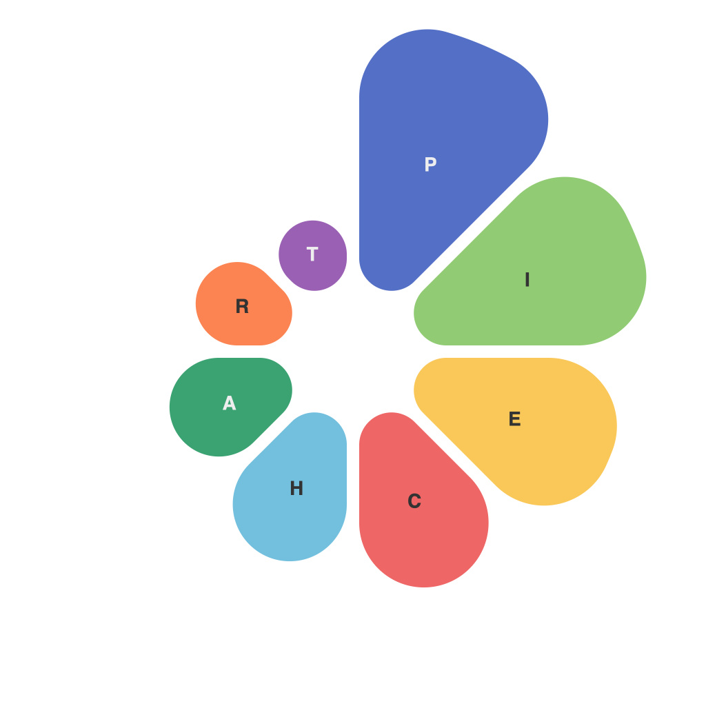
In the realm of data visualization, pie charts have historically stood as a staple, their circular symmetry easily illustrating proportions and percentages. Despite their simplicity, crafting an effective pie chart requires both an artistic sense and a scientific approach to data representation. Let’s delve into the nuances of pie chart design, analyzing the elements that turn raw data into compelling, informative visuals.
The Art of the Slice
One of the primary tasks in designing an effective pie chart is to determine how to best split the pie into slices. Artfully distributing these portions will aid in viewer comprehension, as different sizes need to be differentiated to be easily interpreted. Key factors to consider include:
1. Color: Using contrasting colors helps slices stand out from one another. Be mindful of color theory to ensure clarity—avoid shades that could be misinterpreted or too similar tones that may blend together.
2. Shape: While standard slices may suffice, experimenting with uneven shapes can sometimes aid in visual distinction, particularly if the data allows for it. However, this should only be done sparingly to maintain clarity.
3. Labeling: Slices should be labeled directly or with a key. Labels should be readable at a glance, using font size and styling to ensure they don’t overpower the chart.
The Science of the Slice
The scientific aspect of pie chart design lies in how data is arranged, scaled, and presented to provide an accurate and transparent depiction of the information. Here are some scientific principles to consider:
1. Order: Arrange slices in a logical order, either alphabetically, by size, or based on the data itself. Ensure the most significant piece is at the top, while the largest slice occupies a substantial portion of the pie to stand out.
2. Size: The size of each slice should reflect its corresponding data’s proportion to the whole. This relationship is often determined by angles or arc lengths, depending on the software or design tool used.
3. Precision: Be careful with the data representation. While it may be tempting to round numbers to keep the chart looking cleaner, overly rounding can lead to significant distortion. Always err on the side of accuracy.
Avoiding the Pie Chart Pitfalls
Pie charts can be riddled with common pitfalls that undermine their effectiveness. Here are some tips to avoid these issues:
1. Avoid Overcomplication: There should only be a few slices in a pie chart. Too many can dilute the visual impact and make it challenging for viewers to discern individual pieces.
2. Be Skeptical of the Slice of Pie: The very act of splitting up a circle can be misleading. It does not accurately represent real-world data, as it implies that everything can be neatly categorized, when reality can be far messier.
3. Be Alert to Bias: Pie charts can unintentionally influence a viewer’s interpretation. Aim for a neutral design that doesn’t subtly indicate a particular perspective.
Using the Right Pie Chart When Properly Constructed
An effectively designed pie chart can be an invaluable tool for communicating complex information in a digestible, compelling manner. By adhering to the art and science of pie chart design, data visualizers can ensure their viewers walk away with a greater understanding of the data at hand.
The key lies in understanding that a pie chart is not just an artistic project, but a science of proportion and presentation. By thoughtfully considering the aesthetic and data representation aspects, the result is a visualization that speaks volumes without overwhelming the audience.

