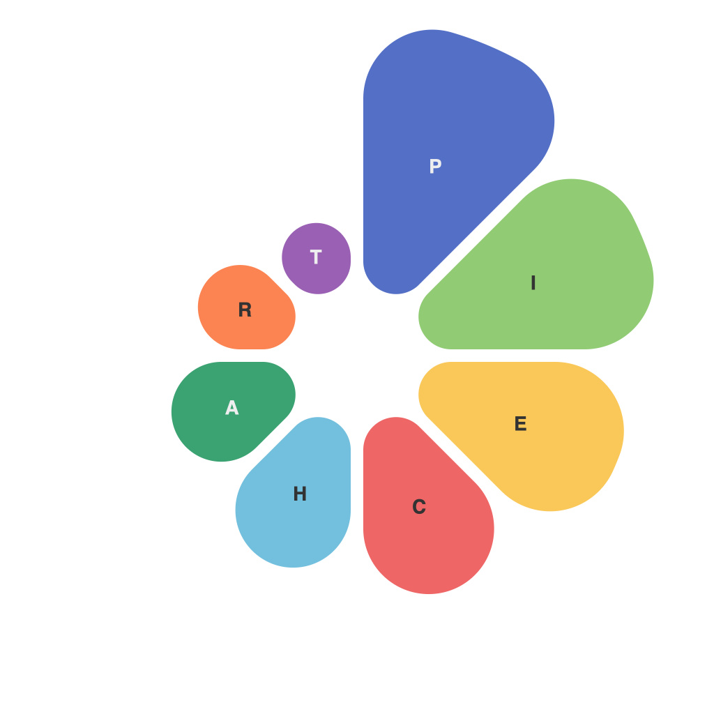
Visual Insights: The Art and Science of Effective Pie Chart Design and Analysis
Data visualization has become an indispensable tool in our data-driven world. Among numerous chart types, pie charts have stood the test of time, providing straightforward representations of data proportions. However, what sets the effective use of pie charts apart from the merely good? This article takes a deep dive into the art and science of pie chart design and analysis, exploring how to create clear, informative, and persuasive data visualizations.
### The Art of Pie Chart Design
A well-crafted pie chart can be a beautiful piece of visual storytelling, but artful design is more than aesthetics. The following principles will help create pie charts that stand out:
#### 1. Clarity and Simplicity
Pie charts should be as straightforward as possible. Avoid unnecessary features, like grid lines and shadows, that might distract viewers from the data itself.
#### 2. Color Scheme
Appropriate color choice not only enhances the visual appeal of a pie chart but also helps in distinguishing segments. Use colors that are distinct and have high contrast.
#### 3. Labels and Legends
Ensure that labels are clear, legible, and provide all the necessary information. A legend may be required if there are too many color-coded segments.
#### 4. Proper Segment Ordering
Order the segments in descending order of size to draw the viewer’s attention to the most important categories first.
### The Science of Pie Chart Analysis
Pie charts are not without criticism, with some suggesting they are not the most effective data presentation tool. However, when used correctly, they can provide valuable insights. Let’s delve into the science behind analyzing pie charts:
#### 1. Size Perception
People tend to perceive the size of a pie segment more accurately than its numerical value. Therefore, when comparing large numbers, pie charts can be misleading.
#### 2. Central Bias
The center of a pie chart is more likely to be perceived as slightly smaller. To combat this, ensure that the largest segment is in the bottom part of the pie, which is less likely to be mistakenly deemed smaller.
#### 3. Comparisons Between Pies
Comparing two or more pie charts can be challenging, as people may prioritize segments in the same relative position in each pie. The pie chart is best used for individual analysis rather than comparative purposes.
#### 4. Data Granularity
Avoid pies with more than around seven or eight segments for ease of interpretation. More than this can overwhelm viewers and make interpretation difficult.
### Case Studies: Pie Chart Design and Analysis in Action
Consider an example where a marketing team presents the distribution of sales across different product lines. By applying the principles of strong design and careful analysis, they craft a pie chart that highlights the dominant product category. The color scheme effectively distinguishes segments, and the legend succinctly clarifies meaning.
Upon analysis, the team discovers that while one product line appears large, its segment size is actually smaller when the sales figures are normalized to the total sales.
### Conclusion
While pie charts might not be the end-all, be-all of data visualization, they are certainly a valuable tool in the arsenal. Proper design and meticulous analysis can turn a pie chart into a beacon of clear and precise data storytelling. By understanding both the art and science behind pie charts, data communicators can effectively convey complex information in a format that is accessible and insightful to their audience.

