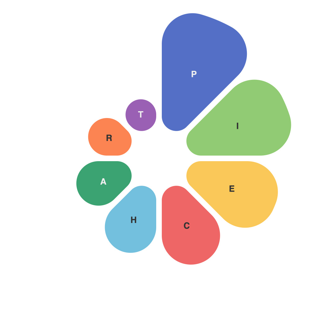
Unlocking Visual Insight: Mastering Pie Charts for Effective Data Communication
Visual communication is a powerful tool in conveying complex data succinctly and engagingly. One common and effective way to illustrate data visually is through pie charts. These graphical representations offer a clear and intuitive approach to understanding proportions and percentages, ideal for various applications such as business intelligence, market analysis, educational presentations, and more. Here’s how to use pie charts to unlock visual insights and drive effective data communication.
### The Power of Pie Charts
Pie charts are a visually appealing way to represent data as parts of a whole. They use sectors or slices of a circle to represent the proportion of each component relative to the total. The size of each slice, when seen against others, provides immediate visual understanding of its significance within the dataset. This makes it easy for the audience to compare parts to each other and to the overall total in just one glance.
### Choosing the Right Data for Pie Charts
While pie charts are versatile, they aren’t the best choice for every situation. Here are some rules to consider:
1. **Proportions Matter.** Pie charts are most effective when the emphasis is on proportions and comparisons between categories. They are not ideal for displaying actual values or precise data ranges.
2. **Limited Categories.** They work best when there are a few categories (typically no more than 5-7 slices) because the human eye struggles with interpreting more than that accurately.
### Designing Effective Pie Charts
To ensure your pie charts provide clarity and impact, follow these guidelines:
1. **Use Clear Labels and Legends.** Each slice should be labeled clearly, ideally right within the slice, so the audience knows what each part represents. Legends should be minimal, only used if labels are crowded.
2. **Ensure Readability.** Choose readable colors and labels. Avoid overly bright or contrasting colors which can be jarring. Ensure the text is large enough to read from a typical presentation or printed material distance.
3. **Arrange Slices.** Place the largest slice at the top and arrange subsequent slices in a way that makes it as easy as possible for the viewer to compare sizes. Reverse the order that slices are usually arranged (clockwise vs. counterclockwise) if it aids readability.
4. **Use 3D or not.** While 3D visuals can be intriguing, they can often distort the visual perception of the slice’s size, making the chart less effective. Stick to 2D for clarity and simplicity.
### Customization for Impact
Customization options in software applications, such as the ability to change colors, fonts, and even slice start and end points, can significantly impact the aesthetic appeal and legibility of your pie charts. Experiment with these features within the limits of good design sense to maximize impact.
### Conclusion
Pie charts are a staple in the world of data visualization, offering a simple yet powerful way to communicate proportions and percentages effectively. By choosing the right data, designing with clarity, and customizing for impact, you can effectively use pie charts to unlock visual insights and enhance data communication in various applications. Remember, while pie charts are a useful tool, they are not the only solution, and the choice of charts should always align with the specific data being presented and the intended message.

