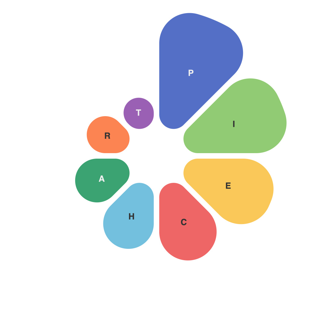
In the sprawling landscape of data visualization, the pie chart stands as a foundational and often misunderstood tool. Although widely criticized for its limitations, the pie chart remains a popular choice for presenting complex datasets when used correctly. This comprehensive guide delves into the visual art of pie chart design and usage, helping you harness their strengths and navigate their challenges.
Introduction to Pie Charts
A pie chart, also known as a circle graph, is a circular statistical graph divided into slices to illustrate numerical proportion. Each slice of the pie represents a component of the whole, providing a visual comparison of individual pieces within the collection.
Key Components of a Pie Chart
1. The Whole: Each pie chart represents 100% of the data presented. The sum of all slices is equal to the whole.
2. The Slice: Each slice within the chart represents a segment of the whole—typically a category of data.
3. The Center: The point within the center of the circle may be the focus or highlight of the chart, signifying a significant quantity or a percentage.
4. Labels: Clear and concise labels are crucial for ensuring that the audience correctly interprets the pie chart.
5. The Legend: While a legend is less common in pie charts compared to other types of graphs, it can be helpful when dealing with multiple datasets or series.
6. Colors: Using distinct colors can enhance understanding and provide clarity to different segments.
Design Principles for Effective Pie Chart Creation
1. Keep It Simple: The rule of thumb is to limit a pie chart to five slices or fewer; adding more slices leads to a complex and possibly misleading chart.
2. Start Slices from 12 O’Clock: The convention is to draw the starting slice from the top clockwise, allowing viewers to compare slices against a common starting point.
3. Use a Clear Background: The background should be uncluttered and simple to allow the pie chart to stand out.
4. Pay Attention to the Font: Use a clean and simple font that’s easily readable. Ensure you have enough contrast between the text and the chart color.
5. Be Mindful of the Colors: Pick colors to differentiate slices that stand out easily and provide adequate contrast.
Navigating Common Challenges
1. Misinterpretation of Data: People can misinterpret the data by focusing on the size of the slices rather than the angles.
2. Irrelevant Data: Some datasets are inherently difficult to represent in pie chart form due to the nature of the data (e.g., highly skewed distributions).
3. Comparison Issues: It’s challenging to compare specific slices to one another due to the lack of a standard reference.
Best Practices
1. Choose the Right Data: Opt for pie charts when you want to show how parts relate to the total of a single variable. Alternatively, bar graphs, line graphs, or scatter plots might be more suitable for other types of data.
2. Use Secondary Data Visualization: Provide additional tools, such as a tooltip or a pop-up, to offer more precise information when hovering over sections.
3. Consider Alternative Formats: Sometimes, a doughnut chart, which is a variant of a pie chart with a hollow center, can be a more effective representation.
4. Validate Assumptions: Before presenting a pie chart, ensure it’s accurate and the data supports the conclusion or hypothesis that the viewer might draw from it.
5. Prepare to Adapt: Be prepared to change your pie chart design to address feedback or if you discover that the format doesn’t serve your audience well.
Conclusion
The pie chart is a timeless staple in the field of data visualization. While it bears limitations, it also presents a unique approach to showcasing part-to-whole relationships. By following the principles outlined in this guide, you’ll be well on your way to creating compelling, accurate, and engaging pie charts that communicate data effectively.

