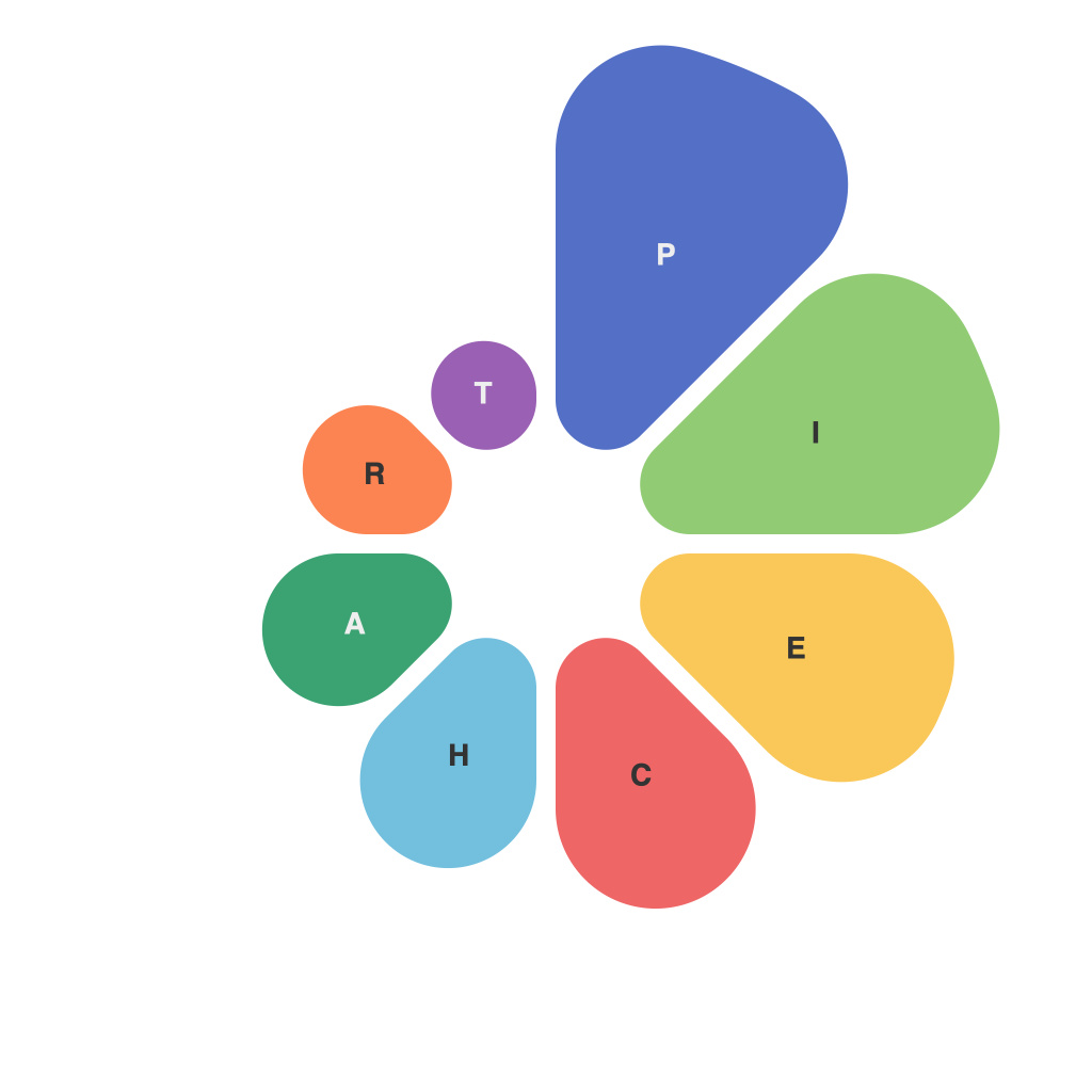
In a world increasingly driven by data, the ability to decipher and communicate this information effectively has become paramount. Among the myriad tools at our disposal are data visualizations, which offer a clear, impactful, and easily digestible way to tell stories with numbers. One such tool is the pie chart, often misunderstood but potentially powerful when employed correctly. In this exploration, we delve into the mysteries of the pie chart, uncovering its lesser-known secrets and uncovering the insights it holds for those willing to engage with its artful presentation.
At first glance, the pie chart seems simple and perhaps even rudimentary. It divides information into slices of a circle, with each section representing a proportion of the whole. This familiar format, however, is the starting point of a journey toward deeper understanding.
To decode the art of the pie chart, it is crucial to first understand how it conveys information. As a circular graph, it divides a single data set into different segments, making it an ideal choice for comparing proportions that form a whole. From marketing budgets to survey responses, to demographic breakdowns, pie charts can present a variety of insights in an immediate and engaging way.
The pie chart also offers a visual shortcut for presenting data succinctly; one cannot help but be drawn to the whole and automatically look for patterns and comparisons. This visual appeal is a hallmark of its design, but it also comes with challenges, primarily related to viewers’ ability to accurately interpret the information.
One common issue that confronts pie chart designers and enthusiasts alike is the challenge of representing smaller slices properly. When there are many pieces, discernment becomes a task of fusing spatial reasoning with numerical knowledge. Pie charts with too many slices are overwhelming and difficult to follow, hence, the rule of thumb “no more than 5 slices” when possible. To compensate for the difficulty of perceiving small angles, a simple color change from the center or a texture pattern might be a subtle but effective cue.
Next comes the artful selection of elements. Selecting the right colors is pivotal in pie charts as it helps in distinguishing slices and grouping similar data points. The color palette needs to complement your data without introducing unnecessary noise. For instance, using colors from a warm or cool gradient can make large pieces feel more balanced against their smaller counterparts.
Another dimension of pie chart artistry is the consideration of the format itself. Standard 2D pie charts are static, but they can be animated to show changes or compared with other data sets. An “exploded pie” chart, where one slice is pulled away from the center, can highlight a particularly important proportion. It’s in the arrangement of elements and the presentation that the true art of the pie chart comes to life.
Understanding the audience is key to decoding a pie chart. If the readers are accustomed to pie charts or are making a quick comparison, that might be all that’s needed. However, if viewers require precise numerical comparisons, incorporating additional data, such as a key or annotations with exact percentages, could clarify the picture.
Interactive pie charts, where users can hover over slices to see more information or have a comparative pie with selected slices highlighted, improve accessibility and user experience. The inclusion of filters can also let viewers interact with the chart, allowing them to focus on specific portions based on their research needs.
Decoding data visualization with the artful pie chart ultimately requires a balance between aesthetic appeal and functional clarity. Here are some guidelines for creating a powerful pie chart:
1. Choose a pie chart when the total number of categories is low and the data is being used to represent a whole.
2. Keep it simple and avoid clutter by choosing the right color scheme and limiting the number of slices.
3. Provide context—use annotations, a key, or notes to explain the data visually.
4. When possible, add interactivity and customization options to enhance understanding.
5. Remember, the purpose of the chart is to tell a story about the data, so ensure it carries the message clearly and consistently.
In conclusion, the pie chart, with its simple yet profound design, is a testament to the power of visual storytelling. By decoding its many nuances, we can harness its artful expression to bring insights to life and share these with others, thereby illuminating the path toward better data-driven decision-making.

