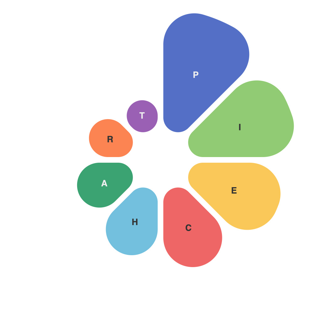
In the realm of data visualization, pie charts have long been a staple, used to represent percentages and proportions within a whole. Despite their popularity, this circular graph format often attracts mixed opinions regarding their effectiveness. This article delves into the insights, challenges, and design best practices associated with using pie charts to visualize data.
Insights
Pie charts provide a straightforward way to convey information about segments within a whole by breaking down data into slices, each representing a percentage. Their simplicity often makes them appealing for quickly summarizing data, particularly when illustrating concepts like market share or demographic distribution. The immediate visual separation of data segments can help viewers understand relationships between categories easily.
One of the key insights from pie charts is their use in creating comparative visuals. With pie charts, it is effortless to identify the segment that takes up the largest area, allowing for an at-a-glance assessment of which category holds the most value, percentage, or size. Additionally, a well-constructed pie chart can serve as a powerful storytelling tool, fostering discussions about the significance of different segments.
Challenges
While pie charts have numerous benefits, they are not without their challenges. One of the primary issues is that pie charts can be misleading, especially when the differences between segments are subtle. A slight angle difference can create the impression of a larger segment, even when the actual percentage variance is not significant. This discrepancy is often referred to as the “pie illusion,” where visual perception can be more impactful than the actual numerical values.
Another challenge lies in the fact that pie charts can only effectively represent two or three segments. With too many slices, a pie chart becomes overcrowded, making it difficult for viewers to distinguish between each segment. This is due to the limited spatial capacity of a pie chart, which restricts the amount of data that can be displayed coherently.
Design Best Practices
In order to maximize the effectiveness of pie charts, it’s essential to adhere to certain design best practices:
1. **Keep it Simple:** Limit the number of segments to three or four to avoid clutter.
2. **Use a Clear Color Palette:** Select a palette that is easy on the eyes and ensures that color contrasts differentiate segments clearly.
3. **Maintain Consistency:** Consistency in slice widths and colors helps viewers differentiate between different data segments.
4. **Include Labels and Legends:** Clearly label each segment and add a legend for reference, especially when multiple pie charts are used closely together.
5. **Avoid Zero Degrees:** Ensure that no segment opens to a zero degree angle, as this can make it visually challenging to distinguish between two adjacent segments.
6. **Consider the Angle:** Avoid starting the pie chart at zero degrees to improve the visual continuity of the graph.
7. **Use a Third Dimension:** While traditional pie charts are two-dimensional, a three-dimensional pie chart can be used to emphasize certain segments, though it often distorts perception.
In conclusion, pie charts are a versatile tool within the data visualization toolkit that can effectively convey information when used appropriately. Despite their limitations and potential for visual misinterpretation, following design best practices can ensure that pie charts serve their role as effective data communication devices. By understanding the insights, challenges, and applying carefully considered design methodologies, professionals can harness the power of pie charts to provide insightful perspectives on numerical data.

