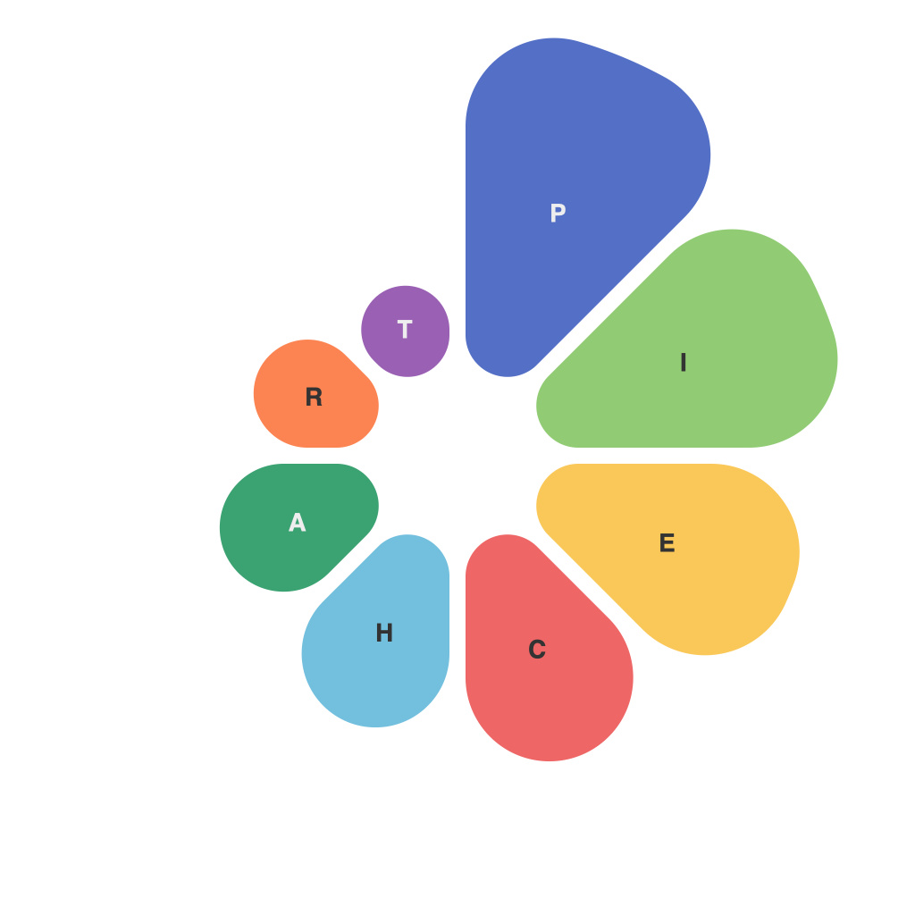
In the bustling world of data analysis, visual presentation lies at the heart of conveying information effectively. Color and composition play pivotal roles in enhancing the understanding of complex datasets. One such tool that stands out for its ability to provide a quick and clear overview of relationships, proportions, and trends is the pie chart. Gaining mastery over pie charts is akin to learning a language that can decode data into visually compelling insights, leading us on a journey of discovery through the visual insight revolution.
At first glance, pie charts appear deceptively simple, offering a circular format to slice and dice data into individual slices that represent parts of the whole. However, decoding data in color within these charts is an art that, once mastered, can transform the way we comprehend and communicate data.
color as the interpreter of meaning
Colors are not just hues on a chart; they are the interpreters of meaning. When used thoughtfully, colors can highlight the most critical data points, draw the viewer’s attention to significant differences, or indicate a progression or change over time. By leveraging color to its fullest potential, visual analysts can ensure that pie charts resonate with more than just the eyes—information lingers in the mind.
Strategic color use enhances the readability and impact of pie charts in several ways:
1. **Differentiation**: Employ contrasting colors to set apart various data segments. This differentiation can help readers easily identify distinct categories or groups within the dataset.
2. **Emphasis**: A shade or intensity that is bolder can emphasize particular slices, drawing the viewer’s focus to key data points or the trends they represent.
3. **Hierarchy**: Establish a logical hierarchy by placing brighter and more intense colors at the top or bottom of the pie and blending tints and tones to create a gradient that guides the eye from the most important to the less prominent data.
4. **Cultural Context**: Consider the cultural connotations of the colors chosen because meanings can be subjective. For example, blue in some cultures may symbolize calmness and trust, whereas in others, it may be associated with sadness.
mastering the shapes and sizes
Beyond color, the shape and size of pie chart slices provide additional visual cues. When comparing pie charts, the accuracy of slice sizes can mean the difference between clear communication and misunderstanding. Here are a few principles for mastering these aspects:
1. **Slice Shapes**: Uniform shapes—typically pie segments of equal radius—ensure that the chart accurately reflects the data proportions. Asymmetrical slices can be misleading.
2. **Slice Sizes**: Ensure that the relative sizes accurately represent the proportional data. Larger slices should be more spacious and larger in diameter, and conversely, smaller slices are generally less prominent.
3. **Labels and Text**: Optimize label placement to avoid overlapping slices and minimize text clutter. Clearly labeling with both the full name and its corresponding percentage or count can prevent confusion in large datasets.
4. **Animation and Transition**: If you are animating the pie chart, pay attention to the smoothness of transitions when moving from one state to another. Jarring shifts can make it difficult to follow the data.
deciphering the trends
The essence of pie charts is in their portrayal of changes over time or the comparison of two or more sets of data. When trends stand at the core of the analysis, pie charts can offer a unique perspective:
1. **Sequential Pie Charts**: This technique involves taking a single slice of a pie chart and moving it forward to a new pie chart to track changes over time. Color can continue to convey a narrative, but it’s essential to maintain visual consistency for accurate comparison.
2. **Multi-series Pie Charts**: Comparing two or more sets of data in a single chart can be challenging but possible through careful balance and alignment. It might be necessary to invert colors or find a nuanced way to manage the additional complexities.
3. **Interactive Pie Charts**: Adding interactivity—like hovering over a slice to reveal more details—provides depth and context to the user.
pie charts with a purpose
Ultimately, decoding data in color within pie charts is about understanding their purpose. When the objectives are aligned with the format, the chart can serve its intended function effectively. Whether it’s to compare market segments, visualize a budget allocation, or track progress against a goal, pie charts are a go-to visualization that requires an astute approach to design and interpretation.
In conclusion, pie chart mastery is not merely about the art of arranging circles and filling them with colors. It’s about weaving understanding into a visual tapestry that tells a story, guides judgments, and inspires informed decisions. The visual insight revolution in decoding data through color and pie charts opens new horizons for data visualization experts and enthusiasts alike, transforming numbers into narratives that resonate and resonate deeply.

