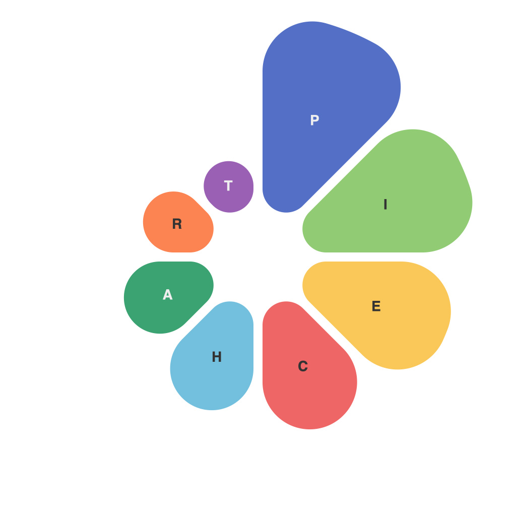
In the rapidly evolving world of data and analytics, the ability to present complex information in an engaging and accessible format is paramount. The well-crafted pie chart, often an underappreciated tool in the visual arsenal, has the power to transform raw data into compelling narratives that resonate with all levels of an audience. This article aims to decode the art of using pie charts as an essential element in the practice of visual storytelling.
As with any visual representation of data, understanding the pie chart begins with understanding the data itself. A pie chart visually divides a circle into sections, each representing a proportion of a whole. The size of each section can be directly linked to a percentage in the dataset, making it a straightforward way to illustrate parts to a whole relationship. Whether showcasing market share, election results, or any portioned data, pie charts provide a clear and concise snapshot of complex information.
**Choosing the Right Data to Chart**
The first step in crafting a compelling pie chart is selecting the right data. It is essential that the data is representative and appropriate for a pie chart. Numbers should be easily compared in relative terms, and if the aim is to emphasize the size of one segment over the others, it is imperative that the differences are significant enough to be visible when presented as slices of a circle.
One common misconception about pie charts is that they should only be used for a limited number of categories. While this belief is rooted in an old design rule, this is no longer true. The key is to avoid overwhelming the viewer with too many sections. The ideal range for pie charts is 3 to 6 categories, each proportionally representing a significant portion of the total.
**Design Considerations: Making Your Pie Chart Pop**
Good design is not just decoration; it is fundamental to conveying the message of the data. When designing a pie chart, consider the following:
– **Color:** Use colors that are distinguishable from one another. The human eye can differentiate about 7-10 hues at a time reliably, so avoid a color palette larger than this and consider a scheme that reflects the theme or purpose of your presentation.
– **Legibility:** Ensure that the text is large enough to read easily, particularly if you are using it on a large screen or in a printed document. Avoid overlapping text and colors that blend together.
– **Labeling:** Clearly label each section of the pie chart with the proportion it represents, and if room allows, include the category name. This provides context and aids the viewer in immediately understanding each part of the whole.
– **Orientation and Rotation:** Horizontal pie charts can be easier to read and compare segments because our eyes are more accustomed to following the right-to-left direction. Some designers may use rotated labels to avoid clutter, but be cautious as this can compromise legibility.
**Pie Charts vs. Their Competitors**
While pie charts are a powerful tool, they are not the only means of conveying information visually. For instance, bar graphs may be better for comparing multiple groups over time, and scatter plots are ideal for illustrating relationships between continuous variables. In comparison, pie charts excel in showing how different segments relate to a central, categorical whole. Deciding between a pie chart and another visualization style depends on the story you wish to tell and the needs of your audience.
**Incorporating into the Overall Narrative**
Once designed, pie charts can be the centerpiece of a larger narrative. The goal is to pair qualitative storytelling with quantitative data through visual storytelling to create a more memorable and persuasive message. The pie chart may be part of a wider presentation that includes a mix of visuals, such as graphs or text elements, to explain the data’s implications and draw conclusions from the visual clues presented.
**Limitations and Considerations**
Despite their utility, pie charts are not without limitations. Because it can be difficult to discern exact differences between segments, they may not be the ideal choice for large datasets or scenarios where precise number comparisons are required. Additionally, the human brain finds it easier to compare angles for length rather than areas, which can lead to misinterpretation when reading pie charts with very similar-sizes segments.
Moreover, pie charts should be used judiciously. As with any form of visual representation, they can sometimes be overly simplistic and fail to capture the complexity of real-world phenomena. It is crucial to pair data visualization with additional methods of analysis to ensure a more comprehensive understanding of the data.
**Conclusion: Pie Charts as a Gateway to Data Storytelling**
Pie charts encapsulate the essence of data visualization — they make complex data comprehensible and engaging. By paying careful attention to the choice of data, design elements, and the integration into a broader narrative, pie charts can be a powerful instrument in the toolbox of anyone seeking to harness the power of data storytelling. Embracing the craft of pie chart creation can enable individuals, organizations, and thinkers to share insights, create compelling stories, and guide impactful decisions.

