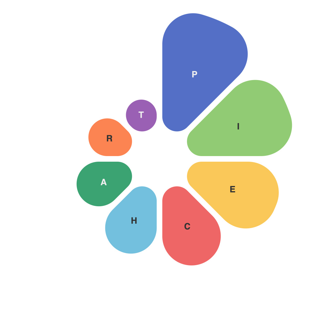
Navigating the ever-changing landscape of information, pie charts have emerged as a fundamental visualization tool, conveying complex data into digestible slices. This article delves into the nitty-gritty of mastering the impact and presentation of pie charts to ensure they communicate effectively and efficiently.
### The Power of Pie
Pie charts, with their simplicity and visual allure, can encapsulate a significant amount of information with ease. They are excellent for illustrating proportional relationships, especially when comparing data sets with similar totals. However, the effectiveness of these charts is not just in their ability to reveal information; it lies in how they are crafted and presented.
### Crafting an Impressive Pie Chart
1. **Data Preparedness**
Start by collecting and preparing your data set. Ensure every piece is relevant and has a clear purpose. The aim is to represent the relationship and proportions accurately, without cluttering the chart with too many slices.
2. **Number of Slices**
The rule of thumb is to avoid creating pie charts with more than six slices. As the number increases, it becomes difficult to differentiate between them, which could lead to misinterpretation.
3. **Order of Slices**
Order the slices by size or importants. This not only improves the presentation’s aesthetics but also ensures viewers can quickly identify key data points.
### Color: The Language of Pie Charts
Color plays an integral role in how a pie chart is perceived. Here’s how to leverage color effectively:
– **Differentiate Slices**
Utilize bright and contrasting colors for each segment to make them clearly distinguishable. Using the same color for all slices can blend them into a single mass.
– **Avoid Trends**
Refrain from using color to suggest trends, where one color is perceived as more dominant than another. This can bias interpretation.
– **Colorblind Accessible**
Opt for colorblind-friendly palettes that adhere to color theory to not exclude those with color perception difficulties.
### Effective Labels and Titles
– **Include Titles**
A compelling title sets the stage for what the chart represents, guiding the viewer’s expectations.
– **Labeling**
Clearly label each slice with its respective percentage, to avoid confusion about the relative sizes. Overlaps can be a bit tricky, but proper sizing and spacing will do the trick.
### Visual Balancing
Whether you are using a pie chart for a presentation or a report, the visual balance is key. This is achieved through:
– **Center Alignment**
Pie charts should be centered to prevent being skewed by the base line, which can alter the perception of the proportions.
– **Consistent Slice Thickness**
Ensure every slice has a uniform thickness, as irregularly shaped segments can fool the eye into perceiving differences in size incorrectly.
### Beyond Basic Pie: Creativity in Presentation
The humble pie chart can be enhanced with a variety of techniques to stand out:
– **Three-Dimensional Pie Chart**
While 3D charts can look more dynamic, they can also misrepresent size and can be confusing, so use them sparingly.
– **Exploded Pie Chart**
By highlighting a specific slice (the “exploded” piece), you can draw attention to a particular data point without cluttering the chart.
– **Segment Shape Changes**
While traditional pie charts use circular segments, using other shapes such as triangles or rectangles can add an element of surprise and enhance readability.
### Conclusion
Pie charts are more than just a data presentation vehicle; they are a canvas for crafting narratives with charts. By understanding the nuances of their construction and presentation, you can effectively decoding data and ensuring the maximum impact of pie charts in your visual arsenal. Remember, a well-crafted pie chart can simplify complex data, inspire actionable insights, and leave an indelible mark on the viewer’s mind.

