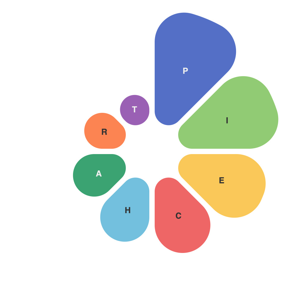
In an era dominated by information overload, sifting through data has become an essential skill. Presenting this information visually can be a powerful way to communicate its significance and help others make sense of it. The pie chart, with its timeless charm, remains a staple in the visual arsenal of data presentation. Yet, crafting the perfect pie chart is far from merely a visual feat; it is an art and a strategic endeavor. Let’s delve into the pie chart craft, where aesthetics meet analysis, and discover how to master its data delights.
Understanding the Basics
At the heart of the pie chart’s success lies its simplicity. It presents data segments as slices of a circle, where each slice is proportionally sized to the data it represents. A pie chart’s primary function is to show the relationship between the pieces of data and the whole, making it an excellent choice for illustrating percentages, proportions, or comparing parts of a whole.
Selecting the Right Data
Before penning a single line of data labels or choosing a color palette, decisions must be made about which data should be visualized. The pie chart should be reserved for representing a single category or data set; it is less effective when it tries to depict multiple datasets or when an array of data contributes to a portion of the pie.
Pie charts work best when there are no too many data points, as too many slices can lead to visual clutter. If a pie chart is overly convoluted, it becomes difficult for viewers to discern the data’s insights. It’s important to determine whether a pie chart can genuinely convey the message and not overwhelm the audience.
Choosing the Best Layout
The layout of the pie chart often dictates its readability. Common layouts include standard pie charts, where angles are drawn from the center of the circle, or donut charts, which use several concentric circles to provide a clearer comparison of individual slices to the whole. In both layouts, the aim is to keep the pie segments distinct and clear, reducing the likelihood of visual confusion.
Strategic Usage of Color and Labels
Color is more than just aesthetic—it’s an integral part of communication in pie charts. Appropriate color selection can aid the interpretation process, making it easier to differentiate between various categories. It’s important to use hues that are neither too bright nor too contrasting, to maintain the subtlety and clarity of the chart’s message.
Labeling is equally important. Data labels should be clear and concise, providing just enough information to help the audience understand the data. Placing the labels on the appropriate radius can enhance the pie chart’s legibility, but overstuffing labels or overlapping slices may detract from the chart’s effectiveness.
Recognizing the Boundaries
As straightforward as the pie chart seems, it has limitations that we must respect. For instance, a pie chart cannot be used to compare multiple sets of data from different categories, and it does not allow viewers to see the actual values of each data segment.
In addition, pie charts are not always the best choice for audiences trying to pinpoint the exact size of data segments. Human perception of angles can be inherently imprecise, which makes smaller slices particularly susceptible to misinterpretation.
Slicing Through the Artistry
The creation of a perfect pie chart involves artistic sensibility, analytical skills, and strategic forethought. Each stage of the process—from the selection of data to the decision on layout and color—underscores the interplay between art and strategy.
In the end, the pie chart is more than just a static depiction of data. It is a dynamic tool that can captivate, inform, and resonate with viewers. Deciphering the data delights within the pie chart craft isn’t merely about presenting statistics; it’s about communicating insights that resonate, engage, and drive more informed decisions.

