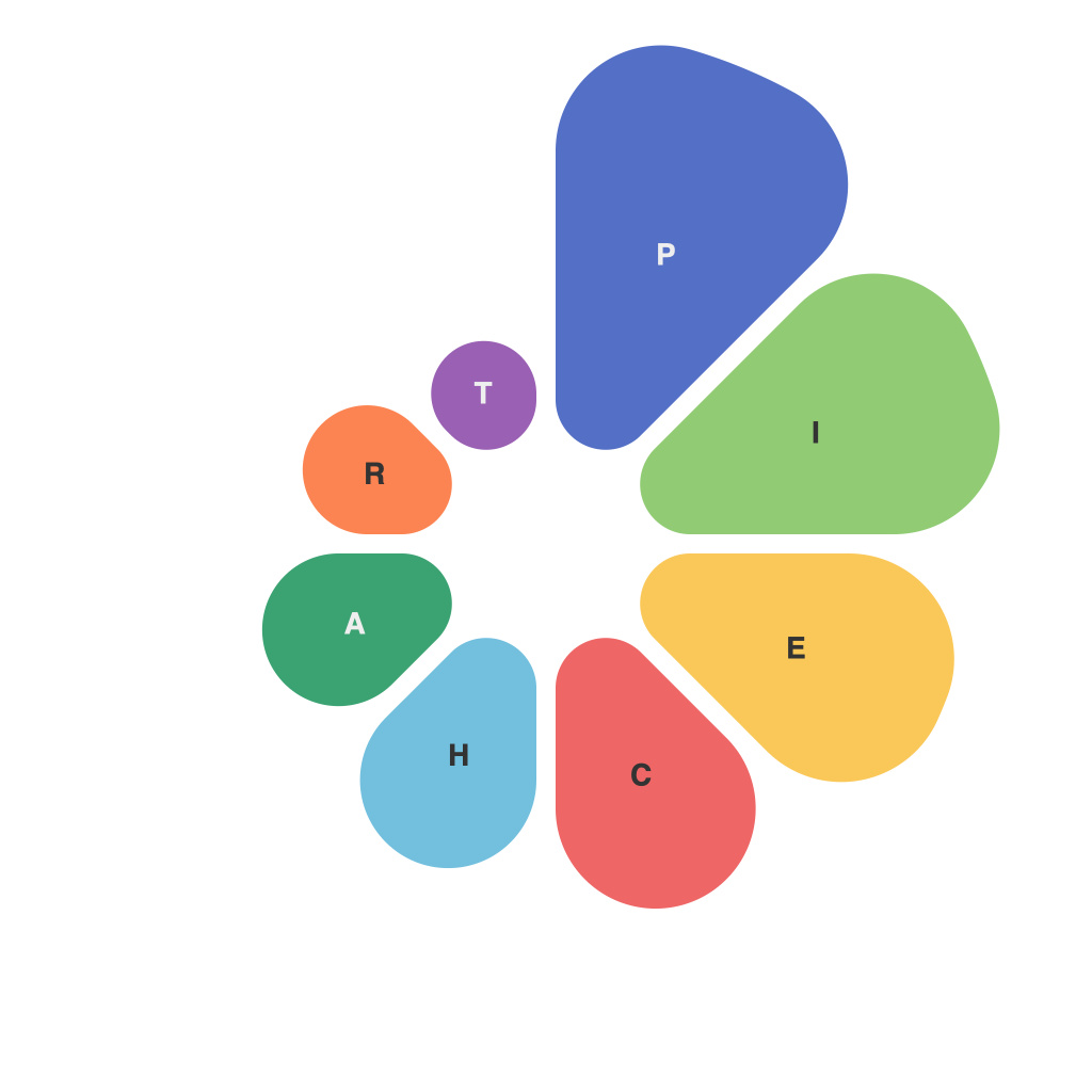
In the ever-evolving landscape of data representation, few tools have captured the imagination of professionals, analysts, and enthusiasts alike as effectively as the pie chart. This timeless visualization method plays an invaluable role in helping people understand complex data sets at a glance. Enter Piechart Mastery: a guide where we delve into the nuances of creating precise and stylish pie charts that empower effective data visualization. From selection of the right data to the intricacies of color schemes and layout, this article explores the key principles and techniques that enable you to master the art of piechart creation.
**Pie Chart Basics: The Blueprint of Mastery**
To begin the journey of piemaking prowess, a foundational grasp of pie chart principles is vital. A pie chart is a circular graph divided into sectors, each representing a proportional part of the whole. When used correctly, it offers a straightforward mechanism to visualize data relationships and percentages at a glance.
**Choosing the Right Scenario**
Before crafting a pie chart, carefully consider whether a circular graph is appropriate for your data. Pie charts are best used for comparing part-to-whole proportions, with no more than seven categories—any more, and interpretation can become unnecessarily complex or, worse, misleading.
**Presenting Data with Precision**
Accurate and meaningful data presentation is at the core of piechart mastery. To ensure precision:
1. **Source Data**: Make sure the data source is reliable. Inaccurate data can skew the pie chart’s message.
2. **Breakdowns**: Use distinct, clear labels for each segment of the pie to represent the data accurately.
3. **No Manipulation**: Refrain from using exaggerated pie charts or altering data to fit the graph—honesty is key.
**Decoding Color Theory**
The right color palette can greatly enhance the visual appeal and comprehension of a pie chart. When selecting colors:
1. **Clarity**: Ensure that colors are distinguishable and not too close on the visual spectrum.
2. **Consistency**: Stick to a consistent color scheme throughout your data visualization to maintain a unified aesthetic.
3. **Subtlety**: Avoid using too many colors as it can be overwhelming and detract from the pie chart’s clarity.
**Pie Chart Layout: The Visual Dance**
Pie charts should have a logical and readable layout:
1. **Segments Order**: Larger segments often deserve prime real estate on the pie. Arrange them in descending order, with the largest at the top.
2. **Label Alignment**: Position labels alongside the segment to facilitate better understanding.
3. **Text Size and Font**: Make sure text is legible, with a font that aligns with the overall design.
**Interactivity: Beyond Static Images**
Static pie charts can convey a limited message. For enhanced engagement:
1. **Interactivity**: Incorporate features such as tooltips that can display additional information on hover.
2. **Animations**: When depicting changes over time or comparing data series, small animations can help tell a richer story.
3. **Accessible**: Be mindful of colorblind users and create pie charts that are comprehensible without relying on color.
**Piechart Mastery: The Evolution of Data Visualization Craftsmanship**
The pie chart may not be the most versatile tool for every data visualization challenge, but with piechart mastery, its power can be harnessed to great effect. Mastery of these skills—selecting the appropriate data, precise data representation, thoughtful color selection, effective layout, and leveraging interactivity—empowers users to craft pie charts that not only tell a story but also captivate an audience and inspire informed decision-making.
Piechart Mastery is not just about creating beautiful charts, it’s about becoming proficient in a language that helps decode the complex world of data, thereby equipping users with the power to articulate insights and trends with precision and style.

