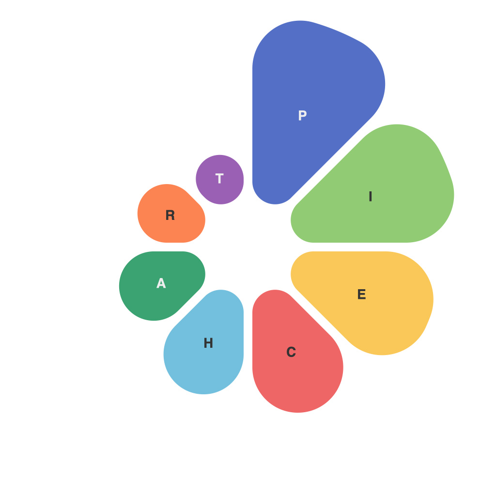
In today’s data-driven world, the ability to visualize data in a clear and impactful manner has become pivotal for effective communication and understanding. Pie charts are a popular, user-friendly option among various visualization tools. They allow for the presentation of a single data series’ segments in a visually engaging way, where each slice of the pie represents a proportion of the total. In this article, we will dive into the comprehensive guide to creating impressive pie charts, highlighting the key considerations and best practices to ensure your charts deliver not only visually appealing presentations but also impactful insights.
### 1. Selecting the Right Data for a Pie Chart
The foundation of creating an effective pie chart begins with selecting the right data. Pie charts are best suited for showing part-to-whole relationships, making it ideal for datasets that contain a few categories (typically less than seven) with distinct proportions. Avoid using them when you have numerous categories, as it can lead to clutter and difficulty in distinguishing between slices. Instead, consider alternatives like bar charts or stacked bar charts for more complex datasets.
### 2. Simplifying the Design
Simplicity is paramount when crafting pie charts. Use a maximum of three colors—two colors for the main segments and a third soft color for the background—ensuring that they do not distract from your message. The colors should contrast sufficiently to differentiate between the slices, particularly when viewed from standard device sizes, and be accessible to all audiences, including those with color blindness. Transparency or subtle gradients can also be effective for enhancing readability.
### 3. Labeling Cleverly
A common pitfall in pie charts is overwhelming the viewer with too much textual information. Each slice should have a label that clearly identifies it, ideally the category label. The labels should be concise and formatted so that they are readable without needing to be clicked open or rotated to see labels under overlapping slices. Consider the readability context of each pie chart, adjusting the label size according to the slice size and the available space. For particularly large datasets, it may be helpful to incorporate a legend.
### 4. Emphasizing the Main Message
In a pie chart, it’s crucial to emphasize what’s most important to your audience. This often means focusing on the largest slices, which capture a significant portion of the total. These slices should be visually distinct, easily identifiable, and perhaps highlighted in a different color or pattern to draw additional attention. The less prominent slices can also be emphasized through color or size adjustments, making subtle information easier to discern without detracting from the main message.
### 5. Tooltips for Enhanced Interaction
When creating digital or online pie charts, add tooltips to provide additional insights or detailed information on hover. These interactively display data values and percentages, enhancing the user’s understanding and engagement. Ensure the text in tooltips is easily readable and directly relevant to the data point it represents, avoiding cluttering and sticking to the essence of each slice’s contribution to the whole.
### 6. Avoiding 3D Effects
While 3D effects may seem to add depth and appear more visually engaging, they can often lead to distortions in perception of the pie segments, making it harder to interpret proportions accurately. It’s best to stick with a flat, 2D design to maintain clarity and precision in the depiction of data.
### 7. Implementing Responsive Design
In environments where pie charts are part of a web-page or an interactive dashboard, it’s essential to incorporate responsive design. This ensures that the charts are easily readable and effectively communicated across a range of devices, from desktop to smartphones. Adjustments like resizing labels, optimizing colors for smaller screen sizes, and ensuring that the chart is pinch-to-zoom capable can greatly enhance the user experience.
### 8. Final Review and Approval
Before finalizing and publishing your pie charts, conduct a thorough review to check for any inconsistencies in colors, labels, or proportions. Ensure that the chart accurately represents the data and communicates its intended message without any misleading elements. If possible, get feedback from colleagues or target users to ensure the chart meets both functional and aesthetic criteria.
By adhering to these guidelines, you not only create visually appealing pie charts but also communicate data effectively and accurately, ensuring that your audience understands the insights and story your data wants to tell.

