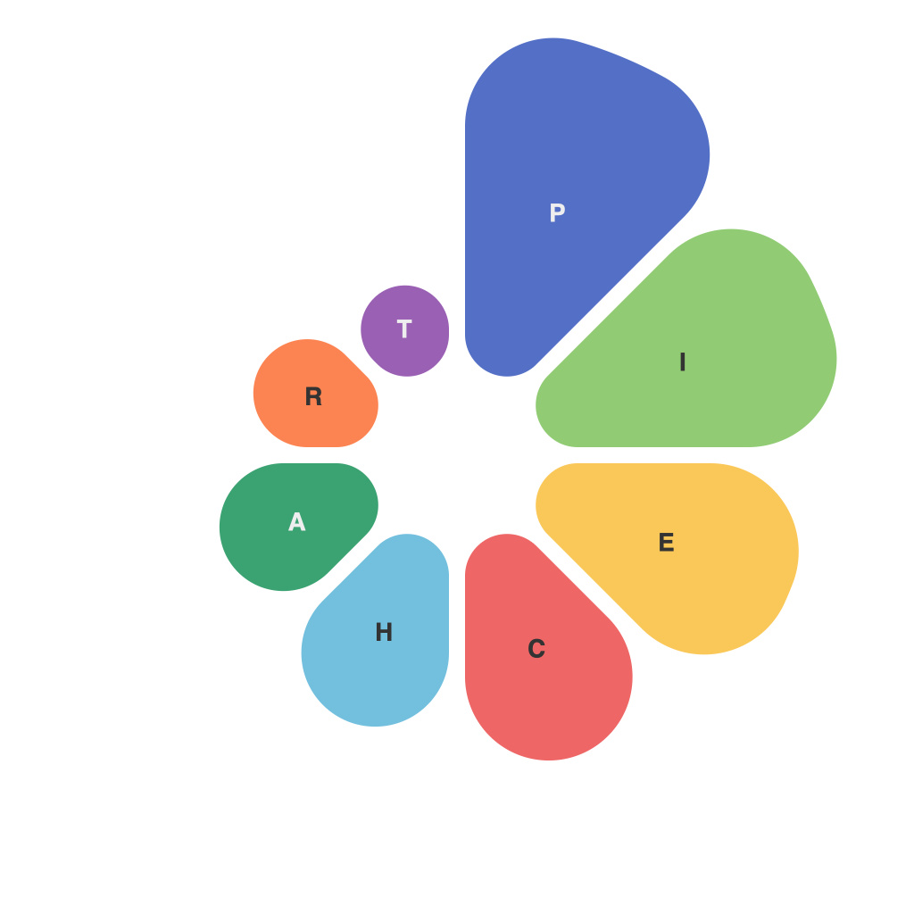
In a world where data is king, the art of pie chart design and interpretation stands as a vital tool for making informed decisions and conveying information effectively. Whether you’re analyzing market trends, tracking project progress, or depicting demographic data, the pie chart has long been a staple in the communication of numerical information. Understanding the principles behind the creation and interpretation of pie charts is crucial to mastering data visualization. This article delves into the intricacies of pie chart design and interprets how to harness this powerful visual format for maximum impact.
The Pie Chart: A Brief History
First introduced by Florence Nightingale in the 19th century, the pie chart has come a long way from its Victorian origins. Initially used to illustrate the causes of the Crimean War’s military deaths, the pie chart has since evolved to become one of the most widely used forms of data visualization.
Pie Charts: The Basics
A pie chart is a circular statistical graphic divided into sectors, each representing a proportion of the whole. The entire pie represents 100% of the data, and each sector’s size corresponds to its relative proportion of the total data. When crafted correctly, a pie chart can make complex information easily understandable.
Understanding the Layout
A well-designed pie chart layout should be straightforward and clear. Here’s what to keep in mind:
1. Sectors: Divide the pie into a number of sectors, based on the data you want to represent. The number of sectors should be neither too many nor too few. Typically, six to 10 sectors are ideal, but with careful design, you can manage up to 10-12.
2. Angle: The angle of each sector represents its proportion to the total. Larger angles denote larger values, but when in doubt, order the sectors by size from largest to smallest to ensure that viewers can interpret the chart intuitively.
3. Labels: Clearly label each sector with its corresponding value or category. It’s also helpful to label the entire pie chart with the total value or percentage to provide context.
Effective Color Use
To make a pie chart visually appealing and easy to interpret, use color wisely:
1. Differentiate: Assign different colors to each sector to distinguish them from one another. Avoid using too many colors that could clutter the chart or difficult-to-compare shades.
2. Contrast: Choose colors that are distinguishable from one another. If some sectors are very similar in color, viewers might have difficulty discerning their individual proportions.
3. Theme Consistency: If you’re presenting multiple pie charts, use a consistent color scheme across them for easy comparison.
Pie vs. Bar and Line Graphs
Pie charts serve a specific purpose and might not always be the most suitable choice for all types of data. Consider these alternatives:
1. Bar Graphs: Bar graphs display numerical comparisons and can be easier to read when comparing multiple data categories, especially for large data sets.
2. Line Graphs: Line graphs are ideal for displaying trends over time, as they show the progression of values over a series of measurements.
When to use a Pie Chart
Pie charts are best when:
– You want to emphasize the distribution and proportion of parts within a whole.
– The data has distinct categories that are relatively easy to compare in proportion.
– You have a limited number of categories, usually less than 10.
Interpreting Pie Charts Effectively
To truly master pie charts, you must also know how to interpret them:
1. Look for Sectors. A pie chart should be immediately clear, with each sector visibly representing its proportion to the whole.
2. Observe the Center. Sometimes, the largest sector may be positioned in the center, while smaller ones are closer to the rim. Pay attention to this spatial bias in interpretation.
3. Read Proportions. Compare the relative sizes of sectors to understand their proportions.
Design Tips and Common Pitfalls
Here are some crucial pie chart design tips and pitfalls to avoid:
1. Avoid Clutter: Don’t include too many data points or overly detailed labels, as this can overwhelm viewers and obscure the message.
2. Be Mindful of the Angle: Do not arbitrarily change the angle of sectors for stylistic reasons; angles should reflect the proportion of the data accurately.
3. Use 3D Wisely: While 3D pie charts might look visually appealing, they oftentimes make it harder to interpret data accurately due to distorted perspectives and overdone effects.
The Art of Pie Chart Design and Interpretation
A well-crafted pie chart can be a powerful tool for presenting data in an accessible, visually engaging, and easy-to-understand way. By following the principles outlined in this article, you can approach the creation and interpretation of pie charts with confidence, enabling you to more effectively communicate data-driven insights across a broad spectrum of applications. As data可视化 continues to evolve, mastery of the pie chart will remain an essential skill for anyone aiming to become a proficient data decoder.

