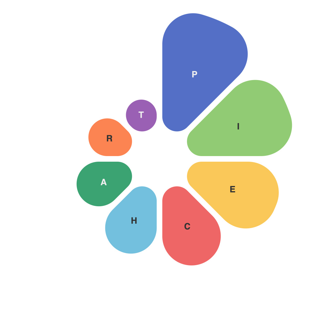
Mastering the Pie Chart: A Comprehensive Guide by PieChartMaster
Pie charts are a popular type of data visualization used to represent parts of a whole. When constructed using the correct techniques, they can provide a visually intuitive way to compare percentages and proportions. However, incorrect use or design flaws in pie charts can often lead to misinterpretation or confusion. In this guide, we will navigate the complex yet rewarding world of pie charts, from understanding their purpose to mastering their creation and analysis.
### Understanding Pie Charts
Pie charts are circular graphs used to show the relative sizes of each part within a whole. Each section, or slice, represents a proportion of the total. This makes them particularly useful when you want to emphasize the importance of each part in relation to the whole, such as market share, budget allocations, or demographic splits.
### Choosing When to Use Pie Charts
Pie charts can be effective when:
1. **The focus is on showing proportions** – If the goal is to compare categories based on their share of the total, pie charts can be quite effective.
2. **The dataset has fewer than 7 – 8 categories** – With too many slices, a pie chart can become cluttered, and it might be more effective to use an alternative chart type like a bar chart or a stacked column.
3. **The categories have direct, additive relationships** – Pie charts are ideal when the total value of each category directly contributes to the overall total.
### How to Create Effective Pie Charts
**1. Start with Clarity**: Before designing your chart, ensure you understand what you are trying to communicate. Avoid clutter by limiting the number of slices. Typically, seven slices or fewer work best, but if there are more, consider grouping smaller categories into a single “Others” slice.
**2. Use Descriptive Slices**: Assign each slice a descriptive name that accurately reflects the data it represents. Avoid ambiguous terms like “Miscellaneous” or “Rest of the Data”. Aim for clarity and precision in naming categories.
**3. Optimize Visual Elements**: Use color effectively to distinguish between slices. Ensure that your color choices are accessible to people with color blindness. Consider using a strong color for the biggest slice to create a clear visual hierarchy.
**4. Label Wisely**: For most charts, automatic labels are fine. However, if your slices have close percentages, consider adding percentage values. In some cases, a legend might be necessary to clarify labels, especially if slice labels are too complex or numerous.
**5. Avoid 3D and Sparklines**: While aesthetically pleasing, 3D charts can distort the perception of the data, and sparklines, while useful in certain contexts, can distract from the primary purpose of showing proportions in pie charts.
### Interpreting Pie Charts
To interpret a pie chart effectively:
1. **Identify the Key Message**: Understand what the chart is trying to convey. Is it about showing the relative sizes of categories or comparing a few categories against the whole?
2. **Check the Labels and Percentages**: Pay attention to labels and percentage values to ensure they accurately represent the data. Inconsistent labeling can lead to misinterpretation.
3. **Consider the Context**: Evaluate the relevance of comparing parts of a whole in the context of the data. For example, if the difference in percentages between categories is negligible, the use of a pie chart might not be the most effective way to communicate your data’s insights.
4. **Look for Patterns**: Note the distribution of data across categories. Are there any obvious outliers or trends that can be used to draw meaningful conclusions?
### Common Pitfalls to Avoid
– **Overusing 3D and sparklines**: While they might seem appealing, these can distort perceptions and distract from the purpose of the chart.
– **Failing to maintain proportional areas**: Each slice should match its percentage of the total. Inaccurate representation can lead to misinterpretation.
– **Neglecting color accessibility**: Ensure that your color choices are accessible to all viewers, including those with color vision deficiencies.
– **Including too many categories**: Pie charts become less effective with too many slices. Consider alternatives like bar charts for a clearer comparison.
### Conclusion
Pie charts, when created thoughtfully, can be a powerful tool for summarizing and comparing parts of a whole. By focusing on clarity, avoiding common pitfalls, and interpreting them correctly, you can maximize their effectiveness. Mastering pie charts not only enhances your data visualization skills but also helps in making your data more comprehensible and impactful to your audience.

