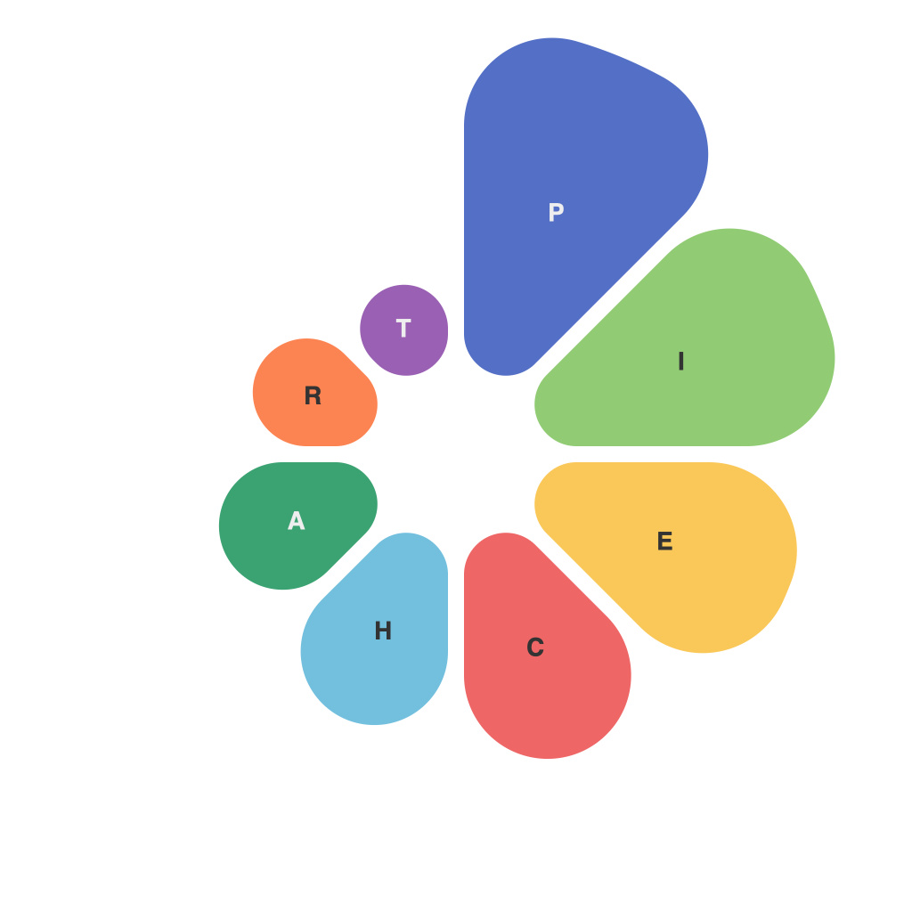
In today’s data-driven world, the ability to effectively distill large amounts of information into a comprehensible format is invaluable. One tool that stands out in this endeavor is the pie chart. Pie charts offer a succinct and engaging way to illustrate the composition of data, making complex analytics relatable and actionable. Mastering the art of pie charts can significantly enhance your data visualization and reporting capabilities. This article delves into the techniques and best practices to master this indispensable data visualization technique.
**Understanding Basics of Pie Charts**
A pie chart is a circular statistical graph that is divided into sectors, each representing a proportion of the whole data. These sectors are proportional to the magnitude of the data they represent. The core components of a pie chart include:
– **Pie Chart Layout:** Each data segment is depicted as a piece of a pie, with larger pieces indicating a higher percentage of the whole.
– **Labels:** These include the name of each segment and can sometimes offer additional details about the data.
– **Colors:** They are used to distinguish different segments and add aesthetic appeal.
– **Percentage Labels:** Located outside each segment, they display the relative proportions as a percentage of the whole.
**Selecting the Right Data**
The key to a compelling pie chart begins with selecting the right data. Ensure that the data you wish to visualize can be efficiently communicated in pie form. Here’s when to consider using a pie chart:
– When there are no natural hierarchies.
– When the entire pie represents 100% of a whole or a specific category.
– When the parts are more or less equally sized.
**Best Practices to Create Effective Pie Charts**
1. **Keep It Simple:** Only put a few slices per chart. Overloading a pie chart with too many segments makes it hard to draw conclusions, as viewers find it difficult to differentiate between small slices.
2. **Use Color Wisely:** Assign contrasting, but not complementary, colors to segments. This improves visibility and readability. Ensure that colors are distinguishable even when printed in grayscale.
3. **Include Legend:** Make sure each slice is clearly labeled inside or outside the pie chart. This helps people understand slices right away without needing to refer to a key or legend.
4. **Align with Text:** Be mindful of how you position text around a pie chart. Keep it clear and avoid overlapping so that the text complements the visual, not detracts from it.
5. **Consider 3D or 2D:** Avoid 3D pie charts unless you have a specific design rationale. They can distort the visual accuracy of the pie’s segments and make it more challenging to interpret the exact size of slices.
6. **Use a Secondary Axis:** If the data requires it, consider a secondary axis for values that do not sum to 100%. This can avoid the inaccuracies of scaling pie charts to include all numbers.
7. **Focus on Proportions:** Pie charts are best for illustrating overall proportions rather than actual quantities. Use them to show trends and comparisons, not differences in magnitude.
**Advanced Techniques**
1. **Interactivity:** Leverage interactive pie charts that allow viewers to click on different slices to view detailed data or even create a new smaller pie chart with the selected segment.
2. **Stacked Pie Charts:** For datasets with multiple variables that can be stacked, you can combine multiple pie charts within the same area, with each slice representing a cumulative percentage.
3. **Pie-of-Pie and Bar Charts:** When a pie chart has a segment larger than 25%, break that slice out into a 2D bar chart. This helps maintain clarity and improves understanding.
In conclusion, mastering the skill of visualizing data using pie charts can empower your analytics reporting. By understanding when to use them and applying best practices in their creation, you’ll be well on your way to producing clear, informative, and compelling data visualizations that serve as valuable decision-making tools. Remember, the strength of a data visualization lies not just in how it looks but in how it communicates the story within the data.

