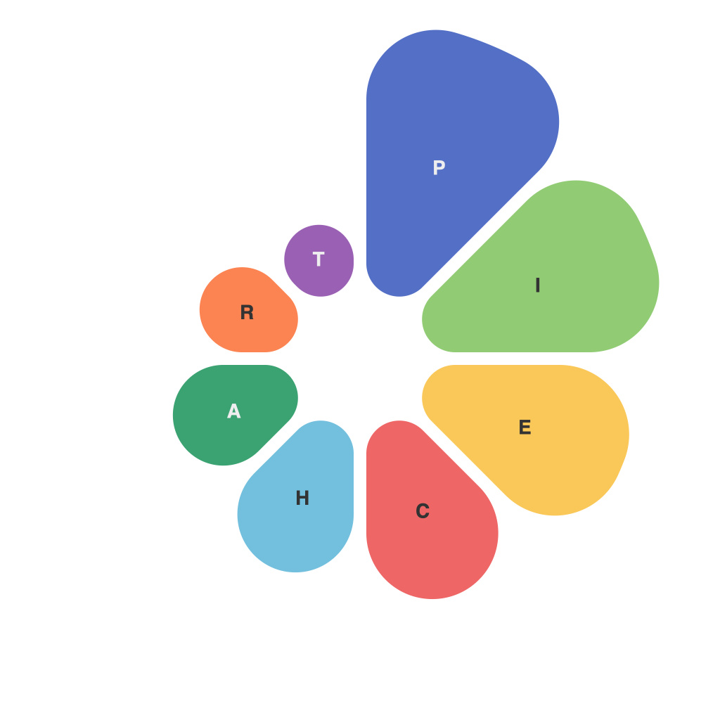
In the vast digital realm, where data is the currency of decision-making, visualization stands as the silent maestro that arranges the symphony of statistics into comprehensible melodies. One such musical instrument in the data viz arsenal is the humble pie chart, affectionately termed as an infographic masterpiece that demystifies complex proportions. This text is adata vignette—a narrative about the art of pie charts, their evolution, variations, and the nuanced storytelling they perform with each slice.
The essence of pie charts is quite simple. It’s a circular graph, divided into slices, each representing a fraction of a whole. The beauty of this graphic lies in its simplicity, yet it boasts a power to communicate complex information with a single glance. Picture the circle as a pie, with each slice cut according to the dataset’s proportions. It could represent the market share of companies, breakdowns of survey responses, sections of a data distribution, or any other proportionate data representation, all laid out in the shape of a slice of cake.
At their inception, pie charts date back to the 18th century, with their roots stemming from William Playfair’s “商业与政治统计图表”(Commercial and Political Atlas and Statistical Breviary) in 1786. Since then, this chart has been a staple in the data visualization ecosystem, though not without its critics.
Criticisms arise from varied angles, with the most profound ones regarding the difficulty of comparing slices within pie charts. As the number of slices increases, the visual chaos can be overwhelming, with eye-mechanics failing to easily determine the relative sizes of segments. Despite these challenges, the charm of pie charts remains alluring due to their ability to be immediately intuitive.
To explore the art of pie charts, let’s dabble in a few of their various forms.
The Classic Pie: The most straightforward, it communicates a single data point by splitting the circle into parts based on percentage or raw numbers, each with a distinct color—making it a feast for the eyes and the mind.
Stacked Pie: A progression from the classic pie, it visually stacking slices on top of one another, this variant allows for the viewing of part and whole relationships. It’s like having multiple pies layered for a richer, more complex data story.
Exploded Pie: This artistic twist to the traditional pie chart isolates one slice, stretching it outwards for emphasis. It gives an attention-getting appeal to the focused category but loses some at-a-glance comparison capabilities.
Donut Chart: Also known as the ring chart, this pie chart version is hollow, with space in the middle, which some argue helps to simplify the perception of slices.
3-D Pie Chart: A controversial choice, the 3-D pie might make it look cooler but often sacrifices readability for visual flair, making it a risky choice if one is aiming for clarity.
It pays to consider these different renditions not only as variations on the same theme, but also as artistic implements for crafting visual narratives. Each form has its own purpose, and the artist (or viz professional) must select the tool that best suits their desired story and audience.
Pie charts, with their inherent challenge to compare slices, have led to the exploration of other visualization techniques when conveying multi-dimensional data. Yet, their popularity persists, and they continue to captivate us. Their simplicity is their strength; their immediate comprehension, their triumph.
Artists of data, take note: A pie chart is not merely a graph; it is a story, a story that is often in need of your discerning eye and skilled hand. Your challenge, when you take the stage and the audience gazes upon your masterpiece, is not only to inform, but to enchant. Choose your slices wisely, as each will contribute to a visual symphony that communicates the rhythm and harmony of your data.

